Home 3D Art Showcase & Critiques

Frank the Executioner

polycounter lvl 14
Offline / Send Message
Isaiah Sherman polycounter lvl 14
I just posted up a new concept painting but I figured I'd post something more in the likes of the community here. This is a 3D character I made for the game "Tread." I concepted, modeled, textured, and rigged this character, so he's kind of my "baby" :p

He's a mix between an executioner, a biker, and an obese S&M.... person. This was my first normal map baking project as well so you may notice some irregularities in the normal map.

However, he goes into the Unreal engine perfectly fine and his normal map displays with no issues.


frank3D_composite-1.jpg


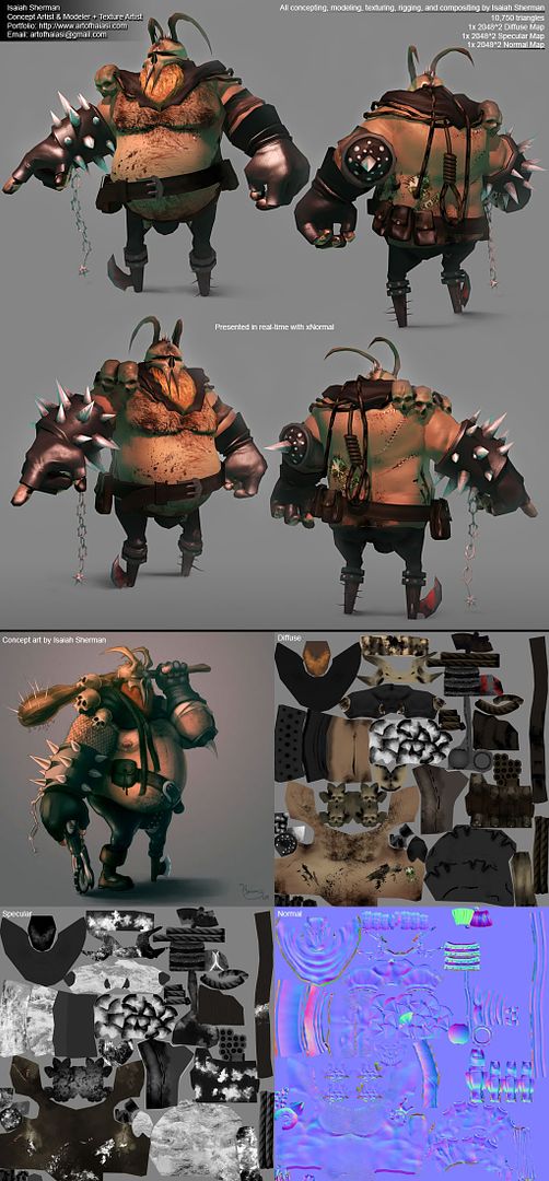
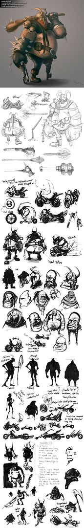
Here is his concept sheet if you'd like to see the work I did on him in his developmental stages.
09gpptExecutioner-1.jpg

Replies

  • Savior
    Options
    Offline / Send Message
    I love the concept and where this is going, really keen to see the bike too. The dirty chest hair and axe foot are brilliant.

    One thing i did notice though, is that the two points of the skull are really sharp, is that deliberate? In the concept they are much more blunt and wide.
  • Zotter
    Options
    Offline / Send Message
    Oh cool! I like the proportions, shapes and the coloring of it. The skin on the belly still seems a bit too even to be skin, usually even on the most smooth skin there's pores, marks and such and for a guy like this it looks like he's been through alot and would have tougher skin. You could either paint it on the diffuse or in zbrush grab an alpha that looks like porous skin, and shrink the alpha down very small and apply it like that. Even if it's supposed to be cartoony and not porous, slight discolorations of the skin would help a lot.

    The only other thing is the black smudges on his belly and back, after first I thought they were cancerous marks :) , I figure it's supposed be grit or oil or something. It just needs a bit more of story behind it where did the grit come from? A victim? His spilt coffee? His armpit? (figured the stuff coming from there would be foul to begin with) did it splash on him? from the side? from the top? why is that grit there? Because right now it just looks like a texture overylay or multiply in PS.
  • t4paN
    Options
    Offline / Send Message
    t4paN polycounter lvl 10
    The beard under the mask doesn't read all that well in the model (concept looks ok) but the rest of it is great. You've got a nice TF2 style going on in there.
  • Isaiah Sherman
    Options
    Offline / Send Message
    Isaiah Sherman polycounter lvl 14
    Savior: I decided to model the skull pointier at the tips because the concept wasn't all that menacing.

    Zotter: The oil on his sides are intended to be wipe marks from his fingers. It is pretty difficult to tell a story of a character just from beauty shots of the model alone. If you look at his fingers I'm hoping you'd be able to decipher than they're oily and that he's been working on his bike. The smears on his side are a result of him wiping his fingers off on himself.

    t4paN: I will revisit the beard. I'm working on figuring out how well Photoshop CS4's 3D paint works and I've already added a lot of detail to the skulls. The beard was another target area because I too agree it doesn't read as a beard all that well. I also plan on putting an alpha channel on the beard to really sell it.

    Thanks, you three :)
  • Zotter
    Options
    Offline / Send Message
    Okay, I actually didn't see any of the grease on the fingers until you pointed it out, but then again only the tips are visible, maybe some grease on the gloves, especially the palms?
  • uneditablepoly
    Very cool, I love those thumbnails you did for different body type concepts. And great final concept for the executioner! :D Good stuff! Can't wait to see more.
  • whipSwitch
    Options
    Offline / Send Message
    whipSwitch polycounter lvl 8
    I love the concept, and I think the model captures the personality intended. But it feels like the textures are holding it back. Kinda seems like you've got one foot in one style and the other foot in another. The flat style gets broken by the realistic rendering of the body hair, grease and tattoos. If you are gonna go for a more cartoony style, hand paint that stuff. Also the skull(head mostly, but the shoulders too) is the roughly the same hue as the skin, which just makes it read like skin, instead of bone.

    just seems like you cant decide what style to stick with and its mudding together at the moment.

    Keep at it.
  • d00kie
    Options
    Offline / Send Message
    d00kie polycounter lvl 17
    I lol'd at the mini ball and chain. I lol'd somethin fierce at his scrote.

    I agree with the beard remarks. Had I not seen the concept, I would not have known that was a beard.
    I think you can push the texture on the rope as well.
    I also would've liked to have seen the mesh arm guard and the bandages on his arms from the concept.

    Otherwise, very good translation from concept to model! :thumbup:
  • Isaiah Sherman
    Options
    Offline / Send Message
    Isaiah Sherman polycounter lvl 14
    I will definitely revisit the texture of the character, then. I will adjust the hues of the skulls to be a bit less saturated. I will also go through and edit a lot of the details to make them feel more cohesive in style.

    It probably wouldn't be all that difficult to add in the fish net mesh and bandage wraps on his arms too! When I get the time I'll get back to him and rework him and repost up what I have.

    Thanks you two :)
Sign In or Register to comment.