Nattapol Tumwasorn's Environment SCENES :)
Artist - Nattapol Tumwasorn
Programs : Maya, Zbrush, Photoshop
Comments and Critiques please !!!!!!
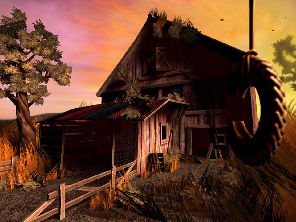
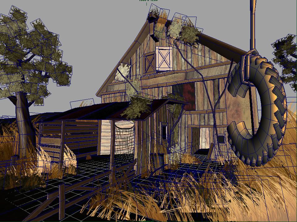
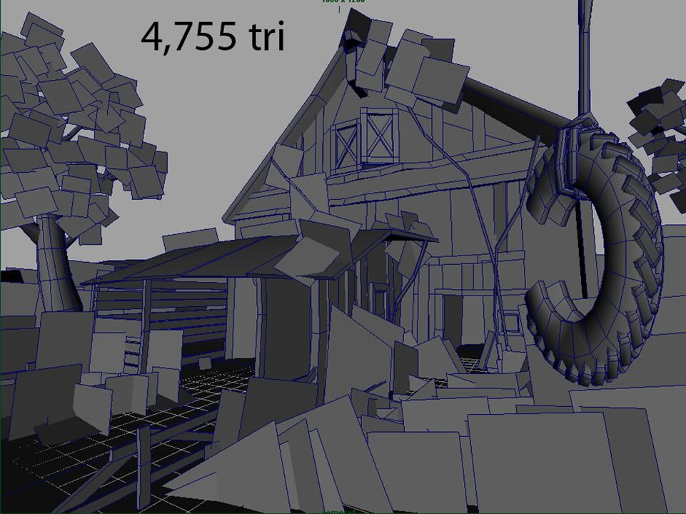
Barn House
4,755 Tri, Diffuse - Normal - Spec
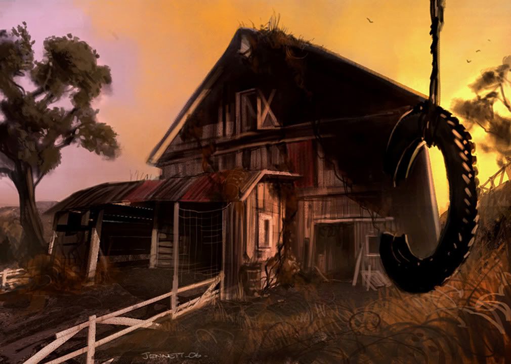
Original Artwork not by Me
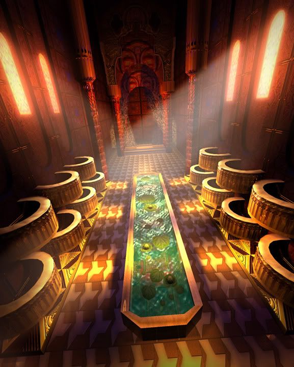
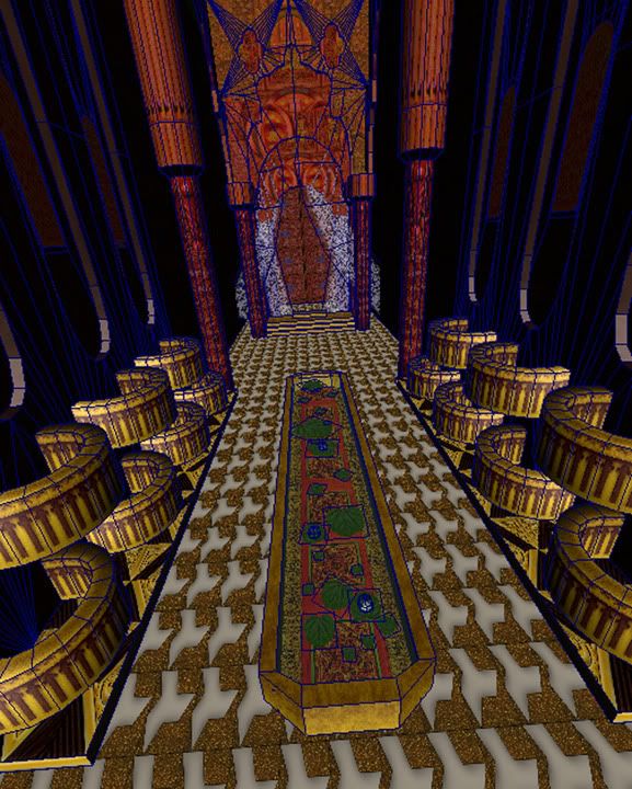
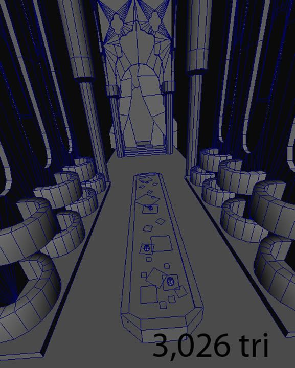
Medieval Room
3,026 Tri, Diffuse - Normal - Spec
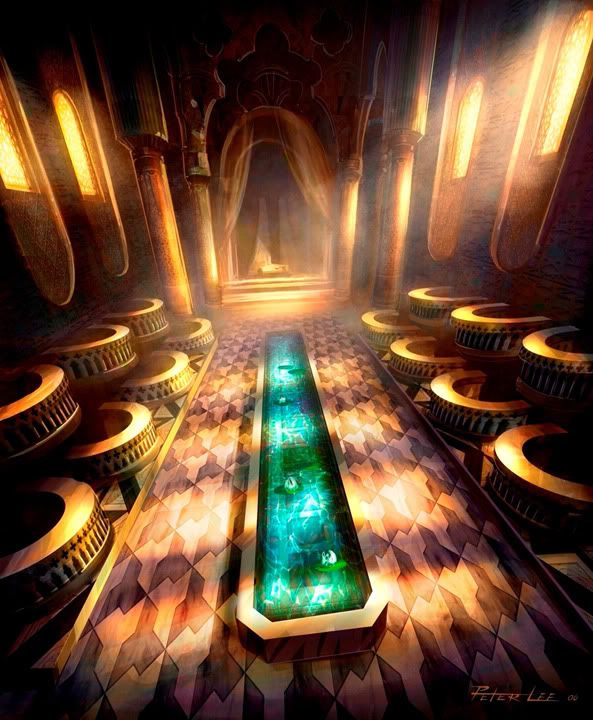
Original Artwork not by Me

Programs : Maya, Zbrush, Photoshop
Comments and Critiques please !!!!!!
Barn House
4,755 Tri, Diffuse - Normal - Spec


Original Artwork not by Me

Medieval Room
3,026 Tri, Diffuse - Normal - Spec


Original Artwork not by Me

Replies
Your second piece looks spot on to the ref. The water needs a lot more bling in it to really sell that its reflective. I would push the lighting in it to. At the moment, it looks a tad bit weak. Brightening up and blowing it out a bit will give it a sharper contrast for the shadows.
Anything else mate ;]