Need input for this level
This is an idea I had for a steampunk game, and this would be the first level of the game. I worked on this using Maya, Photoshop and the Unreal 3 engine. Im still working on the story and other concepts about the idea. Stay tuned.
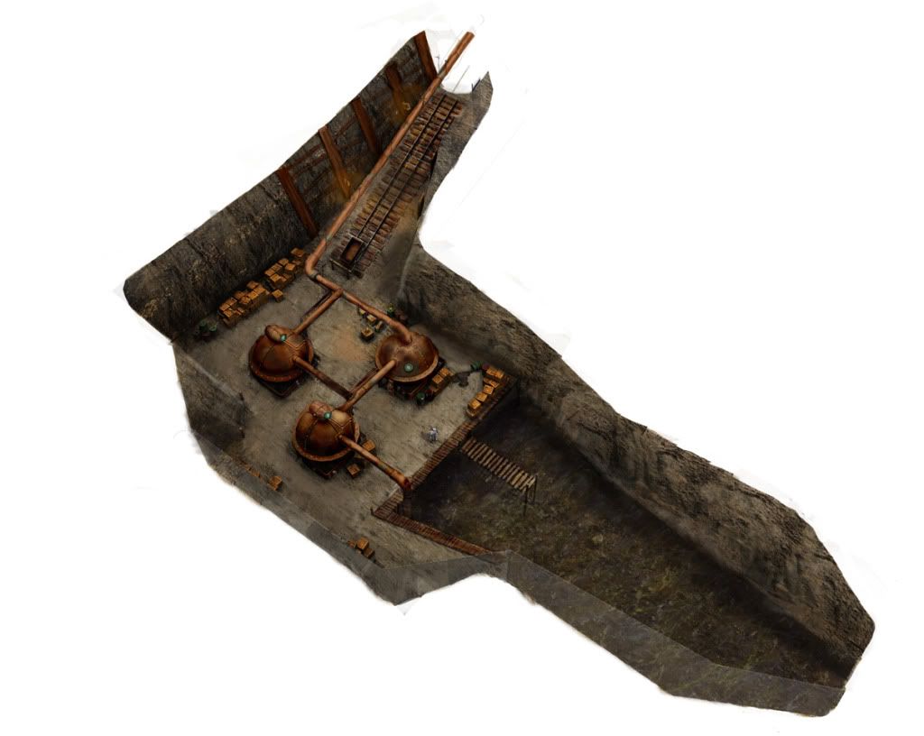
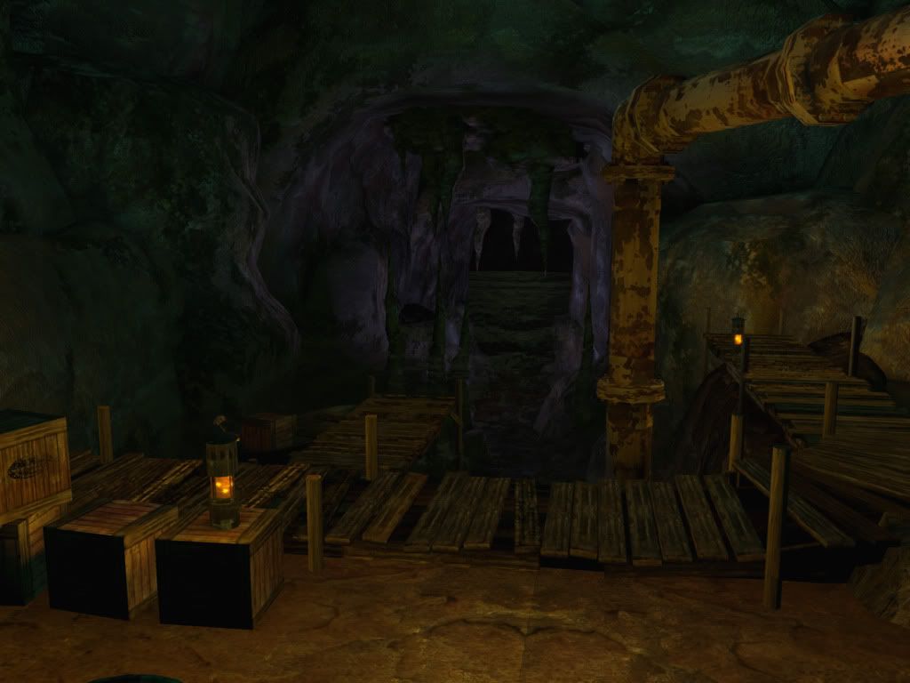
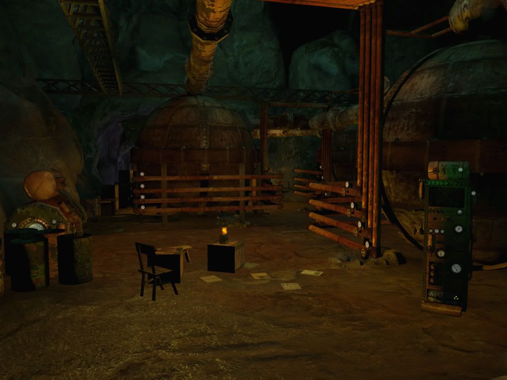
I wanted this level to be in a cave, and the entrance is the river that ends at a supply dock. I have the idea of having mechanics/guards hanging out here and you sneak around either to get passed them or take them out
Any ideas or critiques are welcomed
thanks
you can check out my blogspot for other art work or to get the updates of this project.
www.delvolta.com
Replies
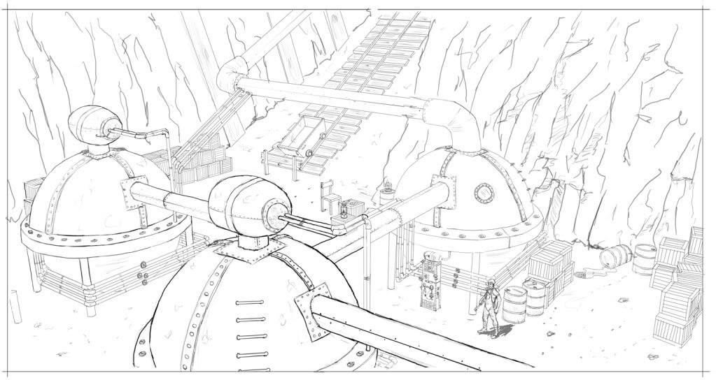
what you have here looks pretty durn good already, but there's a few points that could use tweaking:
- lighting: currently everything is the same-ish colour, try colouring different sections in different colours, like white fluo lamps, some spotlights round the dock, red emergencylighting in the shaft etc
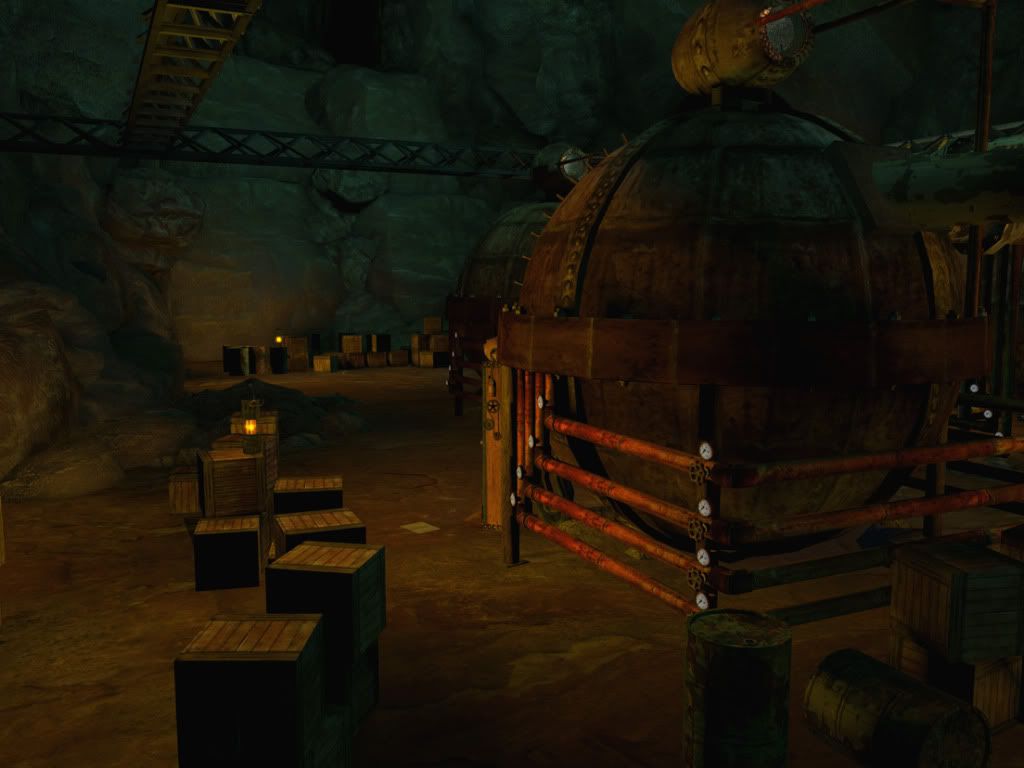
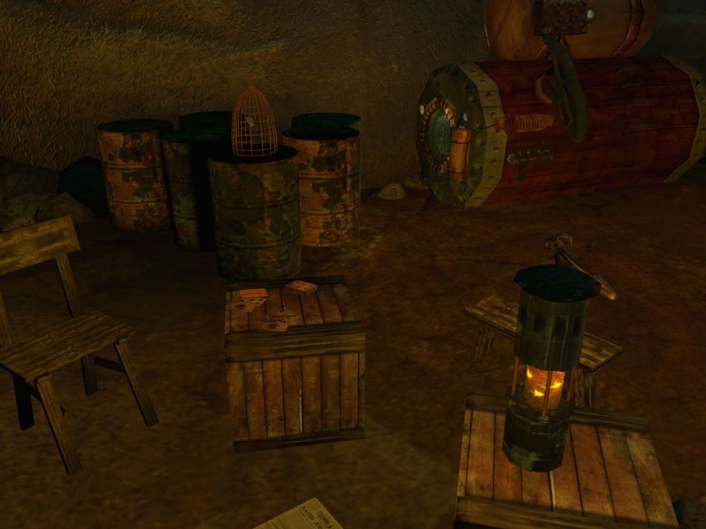
- repetition: you're consistently using the same gauge on the same place on every pipe, and it looks like copy-paste. you;re also just using a single crate in the entire area, add some longer crates, metal boxes, plastic containers, some shelving etcetera.
- it looks too sterile: the only sign of humans being there on a regular basis is the deck of cards. show pathways(would also help with sneaking) add a more centralized meeting spot, add some more entertainment ways (pile of magazines, radio etc) and such things
oh and i'd add some deformation to the floor, it appears its a flat surface
Only a few things to complain about:
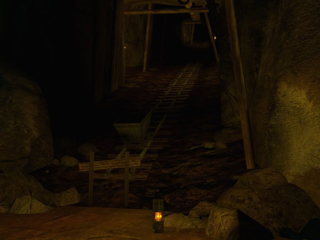
- The cart that defies gravity, the tracks that go no where, and the dirt that transitions poorly. At the end of a track you often have a track bumper. It would make sense to explain the track ending and have the cart rest against it.
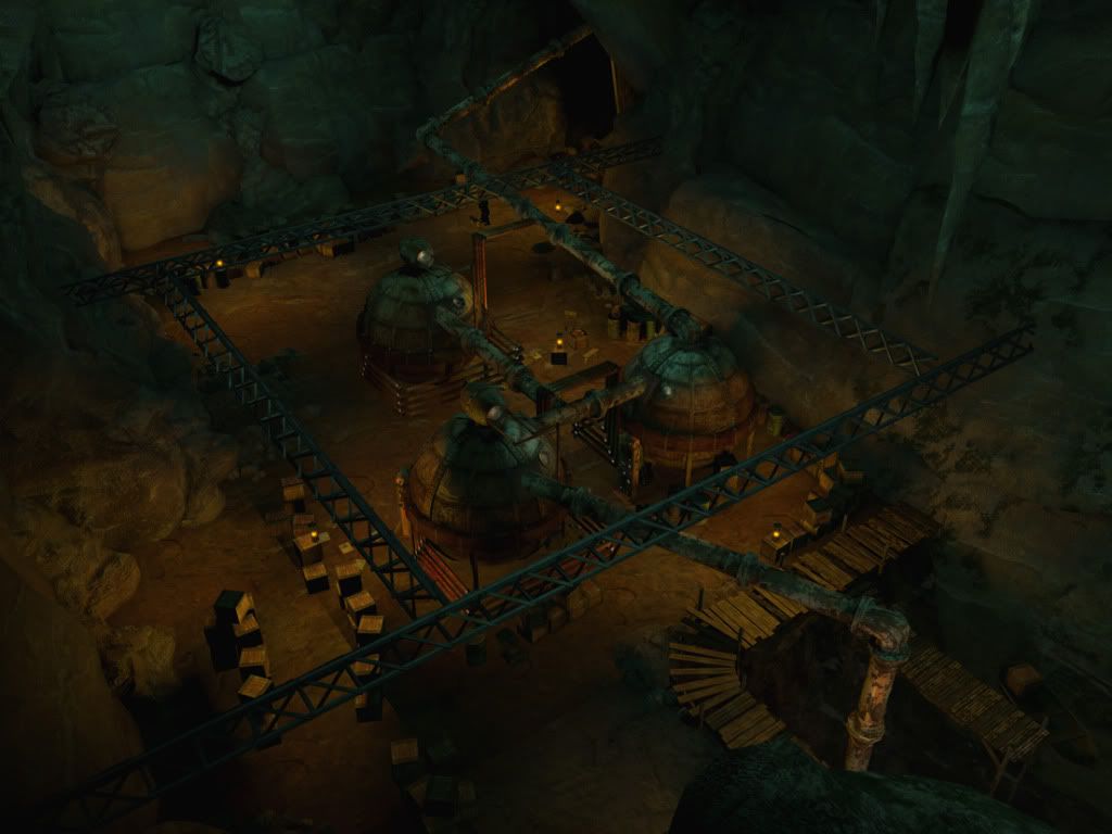
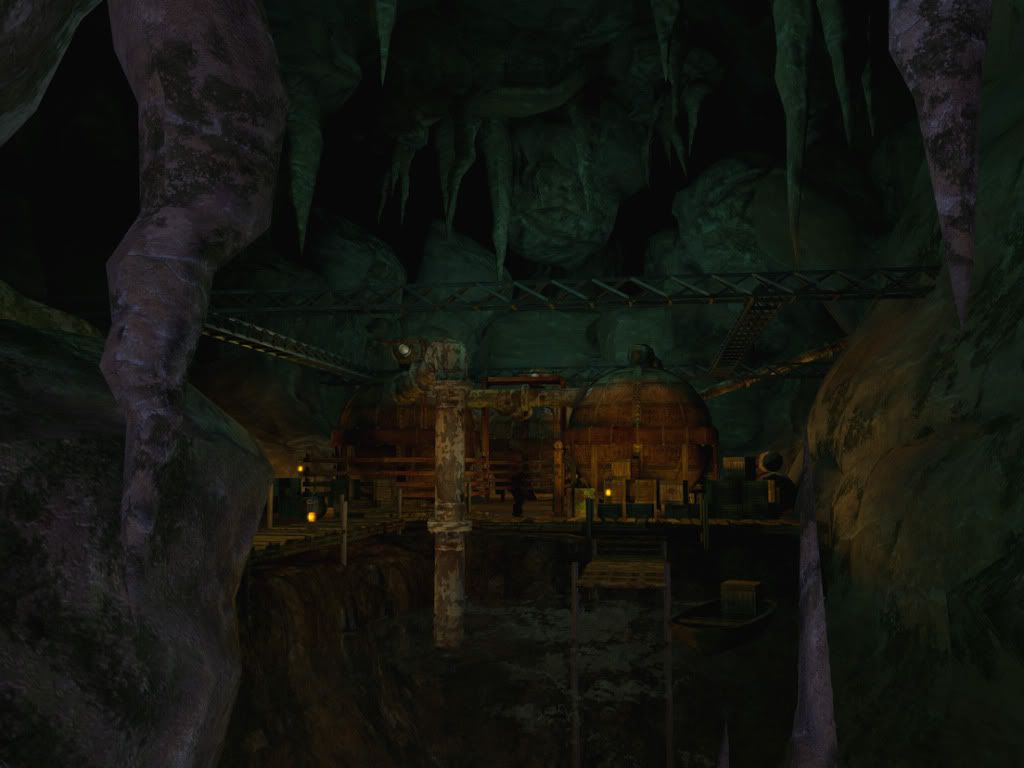
- Lack of shadows? I'm not sure what engine/render this was created in but the objects aren't really grounded.
Like snader said, you have a lot of opportunities for ambient lighting to kick it up a notch.
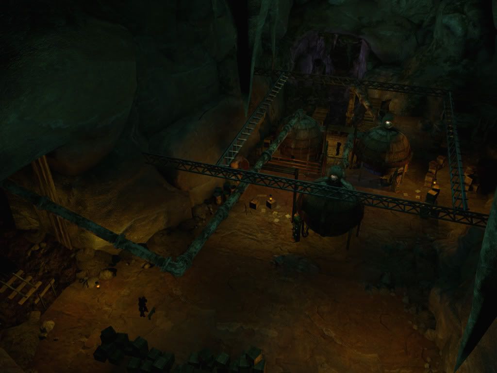
I think the pipes going every which way at the top muddles your scene too much. They look great from a top view, but when you're in the game, it just gets confusing. Any way you could make some of these pipes run across the ground and have the player simply walks over them?
The pipe texture also blends in with the rocks too much, probably want to chip away less paint. This will let the form of the pipes come out more too.
missed to mention that the story takes place around the 1920's, and i wanted to play with advancing technology. The main character is a university professor of mechanical engineering (think Indiana Jones making robots). The story starts out him embarking on a mission to go looking for his colleague (also a mechanical engineer) who disappears after accepting to work for a mysterious client. The protagonist, follow his leads to a remote jungle and finds that there is activity by the river mouth of a cave. Thus, making this level the first one.( that's what i have so far that's solid in the story)
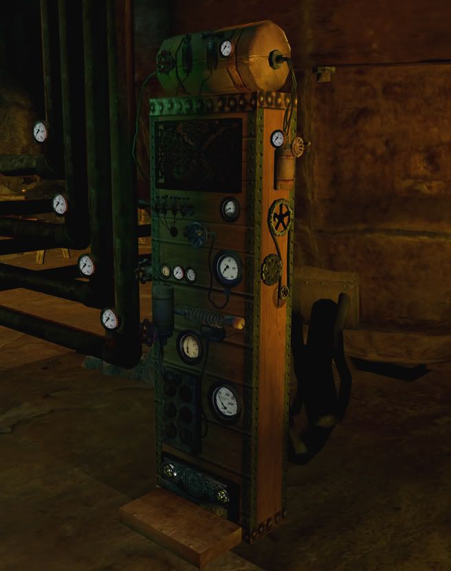
(Snader) - I modeled the wires so i can reuse them around the other machines to give the scene more of a mechanical look. didn't want to feel too restricted on polycount and your right, making the crates cubes - not using my smarts. I like the idea of making the level have more life, gives it more story and will definatly break the repetition of reusing the same meshes to fill space.
(Vig) yea a cart that defies gravity doesn't make no sense, I will probably making some rope pulley system but i think i can come up with something better to fit the motiff of innovation.
(crazyfingers) good idea on having the pipes running in the ground, it will open up the level and get the feel of a cave instead of a cramed ship or something. sorry for no ground shadows, the terrain right now are meshes and i didn't use the unreal terrain editor where it has the options to bake the shadow on. i will change it.
(MattBradley) sorry, i never played half life 2, the only steam games i played were counter strike and day of defeat.
(stimpack)Yea! i definitiley want to have the light mood to be BioShock-y. I will research some screen shots.
again thanks, your critique was really resourcefull.
I think it needs some details that are smaller as your current smallest average notable object (crates), like wire strings bundled and waved along the pipes and ground (could be an alpha texture) - or some more waste objects, stones and that sort of scale object.
You need to get some shadows in there, none of your objects look grounded.
The lighting looks good, except it's has a bit too much saturation, unless thats the look your going for?
Also the tunnel could do with more bounce lights, looks a little funny at the moment going from light to near pitch black and so on, up the tunnel.
As for critiques, I think most of it has been mentioned. Vary the lighting and add some more obvious shadows. Maybe add more detail to the textures so they stand out more and don't all blend together as much.
Overall its looking good!
Vig mentioned a dirt texture that doesn't meet up properly but I would like to emphasize that point by saying seams! You have some unsightly texture seams, one big one on the ground as mentioned and another on a canister shaped object that's sitting above a rectangular object, consider covering them up with some strips or solving the seams somehow if the camera is going in that close.
Agree on some of the lighting comments, it could do with being a bit more saturated, say 25% more including the lamps and effects to match of course! This should help reveal the true colour/detail of your textures more.