Home 3D Art Showcase & Critiques

topology critique

This is a base mesh I'm creating and the idea is that it should deform well in a wide range of motion with simple weighting. I cut in slits in spots to retain volumes and I'm wondering if these are adaquate and where I could use more edge rows.
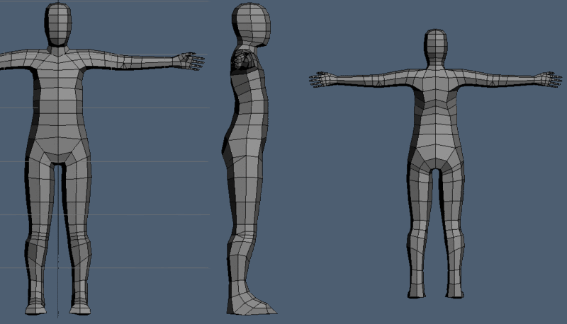
topoquestion.gif

any other criticisms are welcome.

Replies

  • almighty_gir
    Offline / Send Message
    almighty_gir ngon master
    get rid of the triangles at the elbow, keep it quadified for now.

    i'd also think about adding another loop or two around the shoulder area, between the trapezius and the deltoid =]
  • renderhjs
    Offline / Send Message
    renderhjs sublime tool
    try to make each face more like a square instead of a stretched just sliced rectangle. You did not tweaked much other than the 45° outer edges - but not within the shape itself. Depending on your 3d app you should have an option for instance to constrain along or on faces or edges. WIth that you could better shift vertices without changing much of the real surface.

    Just have a look at other wireframes of artists here how they solved the edgeflow.
Sign In or Register to comment.