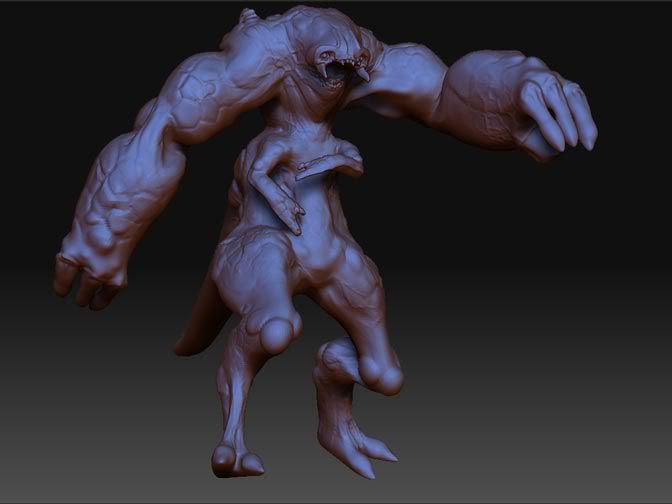
Gnisis Concept
So I doodled this design on an index card yesterday and made a posed 3d mockup of it zbrush today. I'm thinking of doing an under 2k tri model of it and wanted to share this with the polycount community for some feedback and whatnot.

I'm thinking some boney growths around it's claws would look cool. I'm aiming for this thing to give a godzilla like impression of scale so I might model an environment around it to help push the idea.
Anyways, tell me what you guys think.

I'm thinking some boney growths around it's claws would look cool. I'm aiming for this thing to give a godzilla like impression of scale so I might model an environment around it to help push the idea.
Anyways, tell me what you guys think.
Replies
lookin forward to seeing more of this guy
Crits: I think the mid section arms can go, seem a little forced. The lower legs Definitely need to be meatier, especially if you're going for a large scale. you might think about enlarging the tail to make it look like it supports his massive weight, much like godzilla's did
I really dig the facial features, i'd try to capture more of those in the rest of the body.
Ha! I can see what you mean. I was too distracted by the arms to notice the face though. Maybe giving him more defined wrists would help the balance.
Also it looks like you may have abused some zbrush alpha stencils on the arms. Always a good idea to stay away from those - they are too recognizable.