Lobster Johnson - Comicon Challenge Entry WIP
Aesir blew his wad looking at this crap and told me I should make a thread. Who am I to deny someone in a post-orgasmic glow, even if they're looking at the world through rose (or is that spooge?) tinted glasses?
Anyway, this is my entry for the Comicon Challenge over at GameArtisans. I was going to do an Abe Sapien, but then I realized that so many people have had their way with him that I could use a metaphor involving a tubesteak and a corridor, so I settled on Lobster Johnson.
PIKTARZ:
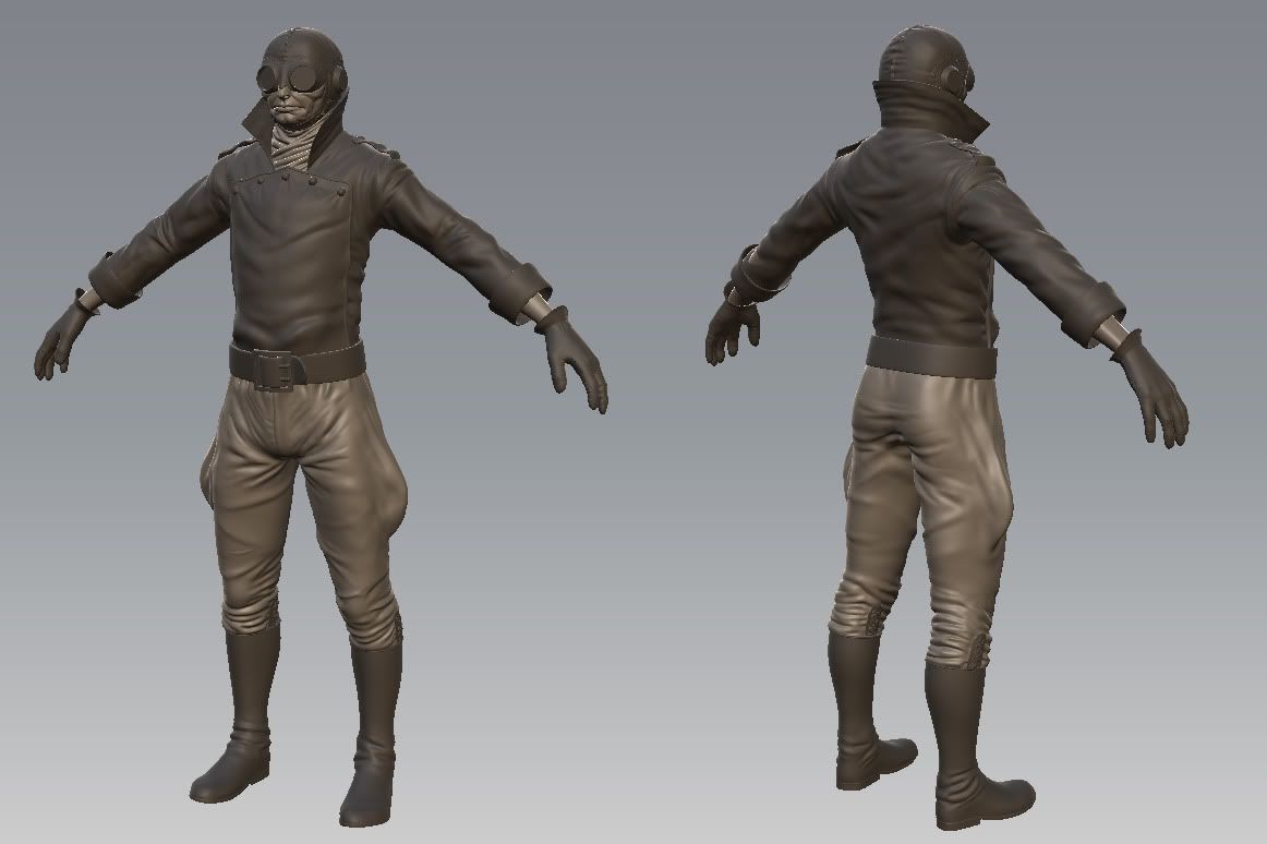
I've since tweaked his nose and other stuff, but whatever...
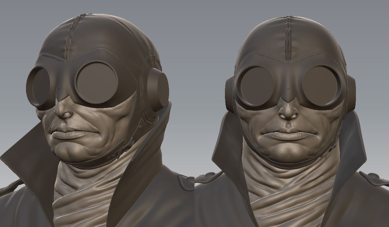
I decided to do a quick unwrap and test bake of his head to make sure I was going in the right direction:
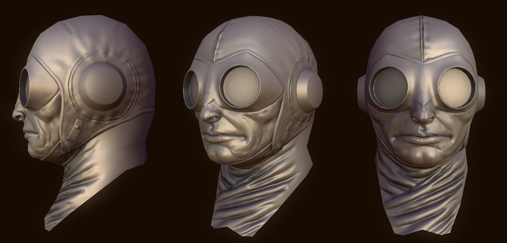
And here's what aesir was getting his rocks off about:
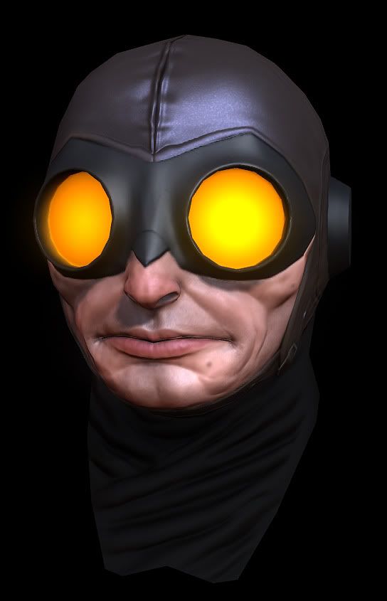
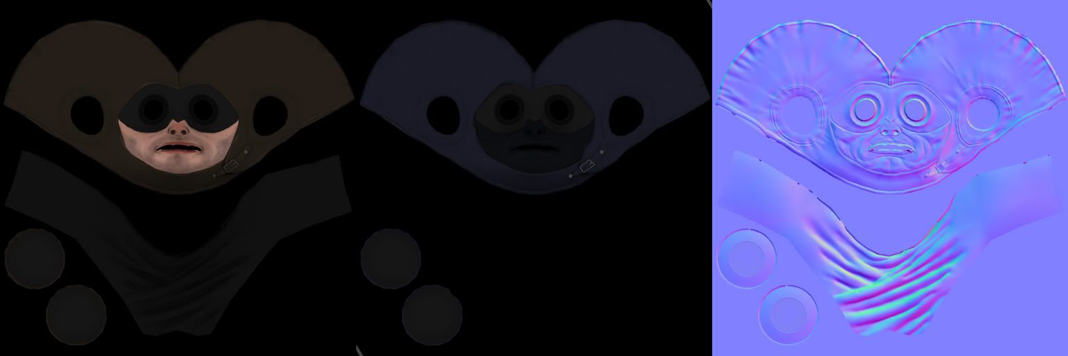
And since I was also instructed to show the texture sheets, here they are in all their incredible mediocrity. They're resized from 1024s, and no, I wasn't concerned with them being very efficient or clean around the edges since they were just for testing purposes and I won't be using them in the final product:
Any comments, crits, spooge or panty wetness are totally tubular in a completely hetero way. Though the hetero is actually optional if your username starts with any of the letters between A and Q.
Anyway, this is my entry for the Comicon Challenge over at GameArtisans. I was going to do an Abe Sapien, but then I realized that so many people have had their way with him that I could use a metaphor involving a tubesteak and a corridor, so I settled on Lobster Johnson.
PIKTARZ:

I've since tweaked his nose and other stuff, but whatever...

I decided to do a quick unwrap and test bake of his head to make sure I was going in the right direction:

And here's what aesir was getting his rocks off about:

And since I was also instructed to show the texture sheets, here they are in all their incredible mediocrity. They're resized from 1024s, and no, I wasn't concerned with them being very efficient or clean around the edges since they were just for testing purposes and I won't be using them in the final product:

Any comments, crits, spooge or panty wetness are totally tubular in a completely hetero way. Though the hetero is actually optional if your username starts with any of the letters between A and Q.

Replies
P442: In the comic, the cuffs aren't actually folded up, but I wanted to break up the silhouette a little more than it would be if they were just straight. Now I don't quite know what to do with them, but the faux fur is a good idea.
Goldo_O, JohnnyRaptor: Thanks!
rasmus: The pants are giving me waaay more trouble than they should. Getting the balance between stylized like in the comic (they're very pointy and stiff) and realistic (more saggy and limp) is proving to be really tough. They should look sorta like the breeches that Nazi officers wore, so I looked at what the guys in Valkyrie wore to get a better understanding of things, but it's still not working out.
This is the first gun I've ever made. I'm not sure whether I love or hate hard surface modeling. It's a very different challenge from doing organic stuff.
I got a bit more work done on the gun. I still haven't modeled the safety because it's a stupidly complex shape that I don't want to deal with right now, but whatever. I'll get it done soon enough.
And while I was busy being a lazy ass and not modeling the safety, I made the gas mask cylinder that hangs from the back of his belt.
I'm almost done with the low-poly version of his head and body. There's still a fair amount of crap geometry going on that I need to fix up, but the majority of the work is done. I've been working on this damn thing for the better part of two weeks and it's been a nightmare because almost the entire model is asymmetrical in very subtle ways. Maddening.
He's currently sittin' pretty at 7734 tris. That leaves me enough for all the accessories on his belt. Woo!
PIKTARZZZZ!!!
Still got some AO to bake to ground all the details, but that's easy enough. I'm kinda ticked off at myself; I forgot about the container on the back of his belt, so when I went to unwrap him and all the other stuff, I didn't leave enough room in the UVs for it. This is gonna be fuuunnn... :poly128:
I just found out that there was a one-week extension on the deadline for this. I can breathe a little bit easier now. Not much easier, however.
*high five*
I got some more work done on this sucker. Any comments, crits or whatever would be appreciated. I'm thinking he looks a bit too monochrome right now, so I'm thinking of doing something with his pants to spice things up a bit.
*nudge nudge, wink wink*
Great work!!
Here are a few minor crits. I think some buttons or darker seams on the fly of the pants would help bring something extra to the relatively flat material. Then on the jacket cuffs, I think you need some kind of lighter material since it is technically what would be on the inside. A nice furry lining or light brown silk could be cool. Maybe make the sole of the boots a slightly darker color than the rest of the boot to help show its a separate harder material. And then maybe a little more yellow in the skin would help reduce the pink look that is going on at the moment.
Ok, I hope some of that helps. Keep rocking it man, and this guy will be awesome when he is done.
Thanks!
aesir:
Agreed. He needs more grime and stuff.
nrek:
Hmm... mmhmm... yeah... buttons... sexy. I like it.
I'm definitely going to put some more work into the other materials as well. Things have a loooong way to go.
one crit - where's his lobster crest/mark on the hand which he burns onto his enemies ? huh?
oh you should so have his calling cards as well:
As for the calling cards... yes... me likey. I hadn't thought of it before, but I think I've got some extra space on the UVs that I could squeeze the card into.
I dirtied him up a bit, added some more color variation to various places, screwed around with his boots and pants some, got a start on the pouches and various other crap. I've still hardly touched his cap and gloves, I haven't touched his skin, gun or grenades at all, his belt needs work... the list goes on. Whatever.
Thanks for the encouragement and crits, everybody.
Somebody over at GA wanted to see the textures, so I figure I may as well post 'em here as well.
IMO, try playing around with some black patterning on the spec map.. really break it up. sometimes when i add that to my models, it really does great things. grab a painterly rough brush and dab it here and there. see if that does anything. it might not work.
I've actually been doing almost exactly what you described with the spec map. Most of the detail you can see on the jacket, aside from the leather texture and large folds, is actually coming from variation in the specular map. I'm certainly going to keep it up until I'm satisfied... or until I run out of time.
nrek:
Funny you mention the base; I'm actually working on it right now. I'm going to make something similar to the one from this statue.
Thanks for the flats, i wanted to see what your spec looked like
I think I'm nearing the end here, and there couldn't be a better time for it. The contest ends tomorrow night. This should be close to what the beauty render will look like and I think probably I'll use this basic layout for all the rest of the images I'm supposed to submit. I dunno about the background color, though; I may want to use something a bit cooler to contrast with all the warm colors on Mr. Johnson.
I actually like the bg colour. Sometimes its nice to not go with an opposing temperature scheme. I say keep it.
Just one thing, the pose still looks a little ungainley, and i think its that the back leg is rotated so far from forwards, bring it back a bit more to center and it should help fix it.
I tried a straight blue version and it didn't look so hot, so here's what I think I've settled on for the final. I still need to fix up a couple of minor things and do one last render, but this is pretty much how he'll be looking. The only difference between this one and the previous one is the gradient background.
I think I can understand why you chose the background colours, and technically they do work, but I think you can bring the character a bit "further". I really like the bottom blues (or what looks like blueish - green... dark) on the bottom of the image, so I mocked this up very quickly... I don't know if you have tried this already (you said you tried the blues and it didn't work).
Either way, good luck, post the voting link in here as well so we can all vote for ya
I'm totally doing that.
The pose could use some tweaking? His knees and elbows are rotated away from his body a bit too much? Might capture a bit more motion and drama from a 3/4 shot?
Looking great, awesome texture work, love the jacket, so awesome...
I don't think I'm going to change the pose too terribly much, though you were right about his knees and elbows. I tweaked them slightly and they look a bit better. I dunno about the 3/4 view, though. I did a test render or two and it looked alright, but something about the full front view just clicks with me. I think it's the eyes.
fearian:
I ramped up the spec on the gun just for you.
Here's a little update. What do you guys think?