Haunted Victorian Room
Hi all, long time lurker first time poster. I have always wanted to post here but figured I was not good enough (I know poor mentality and if I don't post I run the chance of not getting better). So anywhoo, I decided that I wanted to make a new portfolio piece, something that is not typically me. I tend to use very vibrant saturated colors in a lot of my art so I am trying to buckle down and do a dark toned 3d piece. My idea is to make a room (maybe two) completely decorated in Victorian era pieces. I want the room to be packed with as much stuff as I can to make it visually pleasing. The theme is Haunted Victorian and that is pretty much it. I started on the project a month ago but due to life getting busy I had to put it on the backburner. Here is the progress I have thus far. Comments and Crits are very much welcome I want to get better!
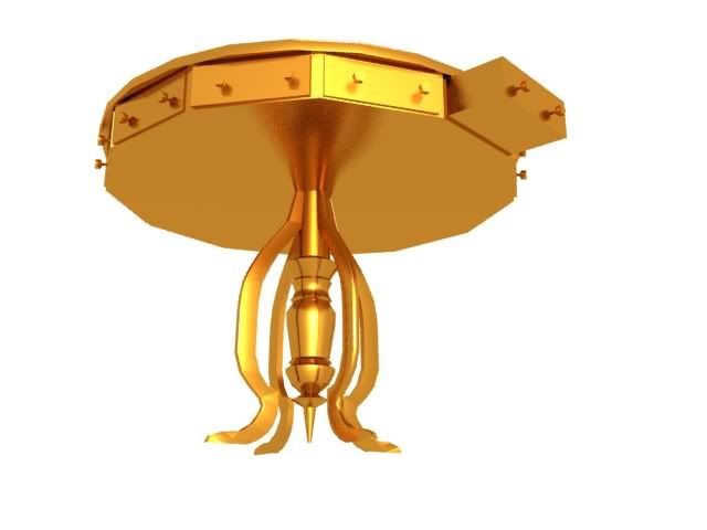
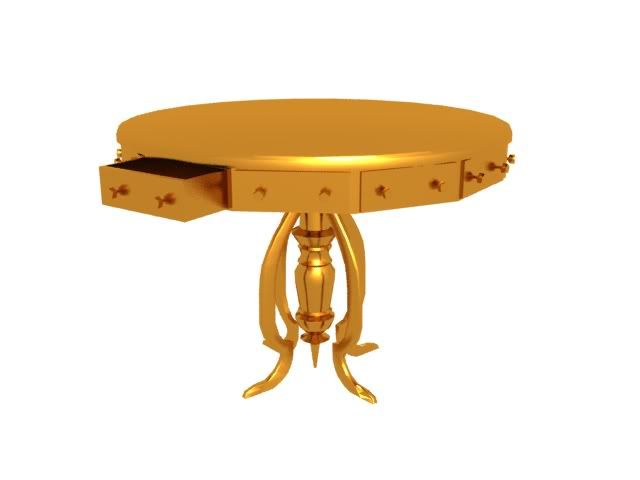
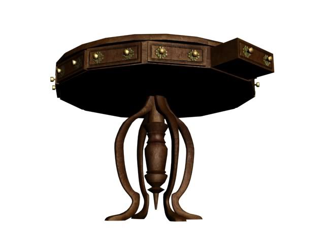
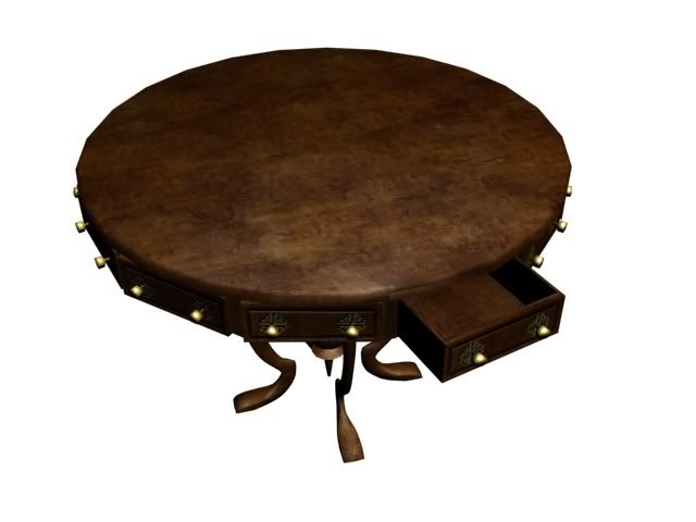
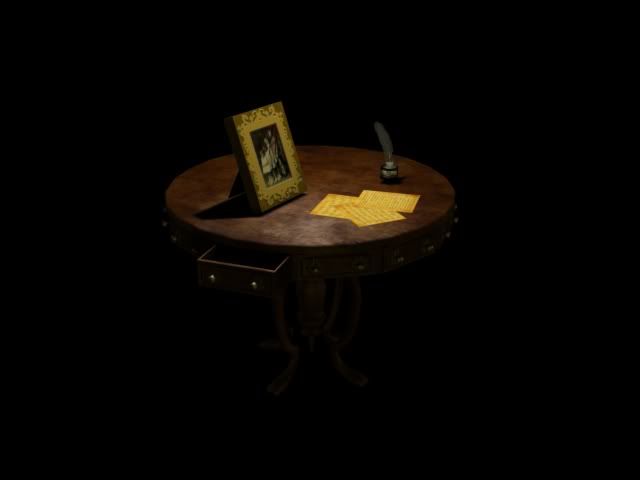
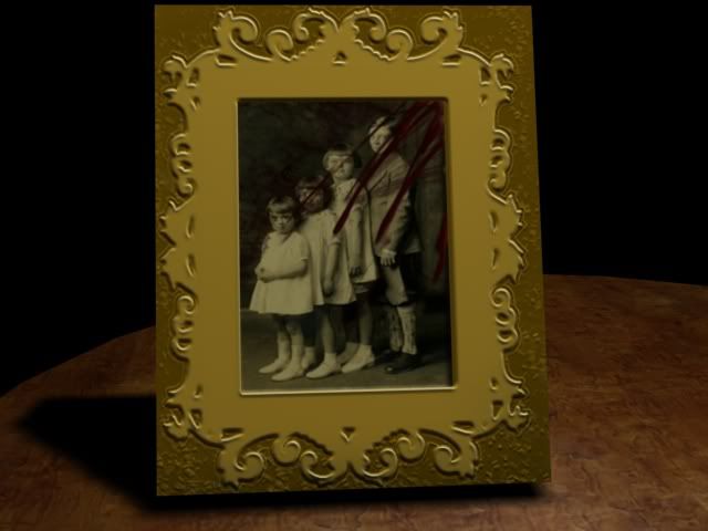
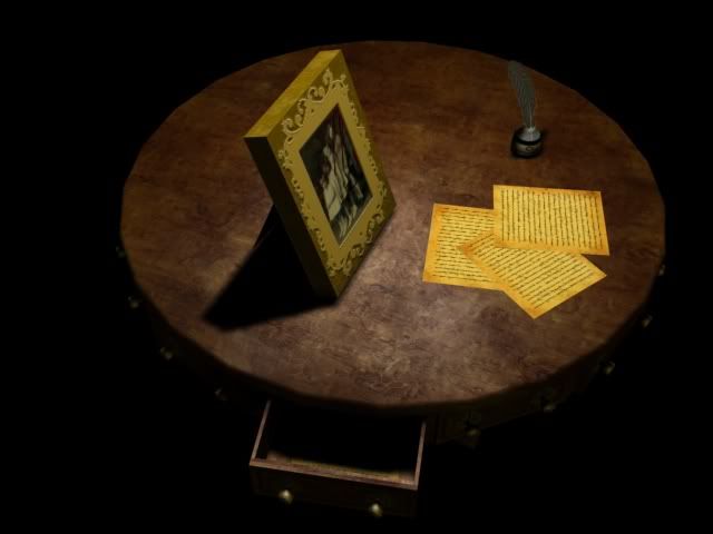
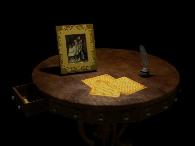

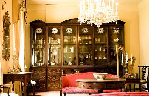
And some reference pics

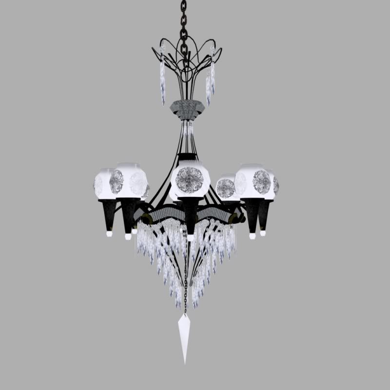
On the chandelier I am putting my own twist on it by making it wrought iron with more light fixtures on it. Also worth noting is that the chandelier currently is unfinished, this version was about the 2nd texture pass on it.
I have more but I will post later.
Thanks so much in advance and I hope to fit right in on this board.
SeanZ


And some reference pics


On the chandelier I am putting my own twist on it by making it wrought iron with more light fixtures on it. Also worth noting is that the chandelier currently is unfinished, this version was about the 2nd texture pass on it.
I have more but I will post later.
Thanks so much in advance and I hope to fit right in on this board.
SeanZ
Replies
How on earth did blood get onto a photo, but not the frame? Who frames a bloody photo? Is their a maid that cleans the picture frame every day for their to be no dust on it or ear and tear? The edges would have some type of distility to it, cause if someone is cleaning, those spots would be hard to get to with one pass cause the cloth wont touch it.
The piece of paper seem very similar and are far to saturated for something old. They kinda look like you dipped white sheets of paper into tea to give the impression of that old look.
Take a look at these for references. Notice were the wear and tear takes place and were the weathering begins and engs.
http://www.deezelbulldog.com/sitebuilder/images/old-paper-1000x1118.jpg
http://fc05.deviantart.com/fs14/f/2007/093/b/a/Old_Paper_by_Digital__Angel.jpg
http://caronedmunds.files.wordpress.com/2008/09/old-paper.jpg
Chandelier will look cool with the lighting, though I would not have modeled out those lines in the middle, but probably used planes with a alpha map or somethin.
Keep posting mate