Thompson SMG
Hey,
I'am currently working on a Thompson SMG (Everyone is doing it!) just to get better at the normal map baking workflow. I'am about to start the low poly and thought i would chuck my High poly up for some feedback first . Here are some screen grabs from the viewport.
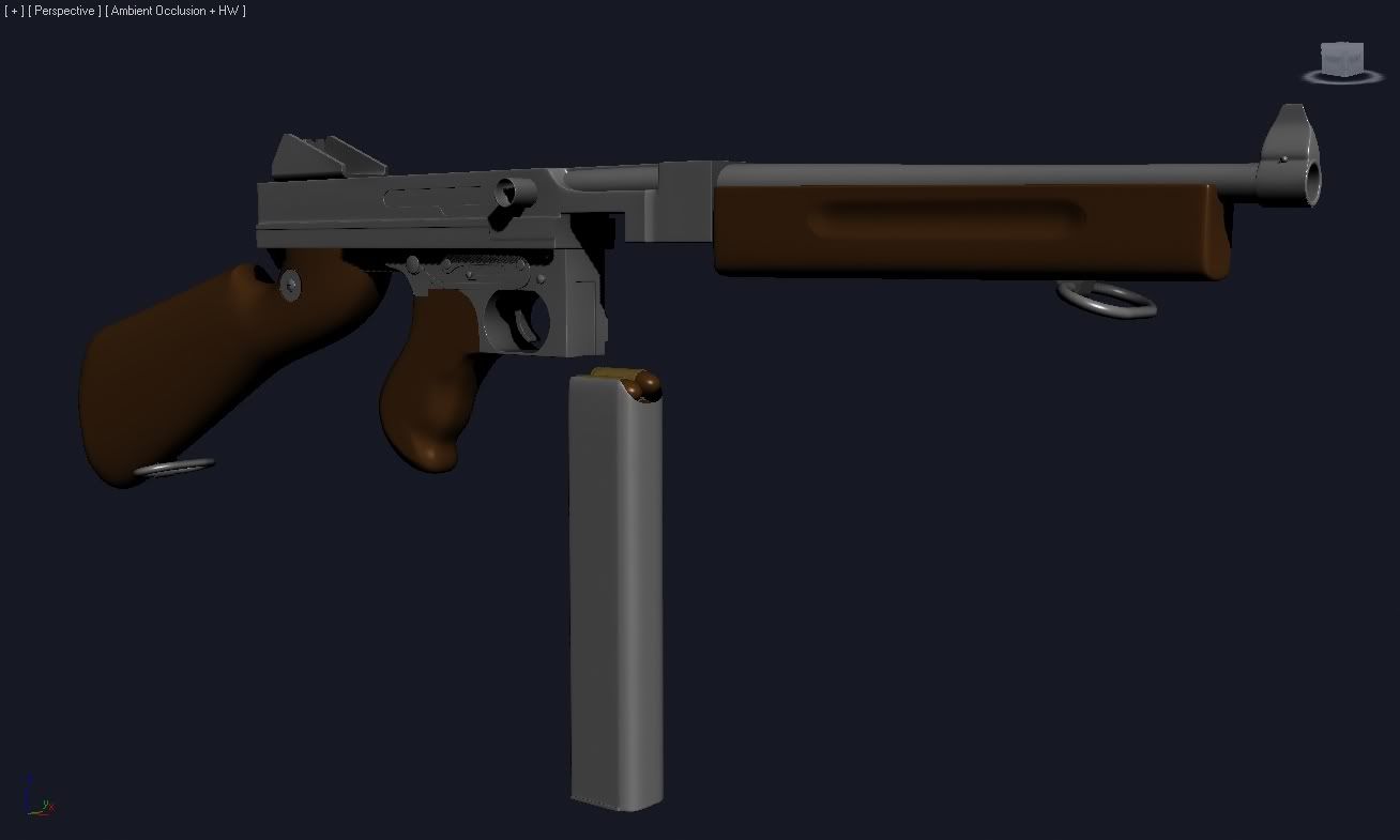
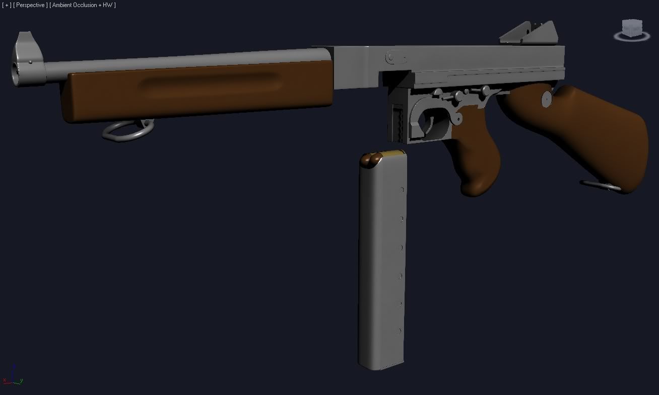
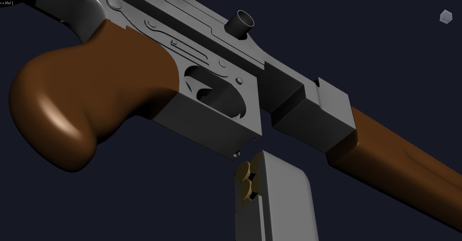
I'am currently working on a Thompson SMG (Everyone is doing it!) just to get better at the normal map baking workflow. I'am about to start the low poly and thought i would chuck my High poly up for some feedback first


Replies
Also how do you make the texture look "wet" like that??
No the barrel on a Thompson is slightly thinner at the end. It looks kinda weird but this is correct. I modeled a Thompson once.
What i reckon is the materials your using arnt doing the piece justice. Have a play around to get a metallic feel.
Also, yes, some wires, so we can see how dence the mesh is around the corners
http://img.redwolfairsoft.com/upload/gallery/M1A1-1024.jpg
I think the best thing would be to go over all the reference you have and really crit the edge you have made, looks like some are great and some just look to sharp, i think maybe some creative licence to get the right looks will be needed. when i get home from work i can have a better look over it for you if you would like. Oh i think the handle might need some hard edges to make it look less blobby. other than that great work, if this is all quaded up, will be easy to get a low poly mesh from it
EDIT:
see attached
One dark grey material (slight blue) with spec up and gloss up half way
one orange ish omni at the front, a blueish one at the back done:)
lol @ 3dRobbo. Lego thompson FTW!
n88tr the "wet" look is just some raytrace mats with high spec so i can see the curves easier. I rendered these using the mats in this tut http://www.artemstudios.com/08Portfolio/Tutorial/MaterialRenderingTut.htm refered to me by Kysterama, cheers buddy.
3DrobboLOL lego gun. Cheers for the advice about the lights, i setup these renders using those colors but not as strong.
To give you guys a better look here are some more images, a clay and wireframes. Also there is a pic of one the references i was using. Let me know what ya think, this is my first full sub-d model other than playing around with a couple of other things.
http://i664.photobucket.com/albums/vv7/Arkanon85/m1a1closeupleft.jpg
Pretty impressive for you first sub-d model. Looking forward to textures!
I think you should stay away from those block colours, they seem to make it look weird.
well here is a pic with some things drawn on it, i look at the ref u posted as my guide.
See what you can do about some of those hard edges, it will be difficult, but well worth the trouble
Looks sick!
I fixed the artifact on the back of the handle last night. I will go over those edges as soon as i get home from work, make em a bit more like the reference i posted. There are so many pics, with different parts don't know which one to use.
Normal map is looking nice and crisp, only crit would be that the rust you have painted in looks more like smudged dirt than surface rust.
Well done
The deepening at the foregrip can use more depth, too! It looks to weak.
The cartridges in the magazine are missing the primer!