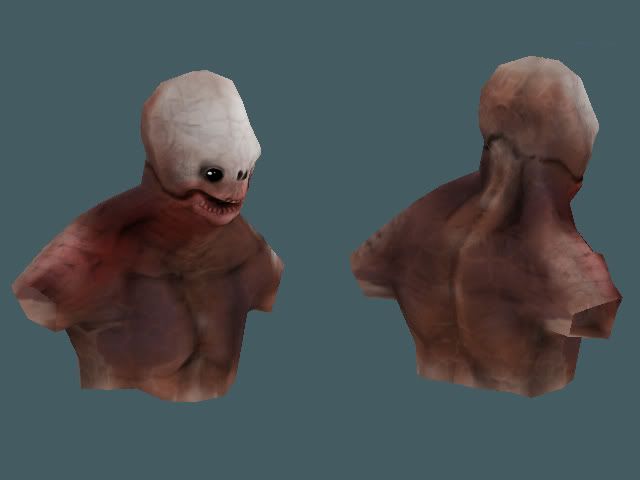
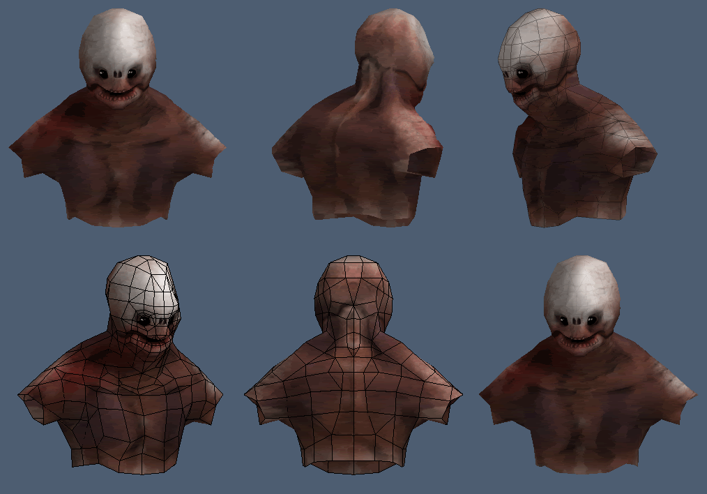
low-poly monster bust
pseudo low poly I suppose, I was aiming for an in game polycount for a nextgen title which I think I maintained for the percentage of the body that's actually modeled.
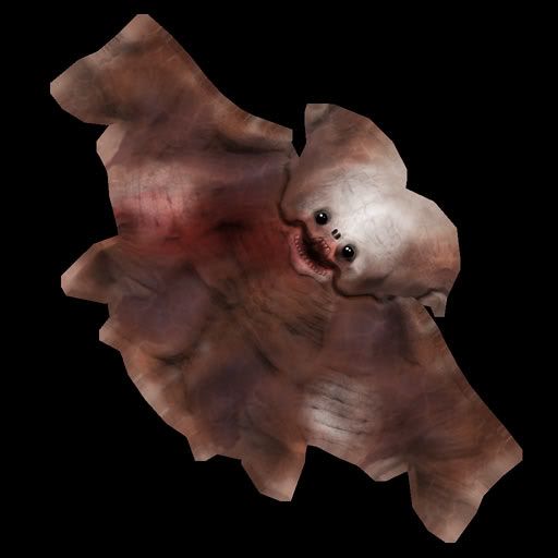
It has a 1024x1024 diffuse map,it's 80% self illuminated and is composed of 608 triangles.
let me know what you think.
feedback and critisism is appreciated.
It has a 1024x1024 diffuse map,it's 80% self illuminated and is composed of 608 triangles.


let me know what you think.
feedback and critisism is appreciated.
Replies
Not really feeling the mosaic tiles filter overlay on it. Keep messing with it, definitely do some sculpting, im sure you could get something creepy lookin with tons of detail for a normal map!
i'm thinking about taking the normal map off and really treating it like a like a static bust and texturing in some dramatic/less ambigious lighting.
comments?
What were your references? It seems like your aiming for a human look, whereas you go against that with the head.
I agree with beartraps, try a sculpt
Maybe add some rot on one of the pecs/under the arm? Would add to the horror.
It looks awesome.
i'm thinking of changing the color scheme for the last revision to something with blue and yellow hues and i'm gonna bake lighting to create the impression the creature is housed in some sort of damp,cavern esque basement.
i'm also going to take note to increase vein presence and at a bit of rot element.
one diffuse map 1024x1024 at 80% self illumination.
thoughts?