wip Medium Armor attempting to not fail
*Update*
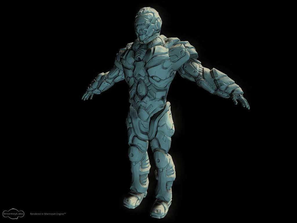

Hello there,
I am working on the third and final armor for a freebie hobby game that I've been involved with for a while now.
Here is the concept art i slapped together.
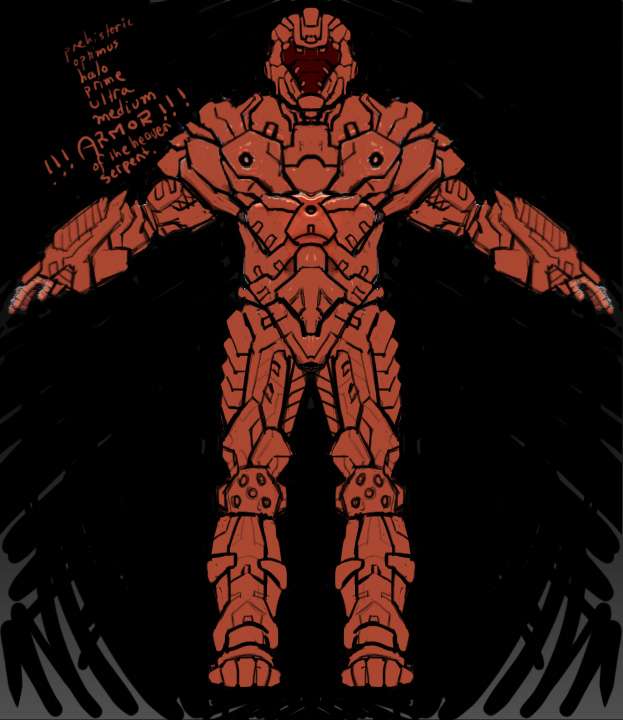
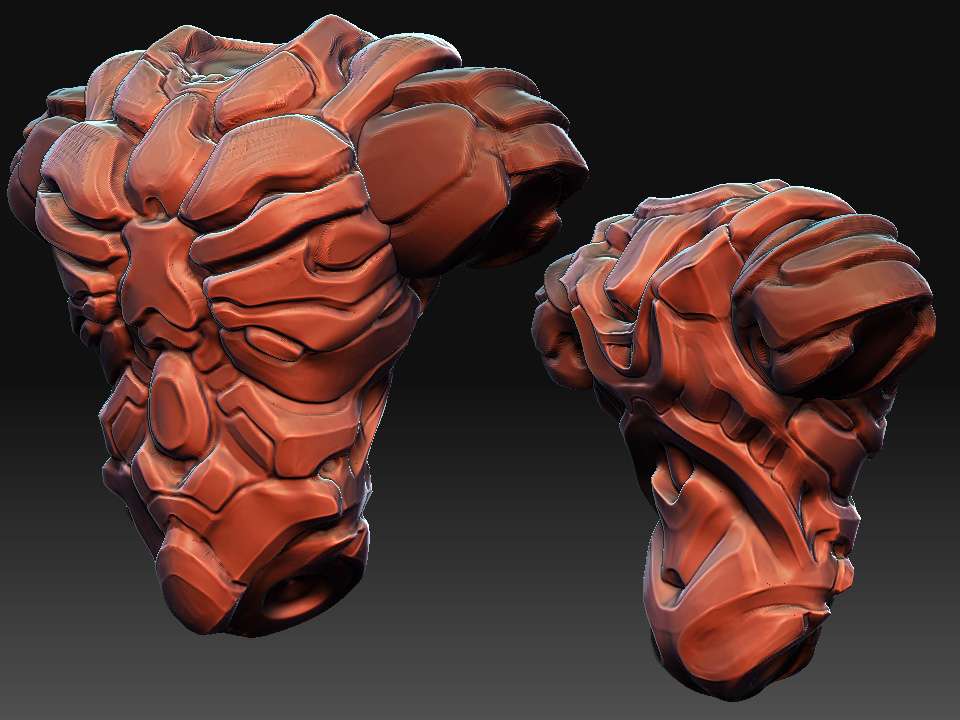
Lately I've been playing with simply alt-tabbing to look at the concept art and then just sculpting away at something. Its definitely not the most accurate way to use concept art but it allows me a bit of freedom, and when the invariable problems that arise from the concept shows up I always feel much easier about making changes. Anyways here is my second attempt at the torso. I am not so sure about it, but for now it at least doesn't look horrid. I will probably move on to the arms or head, mostly just trying to fill it out and at least get the general shapes right. I probably shouldn't have spent so much time on the torso and spent more time fleshing the whole thing out, but sometimes you get carried away..


Hello there,
I am working on the third and final armor for a freebie hobby game that I've been involved with for a while now.
Here is the concept art i slapped together.

Lately I've been playing with simply alt-tabbing to look at the concept art and then just sculpting away at something. Its definitely not the most accurate way to use concept art but it allows me a bit of freedom, and when the invariable problems that arise from the concept shows up I always feel much easier about making changes. Anyways here is my second attempt at the torso. I am not so sure about it, but for now it at least doesn't look horrid. I will probably move on to the arms or head, mostly just trying to fill it out and at least get the general shapes right. I probably shouldn't have spent so much time on the torso and spent more time fleshing the whole thing out, but sometimes you get carried away..

Replies
It is time consuming and the results are usually soft. It would be better to sub d model this.
That being said its a pretty cool design
The 3d work is pretty good though.
so i roughed in the arms, i may tweek the back a bit, but im liking how the front looks.
Fett look funny, perhaps putting some kind of sole on them would be in order.
And what slipsius said about the wrists.
And I'm curious of why you're sculpting this rather than do sub-d modelling.
slipsius : thanks for the comments about the wrists, the thinking went that his forearm armor would practically encase the hand for protection, he doesn't need to much in the way of hand motion since the hand should only be holding a gun and pointing forward
alec3d : the legs are slightly short, but this is a medium armor character and I do enjoy that he looks a bit stocky. are you saying you think he looks tooo stocky?
AimBiz : yes the shoulders will probably clip into the chest a bit, i will probably reduce that thanks for noticing.
the feet were a total experiment i guess they didn't work out, i will probably smooth them out but i might as well try the sole idea first. its always the little things like soles that you miss when trying to make feet look right.
as far as the hard sculpting approach, well i feel it allows me the most freedom with what im trying to do with these models currently. on top of that its good practice and is oddly fun
i also have been getting pretty good results with it recently in terms of normal baking. definitely not the top of the line results but definitely good enough for the game i am trying to make so i don't really mind.
but with everyone wondering about it i might try experimenting with this model and try to retopo the high poly to get all the major forms into a properly modelled mesh. afterwards i can bring it back into zbrush and further detail it.
Here is a page of his that instantly sprang to mind upon seeing your WIP.
going overboard on things like that is a definite weakness of mine
speaking of which if anyone wants to give me some tips about where they think i should try "sniping the detail" it would help, im thinking ill kill some of the detail in the chest, and consolidate the legs to look less lumpy in general but any other ideas would be great as im still not so good at killing this stuff sometimes
**side note** the bottom blaster looks way cooler though i must say
i worked on tweaking the helmet. went ahead and added in a "neck" with a bit of cloth folding action going. the cloth lines work well in breaking up that area imo so im happy with that atleast.
the torso armor was looking a bit bunched so i tried to consolidate that while adding in a few tech lines to make it look interesting.
also spent a bunch of time cleaning up the legs and started on detailing them. i will probably continue what i did on the upper back part of the leg into certain parts of the shins. i still might erase some of the detail in the back of the upper thigh but im leaving it for now, going to try and just make everything sharp and shiny before i start erasing details again.
afterwards i will probably do something similar to the arms, clean up the back and hopefully it will look bangin
once i finish up all this i will probably reduce the height of the torso since it is making the legs look short when in fact the legs are exactly the size i need them in order to re-use some animation stuff and make my life easier in that department.
thanks again for your critiques they are invaluable!
so besides cleaning up some lines the legs are getting close to done.. what do you think? i hesitate with going over them with too much more detail. atleast not without finishing the rest of the armor first.
i also tweaked some stuff with the helmet but its hard to notice. Hopefully soon ill get a real big chunk of time to work on this. so far its 30 minutes here and there
maybe?
the input is definately helping :0
Anyway, this looks really good dude. Im sure it would look a shitload better if u sub-d modeled it as there is some bumpy effects here and there, but looks great none the less. I still cant believe u were able to scuplt this! Makes me want to use zbrush to concept hard surface armor now!
Can't wait to see a texture on this!
beartraps : i use a loottt of flatten brush with standard brush using alpha 39, also smooth tool for when flatten cant get the large flat areas. also claybrush tool is really great for building things up slowly. lastly the inflate brush and then flatten is good for building up areas of plating where you want one plate edge to seem to come up and over the other.
but it does come down to just a whole lot of refining edges here and there. luckily i really enjoy this approach because its more like drawing where you shade something for forever and ever, but along the way you get all these interesting ideas and slowly but surely your designs evolve and grow into unexpected places.
brandoom : thanks for the compliment, the texturing part will be the hardest part for me i am horrid with colors and texturing!
hopefully it gets teh stamp of dun. then i can move onto the low poly and start to see how this will really look ingame.
so the torso is a bit high poly wise, 1306 tri ... i might go through and cut it down to 1000 or i may just be lazy and just let the lod levels take care of it.
now comes the hardest part for me, texturing !!
p.s. marmoset got a lot easier to use since the last release i used, and as ever it makes your models look great
That being said, the model is coming along awesome, no idea how you got that kind of model detail and hard surface detail in Zbrush. Good stuff man, can't wait to see some updates.
hopefully when i work on coloring everything in i will be able to maintain visibility of details, since often times it seems like they will start to get washed in this engine.
i always hesitate with how much lighting info i want to bake into the diffuse.. i guess its experiment time.
as for any compression issues, well its a 1024 tga map and honestly it looks pretty blocky upclose which surprises me since it doesnt seem blocky in pshop but i may not be looking close enough. i have no idea if tgea compresses tga files.
luckily this is the last big model i have to do for tgea i hope i never have to make another model for that horrid engine.
I'd say do a full ambient occlusion pass in to show off your detailing.
and ingame..