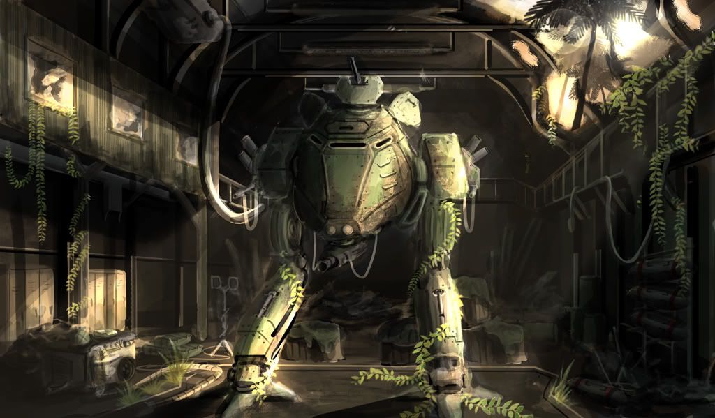
Vietnam M71A1 Walker Hangar Bay
Hello Polycounters,
I'm starting a new project for my portfolio which I have started from concept. Here is a quick background story on the piece.
[FONT="]In the jungles of Vietnam were hidden bunkers that served as maintenance hangars for the M71A1 Zippo Light Armored Walker. Their locations were extremely secretive and were remote to even the North Vietnamese. Upon the quick withdrawal of US Forces in Vietnam, many of these prototype facilities were abandoned, and never recovered by the North Vietnamese Army. This particular hangar is over 50 years old with an intact M71A1 Walker aged over time. The hangar has been since abandoned and not maintained. Parts of the roofs are missing as well as foliage growing throughout the hangar. [/FONT]
Here is my concept

I'm going to be starting with the Hangar which will be a sheltered bunker underground within the mountains and will be utilizing this thread as my resource for comments and critiques. Thanks everyone, and I look forward to making progress on this piece.
I'm starting a new project for my portfolio which I have started from concept. Here is a quick background story on the piece.
[FONT="]In the jungles of Vietnam were hidden bunkers that served as maintenance hangars for the M71A1 Zippo Light Armored Walker. Their locations were extremely secretive and were remote to even the North Vietnamese. Upon the quick withdrawal of US Forces in Vietnam, many of these prototype facilities were abandoned, and never recovered by the North Vietnamese Army. This particular hangar is over 50 years old with an intact M71A1 Walker aged over time. The hangar has been since abandoned and not maintained. Parts of the roofs are missing as well as foliage growing throughout the hangar. [/FONT]
Here is my concept

I'm going to be starting with the Hangar which will be a sheltered bunker underground within the mountains and will be utilizing this thread as my resource for comments and critiques. Thanks everyone, and I look forward to making progress on this piece.
Replies
-N!
Unreal Engine 3
For the Vietnam era this is something thats sheer concept and sci fi for its taste. However its a great backstory for something that would happen during that time under different circumstances imo. Ironic part is that either way, in my little tale, we withdrew after the tet offensive (which holds true), even with these badass mechs haha. The tell tale sign for its Vietnam era, would obviously be the backstory, but I plan on including a logo on the walker thats representative of the 1st Armoured Division in Vietnam, Vietnam era equiment which surprisingly is used today such as cargo boxes, camo tarp, lighting, JP5 fuel barrels, airframe shop table and ammo crates.
Yes I painted the concept i'll have some more development pieces posted shortly for some much needed critiques thanks!
Debating on windows on the back wall, or along the roofing. Any paintovers or suggestions are welcome.
Don't mind the clipping, that'll be fixed.
Time for an image dump of my work in progress. So since i've finished blocking things out, I began on the hangar roof and walls first as I wanted to nail down those textures. I also needed to work out modular pieces in order to efficiently utilize texture space and tiling. For the damage on the right side of the hangar I created alpha cards for damage into the roof and sculpted out damage for the wall in zbrush.
I've completed the walls and ceiling and am ready for critiques, i'll be working on the ground (suggestions are welcome, i'm thinking of vertex painting) and then into the high poly modular pipe system i've created.
The last shot is a set up in Unreal, which is another battle on it's own. If anyone has a great shader network or tutorial in strengthening in normals i'd much appreciate it. Anyhow, here's what i've got thus far.
Added some grates and worked on the ground. The floor right now consists of 1 1024 tileable with alpha cards to blend in damage and dirt.
Here's how the scene's lookin'
I need to hurry and get to the props >.<
otherwise, keep it up. looks like it can be a cool scene!
Created Modular Pipe Pieces for the walls. I also created some decals on the floor to break up the tiling and add dirt along walls, posts, etc. Also worked on the Maintenance pad as well as tileable grates, wiring, lights and lighting.
Still chugging along, tackling the modular stairwells next.
(hoping to get the environment at least done before GDC Austin so I can get some feedback there as well)
Right now the overall color of everything is real monocromatic grey. Try throwing some color in there to give it more life. I know your Mech and Tree's will be colorful but as far as the environment its a little bland.
Also your pipes connecting to the walls have that semi floating feeling. Trying grounding them to the walls with some grunge decals you can slap on where the pipe meets the wall
Ooh good idea, thanks Anthony
Thanks and good idea, i'm probably going to look at variations of painting it after I get foliage into the scene based off my concept. I plan to have vines wrapping around some of the pipes so that should break up a lot of the "bland" areas. Right now i've been pushing desaturated looks for a definite feel of wear and and age, but I do understand the conflict of color variations. I'll definitely see to thissss.
I originally went with a yellow color, but it felt like it matched more of a "construction environment" rather than "military". The yellow was a nice break up of the blandness but really didn't follow through with my original concept. Here it is anyways.
I just wanted to make a suggestion.. where the catwalk is broken, maybe have a damaged/bent or totally broken pipe underneath. As well as some concrete rubble from where the roof has collapsed on the catwalk and ground beneath.
Just ideas
EDIT: Once you get down to the small deco stuff you might want to add in some spiderwebs to help sell the abandoned look. I bet they've got some pretty nasty spiders in the jungles of Vietnam.
Yah I think they do!
The only problem i have is with that bottom set of "vents". I'm not sure why the grunge would be going up...instead of down. Unless there was a fire or some sort of fumes comin from within the locker, gravity would usually pull most grunge downward.
Rofl, flipped the texture?
Haha yah.
1288 Tri's, 1024x1
Slowly but surely, gettin' there.