Western Tale Character WIP: Reynard
Hello Poly Count, this is my first WIP thread here, long time lurk.
I will post WIP's for a character called Reynard here. This character is from a collaborative art project I started up recently with some friends. We wrote a story with all of these characters to give us some context for creating artwork. We're taking a page from the Skillful Huntsman / Exodyssey playbook. The project is called Western Tale.
I am hoping to finish this character in time to put on my graduation reel. Going to get as much done as possible this week!
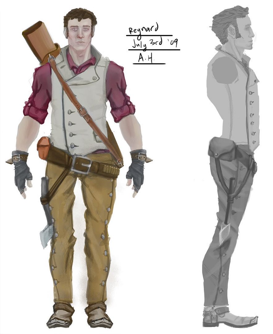
Concept:
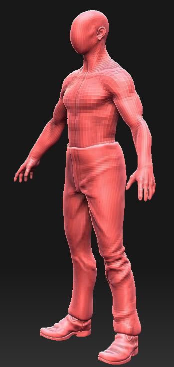
I had been working on the base mesh and bust over the last week, and yesterday began sculpting the clothes for the character out of simple cubes:
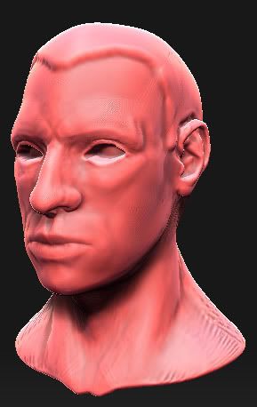
I have done better busts, not sure where I went wrong on this one but I think I'm going to scrap it and try to go for a little bit of a celebrity likeness on the next one.
Critique very much wanted on this process! Thanks!
I will post WIP's for a character called Reynard here. This character is from a collaborative art project I started up recently with some friends. We wrote a story with all of these characters to give us some context for creating artwork. We're taking a page from the Skillful Huntsman / Exodyssey playbook. The project is called Western Tale.
I am hoping to finish this character in time to put on my graduation reel. Going to get as much done as possible this week!
Concept:

I had been working on the base mesh and bust over the last week, and yesterday began sculpting the clothes for the character out of simple cubes:


I have done better busts, not sure where I went wrong on this one but I think I'm going to scrap it and try to go for a little bit of a celebrity likeness on the next one.
Critique very much wanted on this process! Thanks!
Replies
Awesome work anyway
I decided to model the collar separately, but I am worried that it might not integrate into the rest of the vest once I start sculpting. But maybe since the collar is folded over I can hide the seam.
Thinking about going ahead and modeling up the vest rather than doing it this way with a simple cube base, because the whole collar integration thing is making me nervous.
I'd like to hear thoughts on the matter.
Here is the base vest at the moment:
To make it easier to handle in zbrush, I UV'd the vest in four parts - collar left and right, vest left and right. In ZBrush now I can break this into polygroups based on UV's and handle them each separately, making the process a bit easier to cope with.
So far I am pretty happy with the way it is working out, I just need to thicken up the collar and I will try to get in the major vest wrinkles tonight.
Moving on to the sleeves. Not sure how I like the button holes on the jacket collar..
Not sure how I feel about the look of the wrist strap sticking out - maybe its the position on the outside of the wrist...or maybe its just sticking out too far.
Tomorrow's plan: Add any other misc. straps, begin larger belt, begin belt pouch and/or canteen.
I think you need to looking at the wrinkles. They are pretty uniform for the whole character. Each peice of clothing is going to produce different looking wrinkles due to the nature of the fabric. I found a couple images you might want to look over.
You have hills with no valleys basically.
Also i think you've lost a bit of the original shape of the character, his body is looking a lot wider than you have in your concept drawing.
Its looking good though. Keep up the good work, its definitely coming along!
Btw I did use a base mesh called "the purist" posted at CGChain by Monte Cristo. I had to modify the base mesh to remove his junk.
Here is the concept by my friend Bennett Jobling:
A Side View Render of the high poly model pre-smoothing:
A Shot of the "floating" geometry:
And the model smoothed in zbrush, ready to sculpt the cloth and put a couple of dings into the metal:
My hard surface is rusty, so this was a good exercise. Also, I have never tried floating the geo over the main surface before, but from all of the tutorials I have seen, this should bake out fine. I hope.
More to come. I want to get the entire high poly for this guy knocked out before the week is done, and then get the low poly complete and UV'd (hopefully well on its way to being texture complete) by the following week.
I may have gone a bit overboard on the alpha textures on the scabbard, but I'm OK with that. I may apply some leathery alphas to the jacket, but much less intense.
I am currently working on the belt that attaches the scabbard to the character.
But I made the mistake of modeling the rifle in a different scene file and it is sized differently from the main character. This wouldn't be too much of a problem except I've got my rifle broken into multiple parts in multiple ZBrush tools. So I am having to use a proxy rifle mesh to line the belt up on the character, then later I'll move the final low poly rifle mesh into place after I've baked it off.
Pain in the arse.
If I were you, I'd be really careful about the face. It looks like your proportions could use quite a bit of work. I need to brush up on facial anatomy myself, but I wanted to show what I mean:
The rest is coming along very nicely. In fact, I should have been working on my gun instead of this!!! :poly121:
Your game project looks great btw. Good luck man!
Note: I wasn't looking at your drawing when I made this, so keep that in mind!
Need to punch the eye lids out some more...want to "stylize" it a little more over all. Obviously I need to get to the hair, but I'm looking around for examples of good ZBrush hair right now.
The character is supposed to be late teens/early 20's. Might not be hitting it totally...
Anything else anyone sees about it?
-I have some more stuff to post but I'll screen shot it later...
@dolemite: Thanks for the kind words!
Here's some shots of the new head plus some final little bits and bobs.
I just want to do one more detail pass and a bit of cleanup and then I'm calling the high poly done -
want to do another pass on the head (throat and hair specifically).
was thinking of adding a second, smaller pouch. but i'm feeling lazy..
arm needs a little more attention, need to lengthen the fingers.
and maybe a little more leather texture here and there.
My main crit atm is the back of the vest is hanging weird, and the belt seems to not be interacting with the cloth. The belt seems to be floating because of this, but if you got some stress folds in that area it would give the belt a much better sense of weight.
I'm really digging the detail of the high poly so far, keep it up!
The character might appear a bit too old for late teens/early twenties. I've done a quick google search of males in their early twenties, take a gander and see what you think:
http://b7.ac-images.myspacecdn.com/00577/74/18/577788147_m.jpg
http://lh4.ggpht.com/_lc7ey6bqaK8/SckAtJeKcsI/AAAAAAAAA7Y/Qy0iRHPPl00/s640/anthonybatista.jpg
http://www.cs.cmu.edu/afs/andrew/scs/cs/15-463/f06/pub/www/projects/proj2/jingj/me2ken2/morph60.jpg
Obviously these haven't been weathered by a hard, western-style life - but I'd say for younger go with an overall smoother appearance. Maybe less wrinkles on the forehead.
EDIT:
Here's Christopher Reeves in his early twenties apparently:
http://www.capedwonder.com/images/picture-folder/images/career/CW-early-Reeve-portrait-02.jpg
I expect that with the gun and scabbard added, the final poly count will be around 13k. I can probably trim it down some, but I am dead tired of staring at this retopo. I think could always trim some off after the bake...
This is my first real attempt at trying to cute the major folds into the low poly, I observed some other people's work and the only constraint I kept on myself is that it must stay under 15k polys.
Let me know if you guys see any major errors that won't bake well/deform well...
About 25% done with the texture - hope it goes well!