Home 3D Art Showcase & Critiques

Please crit my 2nd 3d game art guys..

polycounter lvl 10
Offline / Send Message
boyluya polycounter lvl 10
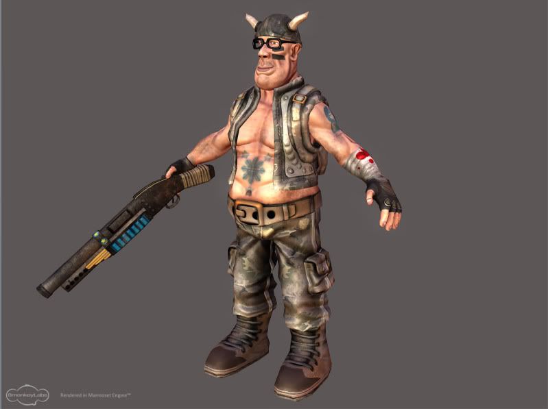
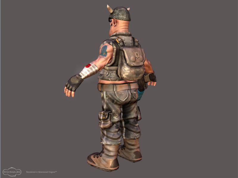
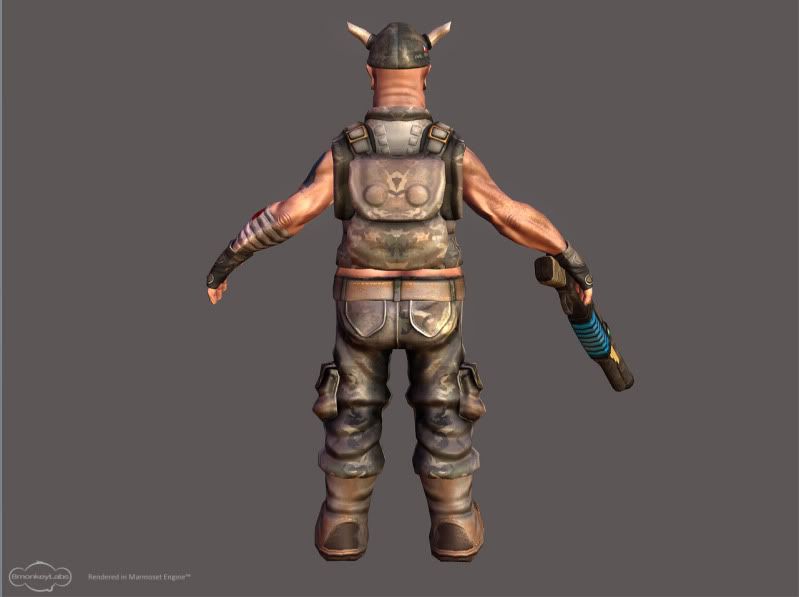
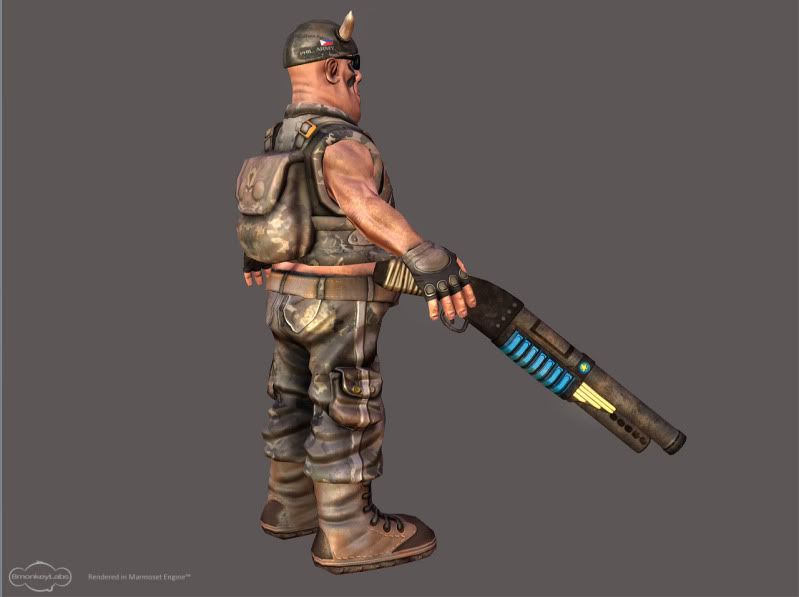
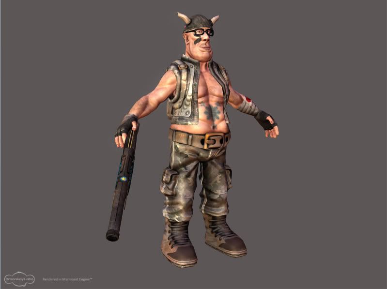
This is my 2nd 3d game art.. About 90% finished, only minor tweaks like feaxing seams needed. I'll pose him soon once I learned rigging. It's around 8k tris in total, 2048x2048 and 512x512 color, normal and specular maps for the body and shotgun respectively. I used maya-zbrush-photoshop-xnormal-marmoset toolbag.

Here's the character sheet inside the toolbag..
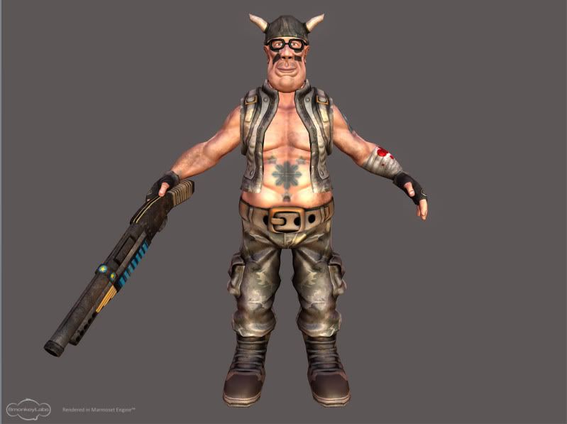
front-1.jpg

quarter_left.jpg

quarter_left2.jpg

back-1.jpg

quarter_right2.jpg


quarter_right.jpg


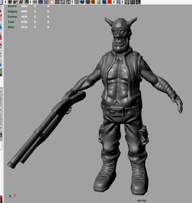
Here's what it looks like in maya viewport..
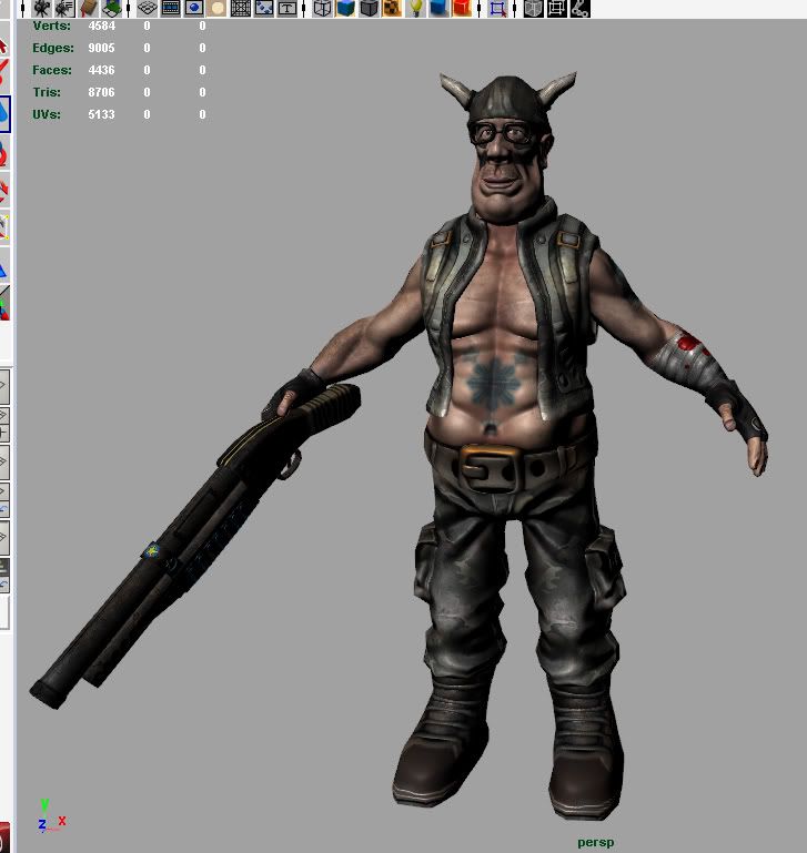
maya1.jpg


Normal mapped..

maya2.jpg


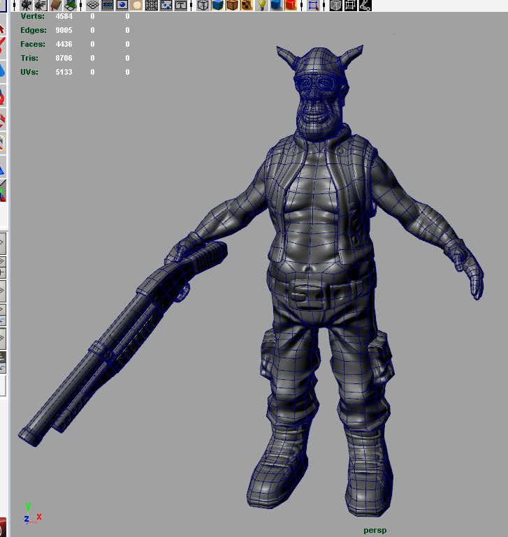
Wireframe..

maya3.jpg


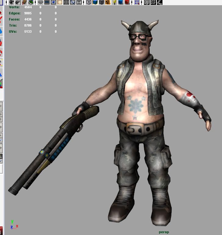
Flat shaded..

maya4.jpg

Replies

  • Bad Spleen
    Hey Boyluya,

    Good work, nice texturing, and a good palette. The details are well proportioned to a stylistic look, and overall a strong character, with a healthy does of personality.

    Spend some more time on the boots, add more polys to define the shape better, they currently look at little low poly, and also slanted strangley. This should be an easy fix, and is the detail that lets the model down.

    The glasses look a little too simple, with them being completely black, you lose any sense of shape and detail. The shape is good, however I'd give them a little bit of grime (in the specular channel most likely) to break up the texture, and possibly some very slightly tinted lenses, just to show that something is there. Unless you are going for missing lenses, which could mean adding some tape to an arm of the glasses, to show some damage.

    The shotgun could do with some variation on the texture, it looks like the correct style of texture, however it doesn't really "relate" to the model. By this I mean that the shape of the object, is having now affect on the texture. The texture is very uniform, and possibly needs some scratches, and areas where dirt would have settled in crevices, and joints.

    I'm being picky I admit, and for a 2nd game character, its very good.

    Keep up the good work.

    Adam

    PS. Modelling a character is easy, rigging a character is hard, modelling a character that deforms well once rigged is where you will possibly find your toughest challenge.
  • boyluya
    Offline / Send Message
    boyluya polycounter lvl 10
    Bad Spleen wrote: »
    Hey Boyluya,

    Good work, nice texturing, and a good palette. The details are well proportioned to a stylistic look, and overall a strong character, with a healthy does of personality.

    Spend some more time on the boots, add more polys to define the shape better, they currently look at little low poly, and also slanted strangley. This should be an easy fix, and is the detail that lets the model down.

    The glasses look a little too simple, with them being completely black, you lose any sense of shape and detail. The shape is good, however I'd give them a little bit of grime (in the specular channel most likely) to break up the texture, and possibly some very slightly tinted lenses, just to show that something is there. Unless you are going for missing lenses, which could mean adding some tape to an arm of the glasses, to show some damage.

    The shotgun could do with some variation on the texture, it looks like the correct style of texture, however it doesn't really "relate" to the model. By this I mean that the shape of the object, is having now affect on the texture. The texture is very uniform, and possibly needs some scratches, and areas where dirt would have settled in crevices, and joints.

    I'm being picky I admit, and for a 2nd game character, its very good.

    Keep up the good work.

    Adam

    PS. Modelling a character is easy, rigging a character is hard, modelling a character that deforms well once rigged is where you will possibly find your toughest challenge.


    Thank you mate. Yeah, maybe I should have put more polys to the boots when I resurfaced him because the shoe laces are a bit flat from the side view. I also tried not to put too much dirt, cause I don't want to "over-dirt" him. But I'll consider everything you said. And about the rigging thing, do you think the edge flow is good enough for the mesh to deform nicely? I do have a decent amount of knowledge about how a mesh would deform nicely and I just based my topology on others' so i think it would deform nicely, or maybe it would'nt.. Haha! Anyways, thank you so much for your inputs, appreciate it..
  • Slave_zero
    Offline / Send Message
    Slave_zero polycounter lvl 8
    NIce work for your first charakter. But As you browse through the threads here you will see that there is room for much improvement.

    I'm not a charakter artist but one thing that really strikes me with your charakter is the normalmap on his belly. Form the model it looks like he is supposed to have a fat stomach. But your wireframe with applied normalmap looks more like there are muscles or what ever. The crinkles on you normalmap in the belly area don't conform with what I can see in the texture or in the geometry / silhouette.

    Form the design-point of view I would recommend that you leave out those blue and yellow glowing stripes on the shotgun. With those colors (blue, yellow) I get the impression that it's som sort of scifi shotgun. But this impression is not supported by your model or the design of the weapon.

    So far my impressions. But I agree with Bad-Spleen you did a nice job for you second character. Keep it up.
  • boyluya
    Offline / Send Message
    boyluya polycounter lvl 10
    Slave_zero wrote: »
    NIce work for your first charakter. But As you browse through the threads here you will see that there is room for much improvement.

    I'm not a charakter artist but one thing that really strikes me with your charakter is the normalmap on his belly. Form the model it looks like he is supposed to have a fat stomach. But your wireframe with applied normalmap looks more like there are muscles or what ever. The crinkles on you normalmap in the belly area don't conform with what I can see in the texture or in the geometry / silhouette.

    Form the design-point of view I would recommend that you leave out those blue and yellow glowing stripes on the shotgun. With those colors (blue, yellow) I get the impression that it's som sort of scifi shotgun. But this impression is not supported by your model or the design of the weapon.

    So far my impressions. But I agree with Bad-Spleen you did a nice job for you second character. Keep it up.

    Thanks for your inputs mate. Yeah, maybe I should take away the blue and yellow stripes from the shotgun or I could lower it's saturation a bit and make a bit unnoticeable. What do you think? I really want those stripes to be part of the shotgun design. About the belly thing, I think you're right. Maybe I should have painted more shadows on that area or maybe the tattoo is kinda blocking the shadows from that area. But I'll try to fix that. Thank you so much for your comments, such a big help. :)
  • killingpeople
    Offline / Send Message
    killingpeople polycounter lvl 18
    it's a really weird character. viking hat, indie glasses, super jacked proportions, matching soldier attire.. but it works, to me, because your execution was done very well. very nice and smooth sculpting finish on your forms, clean bakes, evenly distributed polies in your lowpoly (could be much cleaner, but they're pretty clean) etc. it's techincally sound. so you show, to me, that you have strong technical understanding of character modeling and because it's nice and clean, it gives me the impression you're organized as well, which is a really great skill for a game character artist.

    the texture work is pretty rudementary, what i mean is that the secondary detail to the materials aren't very complex. because the character is cartoony in style it works out. i'm talking about the blood isn't really displayed soaking into the pores of the bandage and the light dirt is very uniform, probably just a brown ao overlay or something. but very nice work, it's clean and executed vry well. the goofy weirdness of the characater is kinda charming and makes it unique.
  • boyluya
    Offline / Send Message
    boyluya polycounter lvl 10
    it's a really weird character. viking hat, indie glasses, super jacked proportions, matching soldier attire.. but it works, to me, because your execution was done very well. very nice and smooth sculpting finish on your forms, clean bakes, evenly distributed polies in your lowpoly (could be much cleaner, but they're pretty clean) etc. it's techincally sound. so you show, to me, that you have strong technical understanding of character modeling and because it's nice and clean, it gives me the impression you're organized as well, which is a really great skill for a game character artist.

    the texture work is pretty rudementary, what i mean is that the secondary detail to the materials aren't very complex. because the character is cartoony in style it works out. i'm talking about the blood isn't really displayed soaking into the pores of the bandage and the light dirt is very uniform, probably just a brown ao overlay or something. but very nice work, it's clean and executed vry well. the goofy weirdness of the characater is kinda charming and makes it unique.

    Thanks dude! I am kinda pretty new to texturing, and to the whole art thing as a whole, maybe that's why. I really want to be in the videogame industry that's why even though I don't have that artistic talent from above, I know I can develop the skills needed to succeed. So I am trying so hard to improve my skills and learn every technical aspects of this industry. That's why I when I do projects, I finish it no matter what the end result would be.

    Thanks for your comments, really appreciate it. People like you who stop by and comment about the works of someone like me are a great help. It's one of the things that pushes me to go beyond my limits and to make it in this industry. Thanks again! :)
  • killingpeople
    Offline / Send Message
    killingpeople polycounter lvl 18
    "artistic talent from above" it's not a gift, imo. it's a skill, just like anything else. you're doing great :)
  • snake85027
    Offline / Send Message
    snake85027 polycounter lvl 18
    I like the character as well, the only problem I have is the line down the stomach that pulls in. He seems have a stomach on him so that area should be more round.
  • boyluya
    Offline / Send Message
    boyluya polycounter lvl 10
    "artistic talent from above" it's not a gift, imo. it's a skill, just like anything else. you're doing great :)

    I'll keep that in mind. :thumbup:

    snake85027 wrote: »
    I like the character as well, the only problem I have is the line down the stomach that pulls in. He seems have a stomach on him so that area should be more round.

    Thank you mate for dropping by. I'll try to change that. :)
Sign In or Register to comment.