Home 3D Art Showcase & Critiques

Deus Ex 3 Sniper rifle.

polycounter lvl 14
Offline / Send Message
GoSsS polycounter lvl 14
Hi !

Here is my last work, the deus ex 3 sniper rifle (dunno if this image is official but I like the artwork):
First the ref found on the internet : http://www.deusex3france.com/wp-content/gallery/artworks/Sniper%20Rifle%20Variations.jpg

The Hi-Res :

Hi-Res_Render.jpg

Renders in the marmoset :

7300 tris and 2048x2048 Diffuse, Normal, Spec.

1.jpg

2.jpg

3.jpg

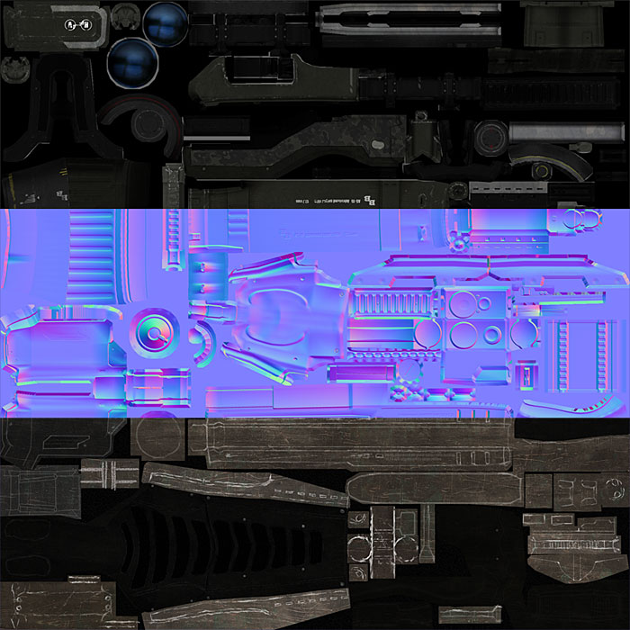
And the texture sheet :

texture_sheet.jpg

Replies

  • nrek
    Offline / Send Message
    nrek polycounter lvl 14
    Great work man!! That turned out awesome :thumbup:. The tape deck style clip thing is really cool, it would be sweet to see it in motion. Can we see some wires of the low?
  • DEElekgolo
    Offline / Send Message
    DEElekgolo interpolator
    Just asking, how do you get that effect on the high res renders when there seems to be a red and blue outline to the model?
  • JasonLavoie
    Offline / Send Message
    JasonLavoie polycounter lvl 18
    Jesus.... that is fircken awesome! *bows down
  • itsover3
    Thats really good man good job!
  • carlo_c
    Love the detailing on the scope! Solid work throughout, I like a lot! :)

    @ DEElekgolo - the red blue outline can be done in photoshop if you go to filter > distort > lens correction. Should be a slider or two under chromatic abberation, should do the job
  • Razorb
    Offline / Send Message
    Razorb polycounter lvl 15
    damn... that is so fugin amazing! :D
  • Autocon
    Offline / Send Message
    Autocon polycounter lvl 15
    Amazing work, the HP and textured version both look great.

    Although its a shame some parts get lost on the pure black background of the renders.

    And whats it look like in first person mode
  • Jeremy-S
    Offline / Send Message
    Jeremy-S polycounter lvl 11
    Damn, man, that is top quality work. I just started getting into making gun models, and textures, so this stuff is really amazing to me, now that I know how hard making good looking lowpoly guns can be.

    Could you share your render settings for marmoset? I've tried, but can't get that look on there. My gun render's always look kinda wet, and watery, and weird.

    anyway, thanks for the inspiration. Rocking work.
  • imb3nt
    Offline / Send Message
    imb3nt polycounter lvl 14
    Excellent work. Def going in the inspiration folder.
  • Ryan Smith
    Offline / Send Message
    Ryan Smith polycounter lvl 11
    great presentation
  • Rens
    far out!

    thats a real great piece of work,
    presentation +5
    good times :D

    (the sliced texture presentation might be cooler if it is top to bottom instead of corner to corner,
    think that makes it easier for the viewer)
  • natetheartist
    Offline / Send Message
    natetheartist polycounter lvl 9
  • culturedbum
    Offline / Send Message
    culturedbum polycounter lvl 17
    Very nice rifle,

    could we please see some low poly wires?

    -J
  • vj_box
  • Wiktor
    Offline / Send Message
    Wiktor polycounter lvl 11
    Suberb modeling and texturing!
  • GoSsS
    Offline / Send Message
    GoSsS polycounter lvl 14
    @nrek : thanks a lot man.
    Here is the wire :

    wire.jpg

    @DEElekgolo : As DEElekgolo said, you just have to go to filter > distort > lens correction and play with the first slider under chromatic abberation.

    @JasonLavoie : Thx !
    @itsover3 : thanks a lot.
    @carlo_c : It wasn't easy to find what to put on this part ;).
    @Razorb : Thanks.
    @Autocon : Yeah I know for the black background but I didn't know what color to use. A dark grey could have been cool but it becomes redish with the post effect :(
    @Jeremy-S : Thanks man !
    For the render settings it's nothing difficult. Here are the spec settings :
    specular_settings.jpg
    This depend on your textures (you can see them in the first post).
    And after that I make my own post effect settings : http://gaetm.free.fr/3d/2009/Sniper/GoSsS.post
    And it's all ;)
    @imb3nt : thanks a lot!
    @Virtuosic : thanks man
    @Rens : Ok, I done what you say for the texture sheet ;) Updated on the fisrt post.
    @natetheartist : thanks!
    @culturedbum : Thanks! Wire is just above ;)
    @vj_box : Thnaks a lot!
    @Disting : Thank you!
  • Jeremy-S
    Offline / Send Message
    Jeremy-S polycounter lvl 11
    Thanks a ton for that info, and the post settings, man. I'll definitely be using it when I get back to working on my guns, and metal objects. Hopefully I won't feel so awful about how bad my guns look with some decent post and spec settings :D
  • EarthQuake
    Looks like you could use a little more ao? I always throw my AO over my spec as well.
  • sampson
    Offline / Send Message
    sampson polycounter lvl 9
    could u show some non-enhanced grabs? just default and that....
  • GoSsS
    Offline / Send Message
    GoSsS polycounter lvl 14
    @Jeremy-S : No problem ;)
    @EQ : I think AO on the diffuse is ok (but I agree, maybe we don't really feel it on the texture sheet, but without the AO, I loose many little details).
    I've a question about your AO over your spec map; why ? I don't really get it, but the result is really clean. In my mind, the same metal reacts the same way even if it is in the shadow.
    Btw thanks a lot for the exemples in the marmoset because it really helps me to understand how you do the plastic parts on your sniper rifle ;)
    @sampson : No problem :
    nopostfx.jpg
    Default settings with Sunny sky.
  • Joao Sapiro
    Offline / Send Message
    Joao Sapiro sublime tool
    if you dont put ao in the spec what will happen is that areas that are occluded and without lightning are receiving reflection wich makes it seem weird. the camo pattern seems really weird, like if it is paint it should have chips or beeing fade out on some places, right now it seems that its a new metal that comes with camo pattern ( ok i dont make sense lol ) appart from that i think it looks good :)
  • imb3nt
    Offline / Send Message
    imb3nt polycounter lvl 14
    One thing i noticed is that a scratch is going all the way through the recessed part of an allen bolt (if i'm seeing it correctly) when whatever scratched it would jump the gap or at least skip the corner.

    Scratch.jpg
  • Joao Sapiro
    Offline / Send Message
    Joao Sapiro sublime tool
    oh also, get some shots on a lighter background you can hardly make up the dark parts :(
  • [HP]
    Offline / Send Message
    [HP] polycounter lvl 13
    Jebus dude, this is beautiful!!!

    I also agree with the dark bg comment, always use grey BG's to display your work. black is a big no-no.
  • EarthQuake
    [HP] wrote: »
    I also agree with the dark bg comment, always use grey BG's to display your work. black is a big no-no.

    I think this is a bit of a misnomer. People talk about black backgrounds like they are a sin, but fail to understand the basic concept behind the common advice.

    Do not present a DARK model on a DARK background.
    Do not present a LIGHT model on a LIGHT background.

    If your model is so dark, that in the shadows it blends into the background and you cannot make out the silouhet, you need to change something, either brighter background or brighter textures/lighting on your model. But i wouldn't suggest you should never use black in presentation, or never use white. Akin to saying "always use quads" or "never use ngons" its just really bad advice out of context.

    Its all about contrast, dark on dark is never going to look quite right.

    GoSsS wrote: »
    @EQ : I think AO on the diffuse is ok (but I agree, maybe we don't really feel it on the texture sheet, but without the AO, I loose many little details).
    I've a question about your AO over your spec map; why ? I don't really get it, but the result is really clean. In my mind, the same metal reacts the same way even if it is in the shadow.

    Generally if a certain area is has occluded diffuse lighting, the specular/reflection will tend to be occluded as well. In a more accurate lighting solution, the object would actually reflect itself, instead of the environment, but those sort of effects aren't really all that common in real time. So a good hack is put the AO in the spec as well, or else the final result will just feel a bit flat. It really helps to "pop" out the details in your shapes and forms in what often tends to be something much more complexed rendered on basically a flat plane.

    Johny wrote: »
    the camo pattern seems really weird, like if it is paint it should have chips or beeing fade out on some places, right now it seems that its a new metal that comes with camo pattern ( ok i dont make sense lol ) appart from that i think it looks good :)

    What Joao means here is this:

    The camo material as it is now reads as if it were a bare metal material, having all of the same characteristics, same wear, same scratching, showing through the camo. What you want to do is try to change up the material definition here, painted camo patterns like this are going to naturally be a lot more matte, and the wear and tear should suggest a bit more plainly the layer of materials, scratched of paint with metal underneath it.
  • GoSsS
    Offline / Send Message
    GoSsS polycounter lvl 14
    EarthQuake wrote: »
    Looks like you could use a little more ao? I always throw my AO over my spec as well.

    More AO on diffuse : done
    AO on specular map : done
    I get why you do that. Thanks for the explanation ;)
    imb3nt wrote:
    One thing i noticed is that a scratch is going all the way through the recessed part of an allen bolt (if i'm seeing it correctly) when whatever scratched it would jump the gap or at least skip the corner.

    Remove the scratch : done
    Johny wrote:
    the camo pattern seems really weird, like if it is paint it should have chips or beeing fade out on some places, right now it seems that its a new metal that comes with camo pattern ( ok i dont make sense lol ) appart from that i think it looks good.

    This effect was my idea, but your right; it's not really correct :D So, I give your idea a try (is this good btw ?).

    Here are 2 new renders (white bg is for fun, but whit BG + Bloom is kinda cool :p)

    4.jpg

    5.jpg

    I hadn't seen that the camo quality was such reduced by the sharpen filter ... :(
  • Joao Sapiro
    Offline / Send Message
    Joao Sapiro sublime tool
    ok, i would definately kill the camo, its making that part loose all itneresting detail and its just silly a weapon have camo in that area :P
  • Electro
    Offline / Send Message
    Electro polycounter lvl 19
    Oh god white! My eyes! urrraargh! Stick with the grey :)
  • EarthQuake
    try a larger camo pattern, right now i think its just to small scale?
  • GoSsS
    Offline / Send Message
    GoSsS polycounter lvl 14
    @Electro : ^^
    @EQ : I think I'll try your idea. I'll remake all the camo in this area (because I tried to fix this just with some make ups :D and it's not the better way).
  • beartraps
    Offline / Send Message
    beartraps polycounter lvl 8
    definitly dont kill the camo, it creates a lot of interest! this gun looks amazing man, I WANT!
  • killingpeople
    Offline / Send Message
    killingpeople polycounter lvl 18
    ya, johny wouldn't know a sweet gun if it shot him in the face! DX
  • bluekangaroo
    Offline / Send Message
    bluekangaroo polycounter lvl 13
    awesome sauce...I like it. going into my inspiration folder
Sign In or Register to comment.