Environment - Splash Damage Dock
polycounter lvl 20
I don't know, I don't post for an age, and when I do, it's my take on an art test.
Emerging from a budget games wilderness, I find my portfolio lacking all the shiny stuff you don't get when you do nothing but PS2 and Wii projects for a few years So, here I am, filling in the gaps and letting loose with the shiny toolbox.
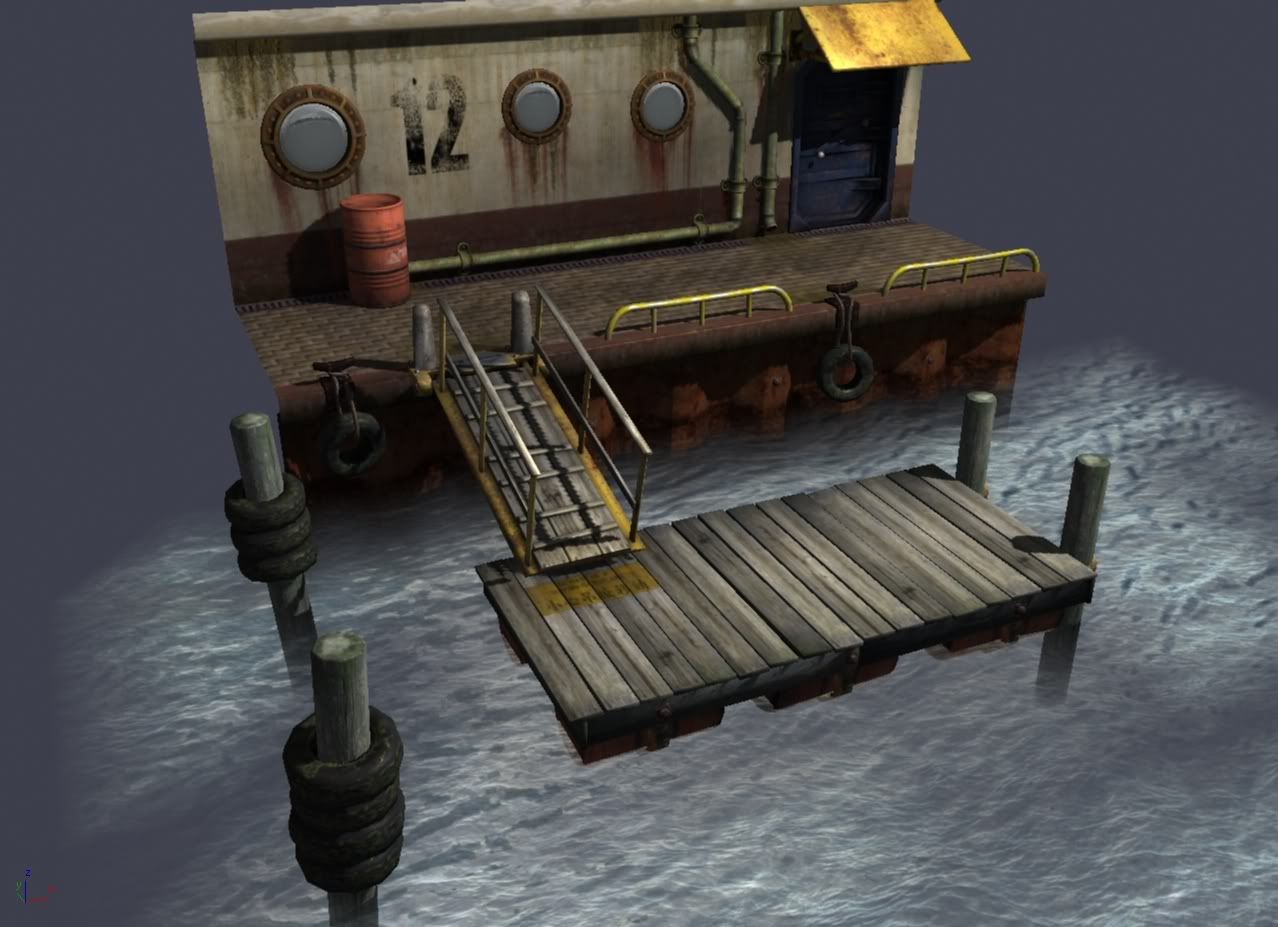
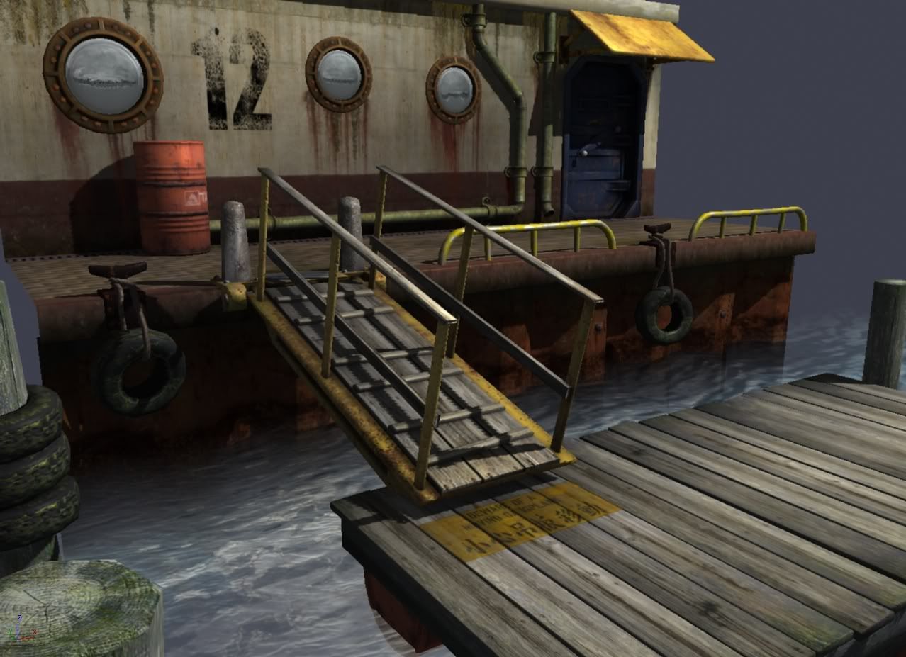
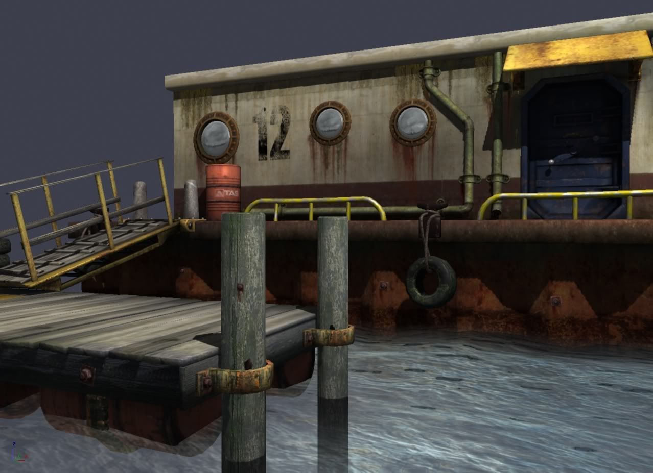
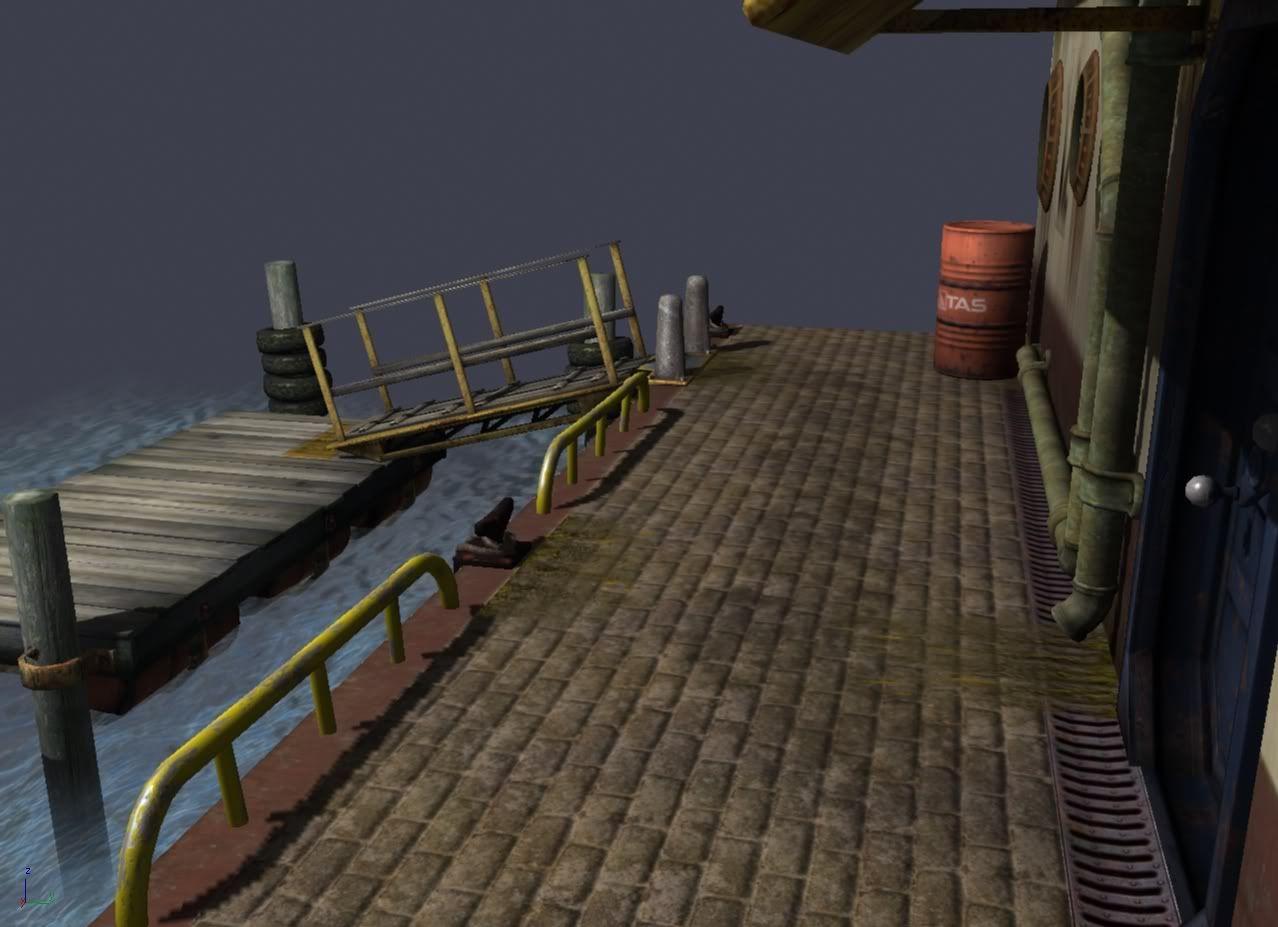
Working from the Spash Damage brief. Currently 16,500 polys down of the 20,000 budget. The scene is captured from the MAX viewport, using custom shaders built using ShaderFX. Diffuse, specular an normal maps, with some subtle AO/radiosity baked into the vertex colours. Textures have been authored using a 512^2 per square meter resolution.
http://jonmurphy-gameart.blogspot.com/2009/06/work-in-progress-dock.html
sorry for the blooger link. Away from home so can't get images linked
God knows how the image colour balance is as I've been working on not the greatest of monitors, and posting this from a borrowed laptop.
Emerging from a budget games wilderness, I find my portfolio lacking all the shiny stuff you don't get when you do nothing but PS2 and Wii projects for a few years
Working from the Spash Damage brief. Currently 16,500 polys down of the 20,000 budget. The scene is captured from the MAX viewport, using custom shaders built using ShaderFX. Diffuse, specular an normal maps, with some subtle AO/radiosity baked into the vertex colours. Textures have been authored using a 512^2 per square meter resolution.
http://jonmurphy-gameart.blogspot.com/2009/06/work-in-progress-dock.html
sorry for the blooger link. Away from home so can't get images linked
God knows how the image colour balance is as I've been working on not the greatest of monitors, and posting this from a borrowed laptop.
Replies
- I assume you did not thought about using colored lights? because the ones you have are either default setups or just white lights (it has the grey layer). So presentation wise they look rather boring.
- The texture have this coders art where colors a choses by symbolic manner and not based on actual research on the topic (like yellow stand for banana, grey for metal, brown for wood though in reality its never just one color or perhaps even that color). So try to look at reference photos and paintings on how the colors really are like.
- perhaps some wireframes for the presentation as well? might be nice to see how you created your topology and used textures on the faces.
all in all I think colors and lighting is the most critical aspect right now
Did mention that at the moment ithe scene is using a single spot light with a slight shift to yellow. I'll be getting some funky lighting once the external lights are built and the scene can be lit to illustrate different times of day.
Away from home atm, so this is the best wireframe image I have available.
Still not quite happy with the texture on the door hood, the bulkhead, or the algae on the tyres.
First image - Single spotlight flat white
Wirefame
Night lighting (no light fittings built yet)
Still plenty of polys in the budget for a few more props
There is the question of how well would the water and the normal map work together? If you can get away using using a few more polys but reduce the shader to just a diffuse then it might run smoother.
Some engines have trouble rendering complex shaders that are half in/out of the water. Sometimes you end up cutting the geo at the water line and having two separate pieces with different shaders applied. Its really engine/game specific, but I think when working at a water line you want to keep shaders very simple.
to the original poster: it's coming along nicely but there's some things that don't make sense in my eyes. For instance the yellow thing on the floating platform. what is it? it looks like a spray but then it looks a bit too sharp and neat for that. the red under the windows looks v
Update on progress. Bulkhead has been remodelled and re-textured, removing the tight bevels. Same done on the planks for the pontoon.
Hung clumps of algae around, although the alpha and the specular of the texture still needs work. Added light fittings and built a better shader for the portholes so they have a degree of self-illumination.
Still a work in progress. I want to re-do the mooring points, then spend the remaining 4k polys on some cargo to scatter around, and some seagull poop decals
maybe I overdid the last one with dominating blue and pink colors but at least it stands out more compared to the upper one.
I think I should note that the shots are taken direct from the MAX viewport, hence the artifacts in the shadows. I feel the next step is to get myself a copy of UT or Crysis and import the scene into either of those engines.
At this stage, the metals really don't feel all that "metal" to me, and I think its mostly due to your spec, see if you can manage to get some nice highlights from your light, as well as the outside lighting. This seems like (based on how your scene is lighted right now) that it is night out (the background is a bit confusing right now, its throwing me off) so why not try and get some cool rim light from the moon or something, even on the water as well. I think this will help balance out your overall lighting, cause right now the docks and ramp seem like they are being shaded by something.
Good work though man, really interested to see how this turns out.
http://dl.dropbox.com/u/6745271/JonMurphy-2009-dock12-c.jpg
Made a rod for my own back trying to produce a convincing scene using custom shaders in the MAX viewport, so I'm bringing the pieces into UDK, giving them a fresh lick of texture paint and whatnot.
Having a play with animating the emmisive in the portholes, trying to suggest some life going on inside.
Hopefully get the pontoon in tomorrow which will bring in some greens to the scene.