Cool stuff, the skull on the first one looks a little weird though - like the interior details are a bit undefined. Maybe you should ad some stuff to the middle ground in the second image - it feels a little empty. Also the street could have a little more defined cracks in it.
Could you ad wire frames and polycount? Have you used any maps (lol, of cours you have- but which ones)
Yeah, some more info about what you are trying to achieve, what software you're using, what process, wires, etc will help us give feedback.
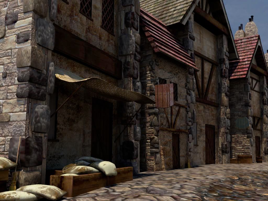
For general advice, your outdoor scene has darks that are too dark. There should be light bouncing up against the bottom of those beams near the rooftops. Also agree with Shep about wonky texture density.
Your texture resolution is pretty poor. Its blurry in areas that really should be crisp such as the low parts of the wall and rocks. Its far to noticeable for you to get away with it.
Hey! Nice to see you on Polycount Piggy! One thing I'd like to point out is that you need to fix up your light a bit in your exterior scene. Make sure you have a colored ambient source that represents the color of your sky. Maybe a lightish blue. After you have that, get in a Big Direct Spot light that represents your main light source...basically, your sun. Color that yellowish white. And after that, bring in some "point lights" if your using maya, or Omni's if your using Max, to add pools of light just to fake some light bounces from the ground and other objects that would generally bounce light. Right now, the light looks a bit dull, so bring up the intensity in your hot spots.
I'm digging the colors brown and red, but you need to watch your resolutions. Whats_True already hit that on the spot.
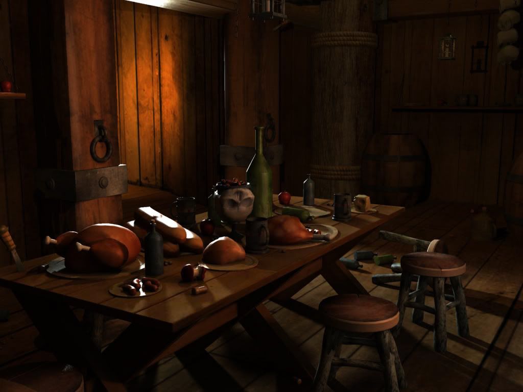
As for the interior, you gotta calm down the light thats making your doorway, and objects burn hot. It also helps to add a visual (like a candlabra) so that the light isn't a ghost light. What I thought to myself when I looked at the interior is "where is that light coming from?" One thing I ask myself when I'm lighting an object, is where are my sources. Very important to keep that in mind.
Your lighting is very nice in both of these scenes. If you can fix up those texture sizes a bit like the others were saying this would look great.
Just a small thing, when you instance geometry, like with those bar stools dont put anything on them that would be extremly noticable as instanced geometry. The crack is a nice little piece of character, but a quick fix to make it less noticable is to either add some alpha cards for grunge or add more cracks similar to that one so you can't spot each unique characteristic as quickly.
What program are you rendering all of these in, cuz that lighting is seriously nice man
Replies
not really game art but quite nice renders, a bit stuck in between the two, lookm to acheive a more even poly distribution
compostion and lighting are good but your texture density is all over the place
Could you ad wire frames and polycount? Have you used any maps (lol, of cours you have- but which ones)
Cheers and welcome to polycount!
For general advice, your outdoor scene has darks that are too dark. There should be light bouncing up against the bottom of those beams near the rooftops. Also agree with Shep about wonky texture density.
I'm digging the colors brown and red, but you need to watch your resolutions. Whats_True already hit that on the spot.
As for the interior, you gotta calm down the light thats making your doorway, and objects burn hot. It also helps to add a visual (like a candlabra) so that the light isn't a ghost light. What I thought to myself when I looked at the interior is "where is that light coming from?" One thing I ask myself when I'm lighting an object, is where are my sources. Very important to keep that in mind.
Good Start Piggy! Keep it going!
...
Today, 09:01 PM
Just a small thing, when you instance geometry, like with those bar stools dont put anything on them that would be extremly noticable as instanced geometry. The crack is a nice little piece of character, but a quick fix to make it less noticable is to either add some alpha cards for grunge or add more cracks similar to that one so you can't spot each unique characteristic as quickly.
What program are you rendering all of these in, cuz that lighting is seriously nice man