Environment - Hallway
Hey guys,
Been out of work so I've been working on this to try to update my portfolio. Still working on more props to clutter it up a little more, but I figured it was to a point where I could start getting it out there.
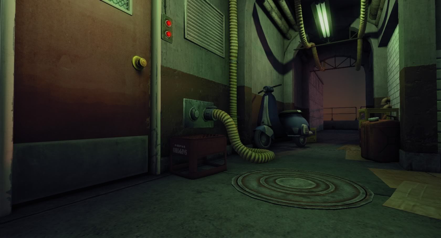
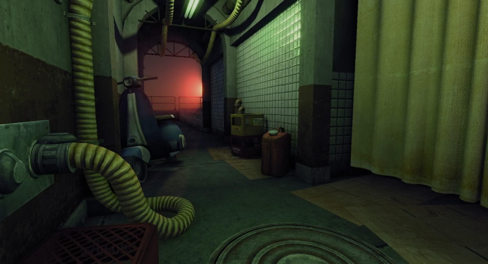
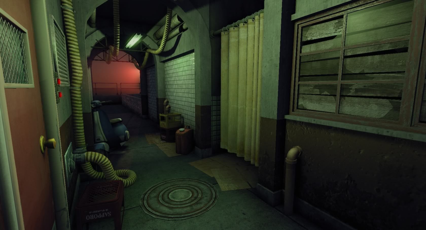
If anyone needs an environment artist in the San Francisco Bay Area I'm free.
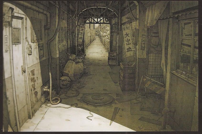
Here's the concept I've been using, I don't really want to match it 100%, but it's what I've been working from.
Been out of work so I've been working on this to try to update my portfolio. Still working on more props to clutter it up a little more, but I figured it was to a point where I could start getting it out there.


If anyone needs an environment artist in the San Francisco Bay Area I'm free.
Here's the concept I've been using, I don't really want to match it 100%, but it's what I've been working from.

Replies
Sky and sun glow could be brighter and have more bloom to it, otherwise it does not make an "outside" impression and also looks like a pink wall.
Thick flexible tubes on the celling look off as to me. On the wall it is ok, but on the celling we r used to se wires e.g. something dark and thin.
Sewer lid needs some more variation to it, maybe more ptoto overlay because right now i can clearly see drop shadow/inner glow effect on circles in photoshop ;P
U could mask it better i guess. Maybe add some holes and anti-sliding surface to the lid texture.
But overall nice work as to me
I didn't want to make it too bright outside because I wanted to have contrast between the fluorescent light inside and the sunlight outside, I'll fool around with the lighting and see what I can come up with, maybe I'll just make it night. The hoses from the ceiling were like that in the concept I've been working from, but I might change it to some thinner wires because they do look a bit odd. No drop shadow/glow on the sewer texture, might just be the AO + spec on the edges. I baked normals down for it, but I think it might just need more geometry to really make it pop. Right now I'm working on some other props, but I'll go back and rework some of that stuff later today maybe.
I've got to go back and screw around with the concrete wall texture too, it's not quite right, I think the scaling might be a bit off.
Thanks for the feedback!
Manhole cover or a rug? Hard to tell. I don't think its so much the texture on top, but that it looks thin and set on top of a concrete slab but not in it. You could probably do this with a decal that includes a concrete seam and fades into the surrounding concrete?
The color pallet is not really meshing together. The lighting is kind of overly correcting for this but I think the lighting needs to come back in line a little more and the pallet needs to be balanced.
Keep at it, its looking pretty good
Sorry, normals are fine, I had a stray light down there.
Still getting the light hitting the bottom of the tiles, but it seems like that may be because of the viewing angle of the camera, normals are definitely not inverted and it still shows up with the fill light on. -shrugs-