Orc Warrior Head
Hi polycount, I'm a new member here, but you can expect to see me around.
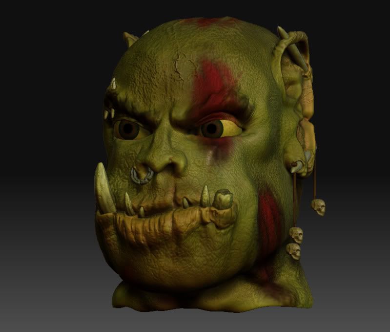
This is a head sculpt i'm working on, thought I'd get some feedback on it before I export the high poly & create the spec map
[FONT=Arial, Helvetica, sans-serif]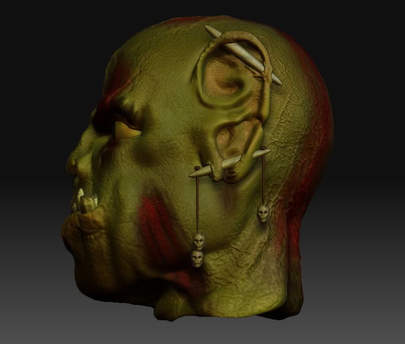 [/FONT]
[the darker green skin color above is using the gw_hulk material in zbrush, i like the way it looks, but it feels too saturated for a war torn orc)
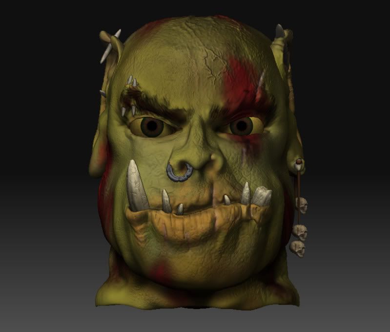
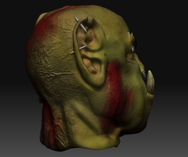
the texture
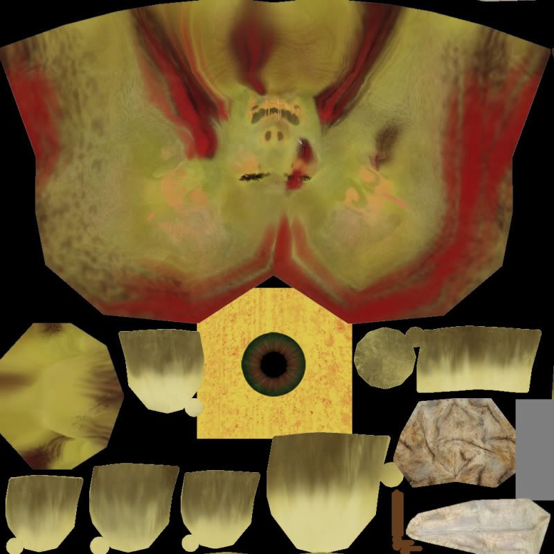
I welcome all thoughts & feedback, please
This is a head sculpt i'm working on, thought I'd get some feedback on it before I export the high poly & create the spec map

[FONT=Arial, Helvetica, sans-serif]
 [/FONT]
[the darker green skin color above is using the gw_hulk material in zbrush, i like the way it looks, but it feels too saturated for a war torn orc)


the texture

I welcome all thoughts & feedback, please
Replies
Cool stuff
cool stuff man, id go back and tighten up the lower levels some more, its still a bit blobby in the shapes.
I agree to a extend to what he said, in short what lacks at the moment are:
- anatomy
- colors
- presentation
- to big eyes
- to agressive bump mapping
- looks to friendly (shreck alike, mainly because of his to big eyes and mouth)
- uncomplete head,- the neck is almost not existent (try to extend it)
curremtly working on:
texturing the metal nose ring
deepened lip crease
eye shrinkage
spec map
as for my presentation, these are just WIP pictures straight from zbrush, there is no presentation at this point, sorry to disappoint.
the high end bump detail should be less noticable, once the normals are all produced and applied to a low poly version.
i shrunk down some of the proportions in a photoshop picture, and i agree, the eyes are way too big. i'll get back to work =P