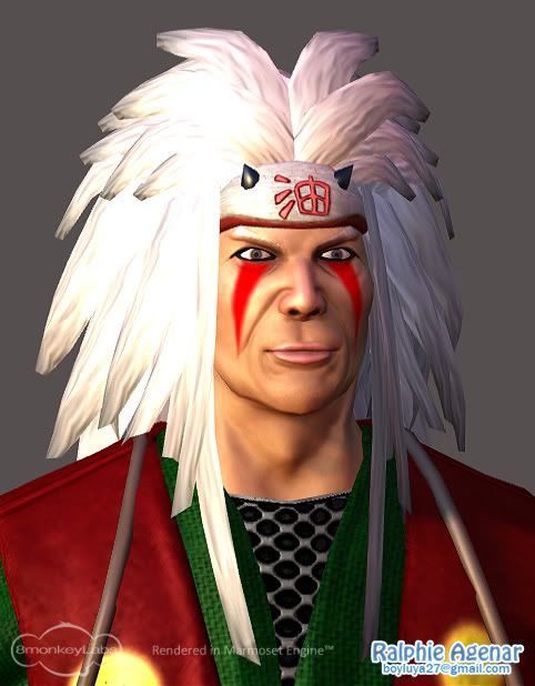
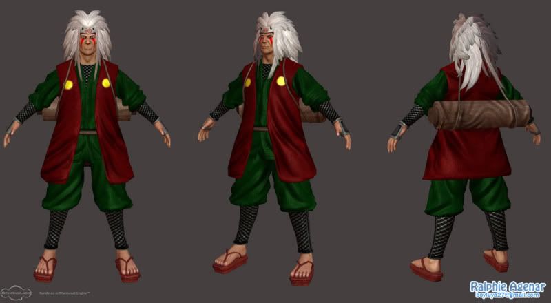
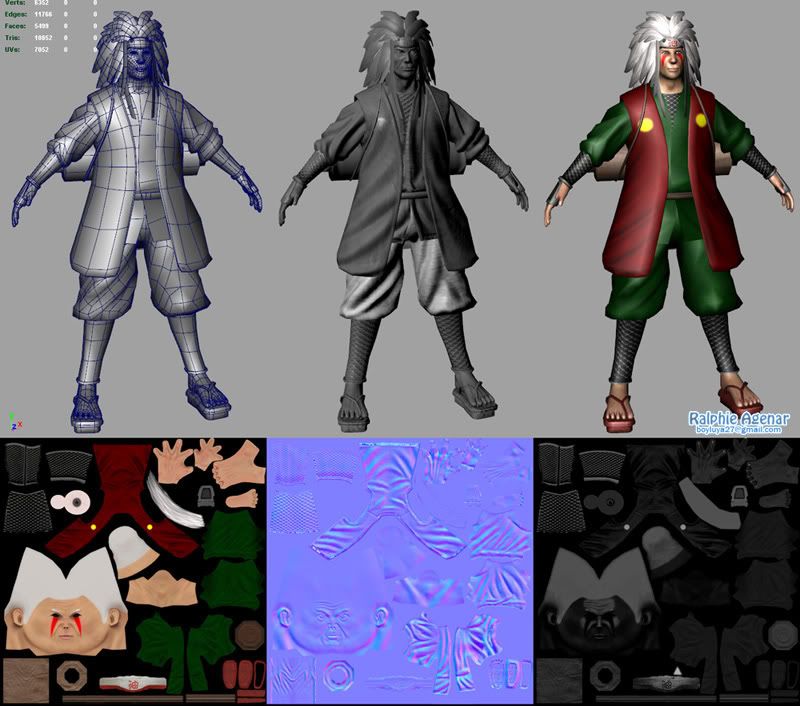
My first 3d game art. It's Master Jiraiya of the Naruto series. Maya-Zbrush-Photoshop-Xnormal-Marmoset Toolbag, 11k tris, 2k color, normal and specular maps.
looks pretty good, but i dont think you've got the face quite right. he looks a little too old and his features are off i'd say. also, you could do with a lot more texture work. that spec map could use some black patches to break it up, for one. some color variation in the color map might be a good idea.
this is the problem with a photo-realistic style. once you start on that path, you've got to make it perfect. it would be a better idea to scale it back, and make something simplified and stylized.. more like the cartoon, but in 3d. right now it's half way between worlds, and it isn't quite working in either one.
Actually, it's kinda working for me, I think it would help if you gave him a bit bigger eyes (not anime big, just a bit more) and if you actually could do something about his lips, his lips are what I find off the most about him.
/edit btw one big-ass belt on his waist, and if possible even over the read coat would really help fill the presentation.
his lips are bothering me, to pink i think. also his red makeup were triangles just lines that went down his face. I also dont like how saturated the colors are.
The last issue I have is for a while i thought you modeled him in a one piece (instead of pants and shirt) maybe bake an ao map or proper lighting would help.
I really like the model and texture is pretty good!
Thank you guys. Yeah, I should have model him in one piece so I could get better AO map. And yes, the colors are too saturated I guess. But, should I re-make him or call it done and move on to another piece?
Replies
looks pretty good, but i dont think you've got the face quite right. he looks a little too old and his features are off i'd say. also, you could do with a lot more texture work. that spec map could use some black patches to break it up, for one. some color variation in the color map might be a good idea.
this is the problem with a photo-realistic style. once you start on that path, you've got to make it perfect. it would be a better idea to scale it back, and make something simplified and stylized.. more like the cartoon, but in 3d. right now it's half way between worlds, and it isn't quite working in either one.
/edit btw one big-ass belt on his waist, and if possible even over the read coat would really help fill the presentation.
The last issue I have is for a while i thought you modeled him in a one piece (instead of pants and shirt) maybe bake an ao map or proper lighting would help.
I really like the model and texture is pretty good!
also even though u dont have an ao, you can hand paint a shadow.
Thank you mate!