Hjourl Depot -Environment
Hey PC, I've been around for a while, but this will be the first piece I've ever submitted for your guy's viewing pleasure. This is an environment I did for school following the Unearthly Challenge rules.
Its an old train depot set in the future. Story behind it is it's on the last remaining Earth space colony and it's being used to transport slaves that are being used to rebuild/clean up the colony.
74,674 tris. This is due next week and would like some c/c on how I can improve it.
Thanks guys
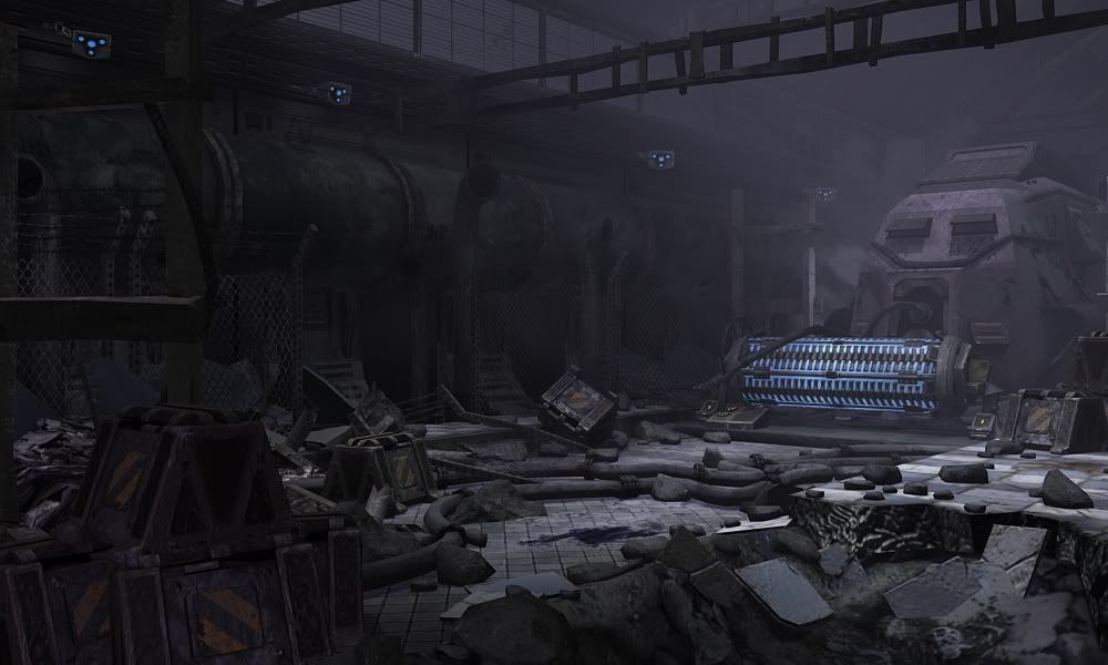
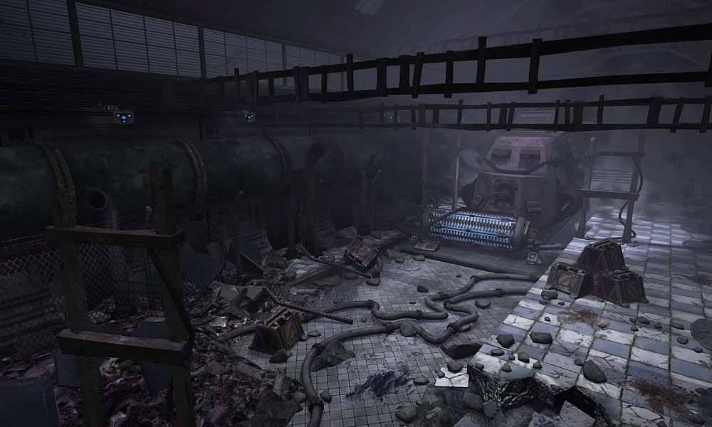
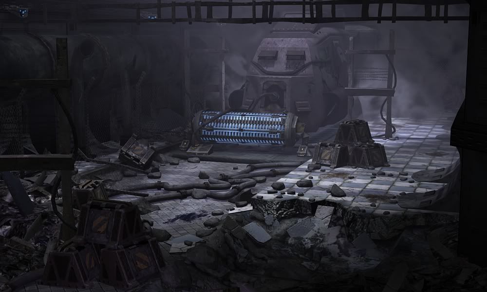
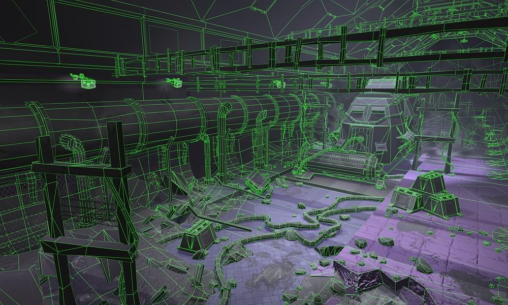
Its an old train depot set in the future. Story behind it is it's on the last remaining Earth space colony and it's being used to transport slaves that are being used to rebuild/clean up the colony.
74,674 tris. This is due next week and would like some c/c on how I can improve it.
Thanks guys


Replies
It might also help to see some shadows from an additional light source You have a lot of complex shapes but with the main light at such a direct angle it doesn't really allow any of those shapes to project their shadows around the scene.
Overall the scene itself looks good I just think the lighting could do some work.
At the moment it's actually quite hard to understand where the lighting is coming from at all, kinda feels like there's just some flying light in the middle of the room.
The modeling looks good though, the scene could turn out quite nice with a bit more work!
If you remove the fog effects from the scene, how does this look? I'd redo the fog to be less volumetric and more an effect that's emitting from areas so that it does not get washed out as the others have mentioned.
I personally liked the fog effect. Maybe make it a tad more subtle and it should bring it together a little more.
I'm diggin the train as well. I know a few people did a similar scene and struggled so this is refreshing to see you working hard on it. Keep up the good work bud.
And many things in the scene were baked down from highpoly's Brome, except for the very noticeable rafters and the segment in the left forground lol. oh and the fences.
I actually like the scene with the fog, but I'm going to see how it would look if I did remove it and tweak the lighting.
Thanks Anthony!
try to define some edges and add some variation to your surfaces.
You said its a train depot? Right now I dont see that at all, I see an area where Im guessing tracks would go but I dont see any to indicate that what is in the room is a train.
Also what is that blue thing? Is that like one of those sweeping brushes on those cleaning trucks? Or is it a fallen over power generator? If it is a sweeper thing for the train I dont see right now how its attached, looks floating. If its a power gernerator thing I think you should angle it more so its not making such a 90 degree angle with the train and add maybe one or 2 standing up so people will understand better what it was and that this one has fallen over.
Looking good so far though.