Left 4 Dead Map: Concrete Jungle [WIP]
That name is definitely WIP as well.
Hey again everyone, it's time for my first project that I'll be posting on here for feedback. Show no mercy as usual, I want to learn a lot from this one.
Almost 100% of my level design experience so far has been with RTS games, and although that's what I would like to end up working on, I think my portfolio needs some diversity (besides, I cranked out two World in Conflict maps last year). This will be my first FPS map ever, as well as my first map in Source.
I have just a few months of summer to cram some mapping in before class starts again, so I may not be able to finish the entire level's visuals. I plan on blocking out the level with orange texture brushes to get the gameplay down solid, and then focusing on getting what I can of the visuals 100% done, even if I only have time to finish 1/3 of the map.
Brief overview: This level will be a dock-side industrial area. Players will start in a Cold War era fallout shelter (the safe room) and they will make their way to other fallout shelters seeking military evacuation from the city. The finale will probably take place on a large ship.
My bad: I modeled a good bit of the level using Sketchup when I had a few blocks of free time, thinking I could just import it into Hammer. That's not going to work, so consider this concept art:
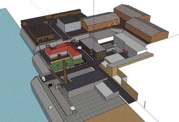
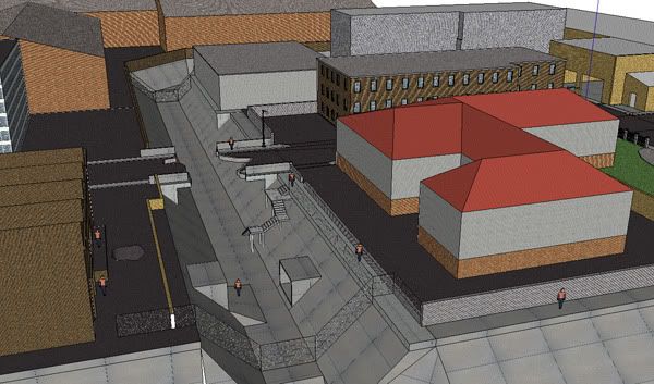
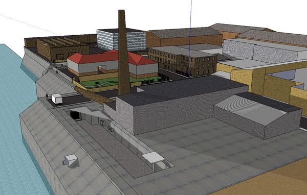
Below is an (outdated) top-down view of the map. The heart is the safe room, red lines are blocked areas, and the yellow line is the direct path through the level. Not shown are the underground sewers, which I'm still planning. The blue stars show the entrances and exits of the sewers (there will be two paths through them).
http://i209.photobucket.com/albums/bb134/EvilViking13/Left%204%20Dead/l4dmaptopdown.jpg
Please toss out any feedback or tips for a Source rookie, they would be greatly appreciate! At this point, I'm rather disappointed at how dependent the levels are on brushes, is there a better way of doing things that I'm not seeing yet?
Here is what I have in Hammer so far:
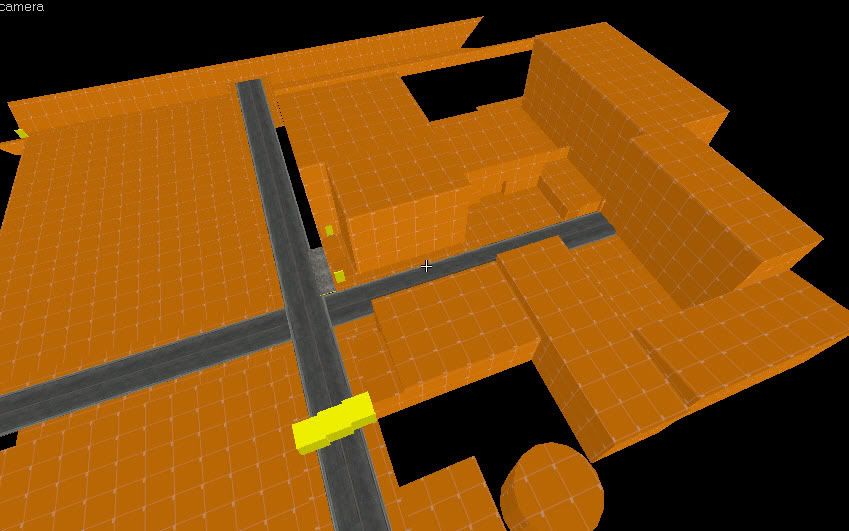
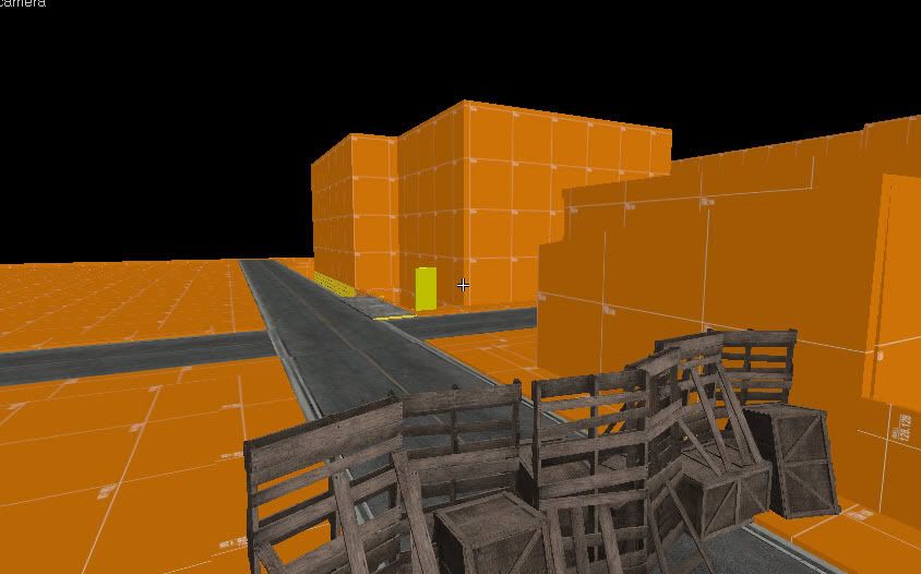
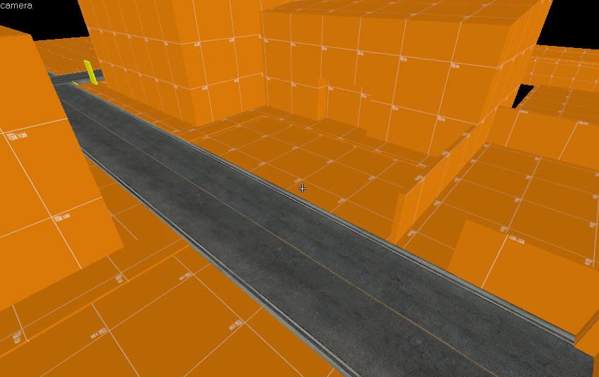
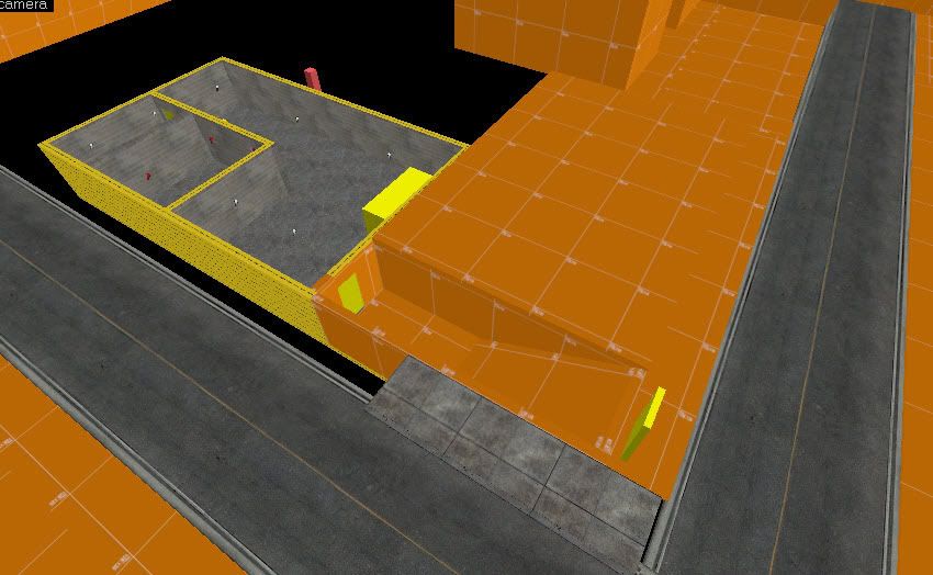
Hey again everyone, it's time for my first project that I'll be posting on here for feedback. Show no mercy as usual, I want to learn a lot from this one.
Almost 100% of my level design experience so far has been with RTS games, and although that's what I would like to end up working on, I think my portfolio needs some diversity (besides, I cranked out two World in Conflict maps last year). This will be my first FPS map ever, as well as my first map in Source.
I have just a few months of summer to cram some mapping in before class starts again, so I may not be able to finish the entire level's visuals. I plan on blocking out the level with orange texture brushes to get the gameplay down solid, and then focusing on getting what I can of the visuals 100% done, even if I only have time to finish 1/3 of the map.
Brief overview: This level will be a dock-side industrial area. Players will start in a Cold War era fallout shelter (the safe room) and they will make their way to other fallout shelters seeking military evacuation from the city. The finale will probably take place on a large ship.
My bad: I modeled a good bit of the level using Sketchup when I had a few blocks of free time, thinking I could just import it into Hammer. That's not going to work, so consider this concept art:


Below is an (outdated) top-down view of the map. The heart is the safe room, red lines are blocked areas, and the yellow line is the direct path through the level. Not shown are the underground sewers, which I'm still planning. The blue stars show the entrances and exits of the sewers (there will be two paths through them).
http://i209.photobucket.com/albums/bb134/EvilViking13/Left%204%20Dead/l4dmaptopdown.jpg
Please toss out any feedback or tips for a Source rookie, they would be greatly appreciate! At this point, I'm rather disappointed at how dependent the levels are on brushes, is there a better way of doing things that I'm not seeing yet?
Here is what I have in Hammer so far:


Replies
are you going to be making your own custom models / textures?
how do you plan on covering up the horizon?
I did a massive search for resources over the past few weeks and came up with a huge list of links I can toss you if you like. I finally got one of my own models to import into hammer but getting the textures to work is a whole different can of worms. I figured I would model to my heart's content and worry about that when it comes time to tighten the level up.
I'll keep an eye on the thread -- maybe we can share tips :P
As for the links, I'd love to take a look if you're up for sharing 'em.
Seems like your still working on the paths and such, and I'm not sure of the scale, but it seems like you got some really long straight aways that need some breaking up. Specifically the drainage area that they run through, is going to need some breaking up, along with areas for the zombies to spawn from additionally.
If you need a playtester, you can hit me up on steam: sicsided or masnelle (at) frontiernet.net
Looking good though.