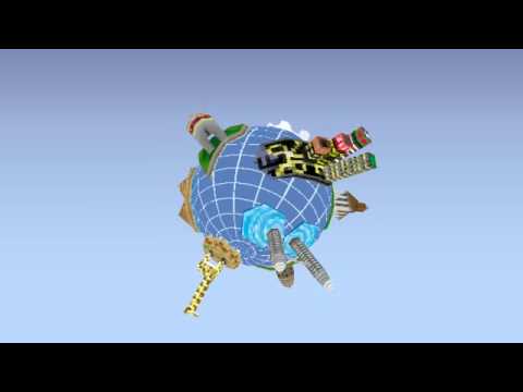
odd low poly pixel globe thing
hello
[ame] http://www.youtube.com/watch?v=wbW3Pvv_hWs[/ame]
(for HQ click on link)

Wanting to create something like this for ages - but having no excuse to do so - my first attempt something stylised, as with my previous taste for diagonal lines and chevrons. Eventually we decided on making the whole globe look more realistic for clarity. Each island on the globe relates to a certain category on the 21 foundation website.
Injecting the model into papervision was the final goal, for in-browser 3d, using the collada format.
Locations on the globe (with room for future edits) are:
styled version:

Some close ups etc:

textures sized up x2 (drawn in bodypaint, highly recommend it)

Comments welcome as usual.
[ame]
 http://www.youtube.com/watch?v=wbW3Pvv_hWs[/ame]
(for HQ click on link)

Wanting to create something like this for ages - but having no excuse to do so - my first attempt something stylised, as with my previous taste for diagonal lines and chevrons. Eventually we decided on making the whole globe look more realistic for clarity. Each island on the globe relates to a certain category on the 21 foundation website.
Injecting the model into papervision was the final goal, for in-browser 3d, using the collada format.
Locations on the globe (with room for future edits) are:
- Iceland
- Lisbon
- Boston
- Cambodia
- India
- Tanzania
- Kuala Lumpa
- Tokyo
- Egypt
styled version:

Some close ups etc:

textures sized up x2 (drawn in bodypaint, highly recommend it)

Comments welcome as usual.

Replies
but most of the locations have their respective landmarks modeled.
Tokyo kinda looks like every other city, at night time.
Tokyo Tower would have been nice ..
do we have polys to model one or two cute penguins on...island?, you mean antarctic right ;D
elephant wins
Here's some crit:
Tokyo seems kind of out of place because you have a fullbright sky with dark building and lights.
Not really a fan of the line on the globe itself.
Are the categories the ones on the current site(Human Coexistence. Coexistence with Earth, Research Tools etc.)? I couldnt make a logic connection between them and cities/countries.