The BRAWL² Tournament Challenge has been announced!
It starts May 12, and ends Oct 17. Let's see what you got!
https://polycount.com/discussion/237047/the-brawl²-tournament
It starts May 12, and ends Oct 17. Let's see what you got!
https://polycount.com/discussion/237047/the-brawl²-tournament
P-51 Mustang
First post here at PolyCount
So this is a plane Im doing for school.
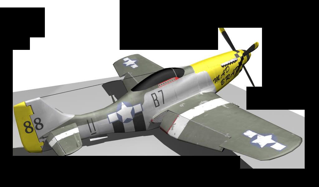
The third picture is a test with a spec. map which im new to.
Please Nit Pick anything about it.
All comments are welcome
Thanks
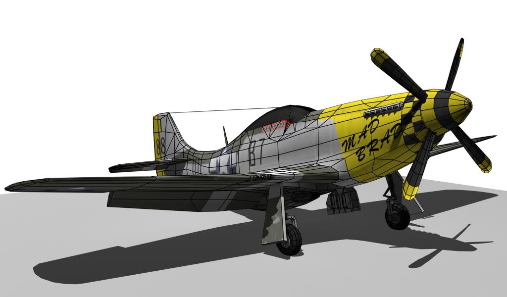
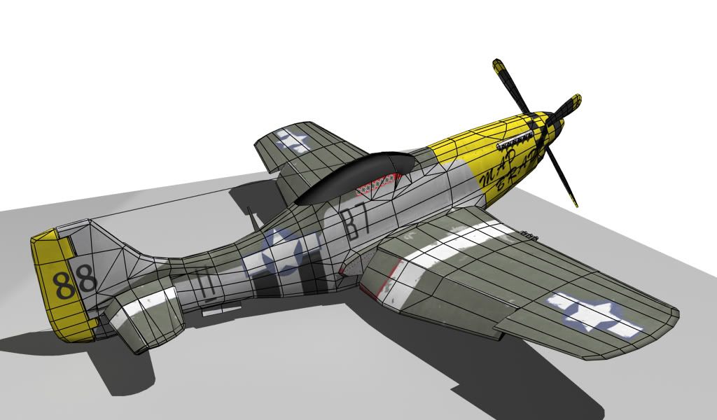
So this is a plane Im doing for school.
The third picture is a test with a spec. map which im new to.
Please Nit Pick anything about it.
All comments are welcome
Thanks


Replies
I think more detail around the cockpit would do nicely. I would consider modeling the inside of the cockpit and making the canopy transparent or translucent.
Don't start on the spec map until you have a solid diffuse OR alternatly start in the other direction with shaders and lightning, make something that looks good presentationwise before you even start on the textures.
Read through the following link and post in the appropirate threads if you have any questions
http://wiki.polycount.net/CategoryTexturing
Finally some refs:
http://www.flickr.com/photos/80643375@N00/410480277/sizes/o/
A plane in ww2 condition (looks a bit polished up, but still) look at the level of detail in the surface and the amount of reflections.
http://www.flickr.com/photos/36375158@N00/2829068994/sizes/o/
http://www.flickr.com/photos/traumahawk/2722129132/sizes/o/
http://www.flickr.com/photos/glosters/1073499213/sizes/l/
http://www.flickr.com/photos/traumahawk/2722125228/sizes/l/
If are under a tight deadline, and don't know how to do any of this, I would just bake some fake reflection into the diffuse, push the contrast on the seams, more contrast and different overlays in the specular + a neutral gray ground plane and background.
The other thing that's bothering me is the text and the USAF star thing. The text doesn't look natural, it has a very artificial computer feel about it. I suggest you experiment with some different fonts and rough them up a little bit, like you have with the USAF insignia. The only issue I have with the insignia is the actual star, it's very round and doesn't look like the original much at all. That's an easy fix though.
Keep it up.
on the changes that were mentioned.
I do agree that it looks really flat. Im going really show off the rivets more
and work on the text and the insignia.
Update coming soon.
Thanks again
dirty and chipped the paint up.
I feel the rivet normals on the tail are a bit off and need some changes
Should there be more dirt and grim?
Bullet holes?
Let me know what you guys think needs changing.
Thanks
Oh, also the leading edge of the prop gets fucked up after a while,
completely forgot. I will take another look at the chipped paint and try to
focus it more on practical parts because it is just random.
Completely forgot to try a different text for the writing on the side.
Will post update later.
Thanks
areas and tried to focus on areas where it would be logical that its worn.
I added some exhaust at the fronta and messed around a bit with the text
I also smoothed out the props a bit cause they were looking boxy.
Added a trim around the cockpit window to break it up a bit, hopefully this helps
Let me know if you guys see anything else
Thanks