Environment Concepts: morgues, and medical wings!!
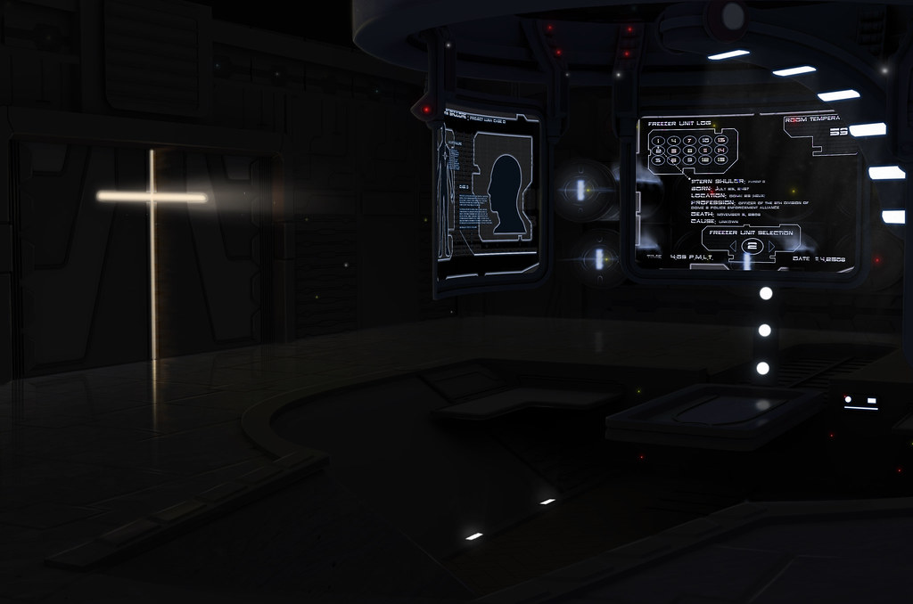
Hey everybody! This is some concept work that I have been working on for about 2 weeks now for a ut3 mod. I want this level to look as awesome as possible so all the feedback I can get would be great. The first image is of a morgue, if it's too dark to really tell what is going on let me know and I will brighten it up for you. The second is a lobby area within the Medical Wing. The morgues is the med wing too! Looking forward to your feedback guys. I
I


 [IMG]http://<a href="http://www.flickr.com/photos/35165722@N07/3585821031/" title="The morgue 3 by williampointer05, on Flickr"><img src="http://farm3.static.flickr.com/2483/3585821031_b6ee338e8c_b.jpg" width="1024" height="678" alt="The morgue 3" /></a>[/IMG]
 I
I


 [IMG]http://<a href="http://www.flickr.com/photos/35165722@N07/3585821031/" title="The morgue 3 by williampointer05, on Flickr"><img src="http://farm3.static.flickr.com/2483/3585821031_b6ee338e8c_b.jpg" width="1024" height="678" alt="The morgue 3" /></a>[/IMG]
Replies
I think the second one looks alright, but it doesn't look like it's from a hospital. I'd suggest adding some muted color to the walls. Something like a beige or tan, maybe, and put some color-coded signs directing people to different wings/floors/departments since the plain green on those hologram signs isn't very distinctive. A "You are here" sort of sign somewhere wouldn't hurt.
The first, dark one seems to be lazy and lacking of an interesting layout. It would seem that you put all your money and effort into the fancy screens while there's nothing to the rest.
The room seems to be a box right now with a boring door stuck into a boring wall.
I would like to see more hints of a layout and the functionality within the room in a room concept.
Maybe it will be more obvious when you brighten it up!
Yeah, Shep sorta beat me to it, but just, a little more brightness/contrast and maybe some more atmosphere. I also stretched it because I thought it'd look better with a wider composition.
Alright added suggestions, and some more detail. Still more to go...
the only crit i have at the moment is the light sources look brighter in the recessed area but the ground and things in that surrounding area aren't reflecting that change in lighting intensity as much as they should.