Old Dentist Chair - Operation Chair
polycounter lvl 17
So the story with this is a doctor of some kind of futuristic fashion(Cyborgs) has adopted this old vintage dentist chair and made it into his operation chair. His work space is an old grunged up apartment similar to how dirty the apartment was from Minority Report where what's-his-face got his eyes replaced..
biggest critique thus far is that I'm having some issues making the "tight leather" look more like leather, I'm not sure if it's the texture or the just the "squarish" model that isn't doing it for me, but i guess i'm not getting the illusion that it's made out of leather.. well, open for critiques! thanks guys, appreciate it!
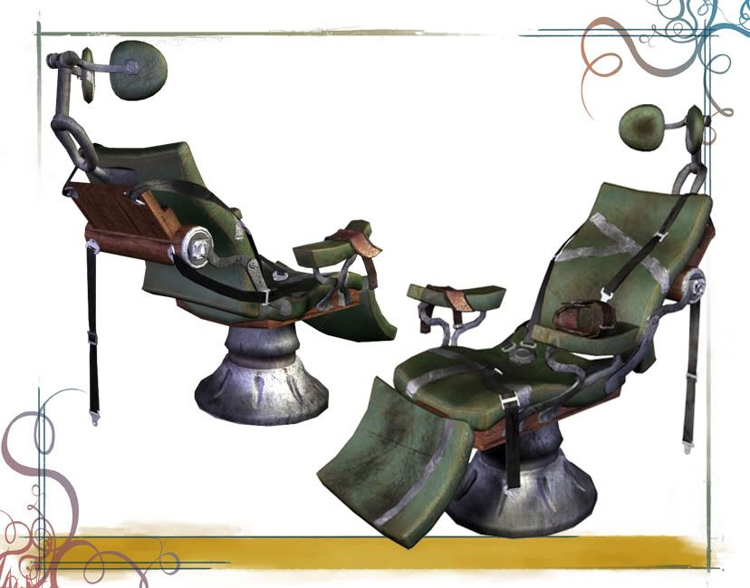
biggest critique thus far is that I'm having some issues making the "tight leather" look more like leather, I'm not sure if it's the texture or the just the "squarish" model that isn't doing it for me, but i guess i'm not getting the illusion that it's made out of leather.. well, open for critiques! thanks guys, appreciate it!
Replies
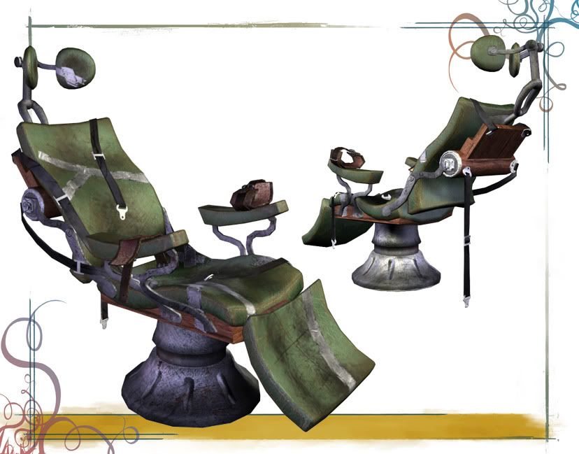
Leather cushions for a chair like that should have some shine on them, this needs to be defined in your specular map. You should also sculpt some small wrinkles along the edges of those cushions on your highpoly model and bake them into your normal map. That should help.
You should also bake or paint some ambient occlusion from the straps onto the cushions, that should help the harsh transition between those two elements.
The metal bits could really use some more worn edges to help define them in the spec map as well. Check out this tutorial.
http://www.iddevnet.com/quake4/ArtReference_SpecularMaps
It's a good start just keep cranking away on it
Also, it wouldn't be a bad idea to play with your values and separate out the shapes a lot more.. like the bed could be brighter than the metal, substantively. Unfortunately right now everything is blending together.
thanks again