The BRAWL² Tournament Challenge has been announced!
It starts May 12, and ends Oct 17. Let's see what you got!
https://polycount.com/discussion/237047/the-brawl²-tournament
It starts May 12, and ends Oct 17. Let's see what you got!
https://polycount.com/discussion/237047/the-brawl²-tournament
Swizzle's thread of stuff and things
I recently came to the realization that, while I have done a lot of 3D crap, a lot of it hasn't been finished or polished to the point where I'd want to put it in a portfolio. Since I have a ton of unfinished things just lying around waiting for some love, I figured I'd start a thread in hopes of getting the kick in the rear I need to get stuff done and into online portfolio form.
Once I get the thing below done, I'll start going back through older work like an unfinished Dominance War entry and several smaller characters and posting it all. Any comments, critiques or whatever else would be all kinds of awesomeness; I want to have a decent portfolio done in the next few months and any help would be greatly appreciated.
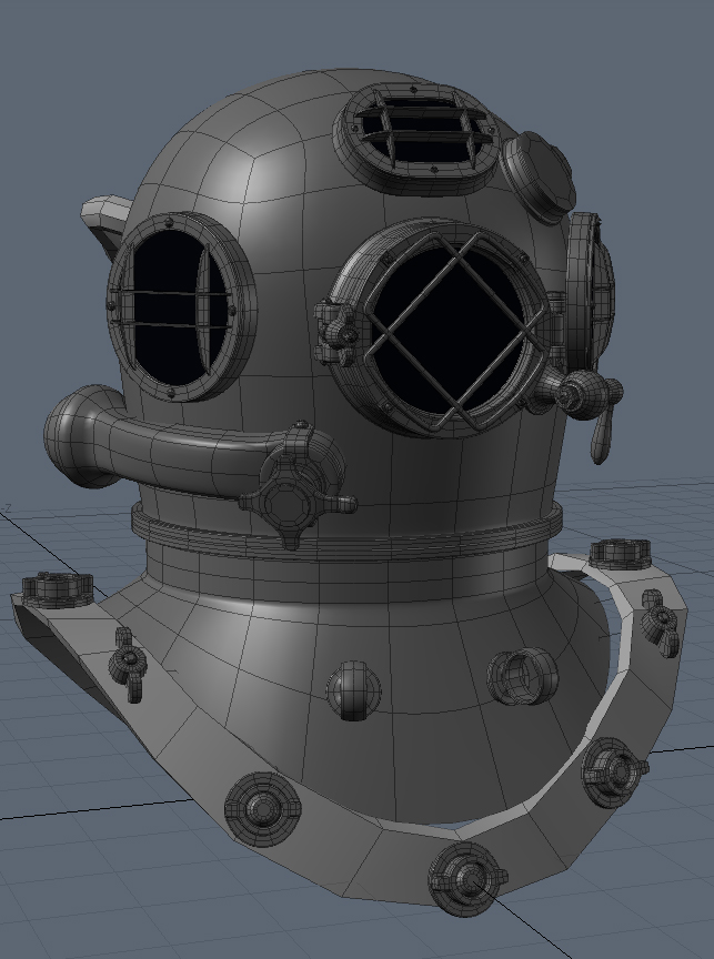
Here's what I'm working on right now. It's a diving helmet based on the one in this image. I'm using it mainly as hard surface sub-d modeling practice, but I'm going to be making a low-poly and some textures for it as well. It's not finished yet; I'm going through and replacing placeholder geometry with more detailed stuff as I go, so that's why the rim around the bottom still looks blocky. There are still some gaps between the various pieces and the actual body of the helmet, but I'm going to bring this into Mudbox to add some welds, scratches and dents which should fill things out a little.


Replies
All flavored with a add of another material like rubber that that connects as a ring with the bottom and other entries and perhaps some stained glass that looks as if mud and dirt already run down the glas a few times and get stuck at the bottom of each glass ring shape.
right now your model does not tell that many stories - but it could be interesting
Thanks! I saw that in the WAYWO thread and rounded off some of the edges a little more. I think a few of them catch the light a bit better now, but it's not all that noticeable.
renderhjs:
I hear ya. Getting some good metal textures is going to be the most important thing for this. I like your suggestion about the stuff running down the glass and puddling; that could look really cool on the end product.
I think I'm ready to call the high-poly done now. I took it into Mudbox and added welds and a few dents, but I was a bit scared of going overboard so I tried to make them fairly subtle. I'm going to be adding more surface detail once I start doing the textures anyway, so I don't want things very noisy.
Next up: Low poly and textures.
I've thought about doing a full character, but I think that's a little more work than I'm willing to put into this at the moment. This started out mainly as some hard surface modeling practice to prepare me for future projects, so I think I'm just going to do the helmet.
carlo_c:
It was pretty simple, actually. I imported it as three separate chunks into Mudbox; everything I didn't want to change was locked on one layer and then the base shape of the helmet and the shoulder/chest piece were on their own layers. Then I just went around everywhere I wanted welds with the wax brush until things were looking right. There were a few areas that needed a little smoothing, but the process was basically just building up until I got the right look.
I'm not quite sure which direction I want to take the textures yet. I know I don't want them all hardcore grimy, but I also don't want it looking like it just came off the workbench. I think I'm probably going for a used but not completely old and battered look.
In case I gave the impression that I was completely pissing my day away, here's proof that I actually got something done.
The normals and AO pass are about 50-60% done and I still have optimization to do on the actual model, but I'm going to wait until I finish baking stuff to really decide what to take away. There are a few areas (like those nuts around the rim of the shoulder piece) that could stand fewer polys that won't affect the silhouette and won't screw up the UVs or normals if I modify them, so I think I can still trim some off. It's pretty heavy right now at about 6000 tris and I want to cut at least a couple hundred off that before I'm done.
I wasn't sure when I started if the welds would read as well as I was hoping, so I'm glad they work.
rasmus:
That's partly my fault and partly Modo's. Modo doesn't do smoothing groups, so the only ways to get sharp edges are to use a material that affects every edge on the model depending on how sharp it is or to break verts. I'm nowhere near done with the baking, though, so I may use xNormal for some parts and Modo for others. xNormal seems to have an easier time with hard surface stuff.
The diffuse and specular are very temporary. I've a lot of work to do on them and I'm just laying down some basic colors to get an idea of what the final product could look like.
cant wait to see it in discoloured brassy glory
Now, which one looks less bad? I'm leaning towards the bronzey-colored one and I'm thinking about giving it back the brass fittings and stuff. Should it look more like that original image, or a little grittier?
As of the two choices right now, I like the one on the left. But with some light oxidation on the other one, it could look really sweet. Good job!
I think you're onto something there, Valandar.
Here are some new experiments along with the flats. I'm not sure if I want to keep the textures at 2048 as that seems a little overkill; the loss of detail really isn't that noticeable from any sort of distance if I scale them down. Eh, we'll see.
Changing things from steel to copper/brass only takes turning a couple of layers on or off, so right now this is pretty simple to get working.
Here are the flats:
And some closeups:
There is WAY too little contrast in it. There's more contrast in the diffuse (which makes no sense for metals) at the moment. Right now i think you've got it kindof backwards -- your diffuse is holding most of the data, and your specular is hanging out in the midtones. Take a look at Earthquake's flats from the fps weapon thread contest: http://img67.imageshack.us/img67/727/texturepg0.jpg
(source)
Obviously it varies by material, but you're going to want more than you have here, it's very matte plasticy.
Personally i like to think of specular in three approximate 'layers'. The base brightness for the object's overral specularity/sheen -- i think you've got that down here. The less speculary grimy, rusty layer darker over this, wearing away the unformity of the highlight and creating some visual interest is next. And then on top of that the brightest, shiny bits, nicks and scrapes and wear.
Greatly oversimplified, grey (base), black (wear), and white (shine!). You pretty much just have the 'grey' right now.
quick and dirty 3dsmaxover of the idea; basically, push your spec!
I'm going to try to make it look like something that people would actually use. Maybe not very tidy people, but at least people who take the larger bits of gunk off when it gets dirty.
SupRore:
This was very good advice. The specular isn't terribly noisy and there's still a lot of detailing that needs to be done, but your advice has still been very helpful. I'm kind of struggling with getting the spec to look right, but at least now I can get a better idea of how I can improve it.
EricV:
Nope! Definitely not finished. The spec and diffuse still have a pretty long way to go until I'll be satisfied with 'em.
Here's a little update. I haven't really touched the diffuse since the last post other than to slightly modify some edge colors, so most of the work was on the specular. The one on the right has no spec and the one on the left has spec turned on, but it's the exact same lighting otherwise.
Still lots of work that needs to be done.