Home 3D Art Showcase & Critiques

walther p22

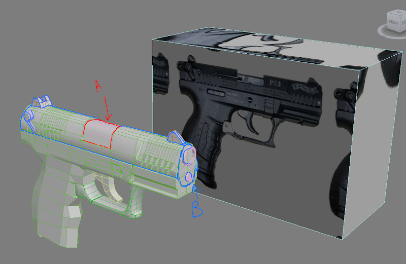
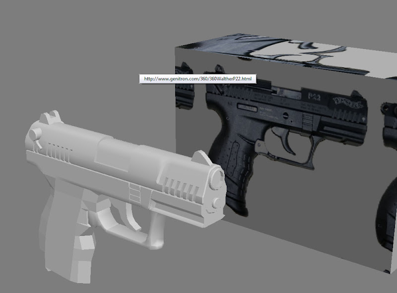
I decided to make a normal mapped gun. Here is an early WIP on the hipoly.
gun%20wip.jpg

gun.jpg

I was going to wait until I finished the hi poly, but I have a question:


Do you think that A and B should be the same piece? Or should I make A and B separate the way a real gun operates?

Crits welcome, of course I know I don't have much yet. Wanted to field that question before I went any further. Thanks in advance!

Replies

  • Joseph Silverman
    Offline / Send Message
    Joseph Silverman polycounter lvl 17
    Same piece if you're not going to cut the detail into the slide (so just a smooth box with textures), obviously. Go ahead and make them separate for a mode this detailed, it aids animation AND saves polygons. Looking pretty good all and all, man. Does that handle smooth alright, though? I notice you've got it flatshaded and it looks like it might be iffy, it's probably worth a few more tris if you're gonna normal map this thing.

    Am i mistaken, or is this gun/image used in an old videotutorial? are you referencing it, maybe?
  • dolemite
    SupRore:

    Thanks for the feedback. I think I'm going to model it out separately.

    The handle is still way unfinished. This is the highpoly for baking normals. I was in between the blocking out shapes phase and the high detail phase when I suddenly realized I had to make a decision about how to model the slide.

    I'm not sure if this is used in a tutorial somewhere. It's a gun I had could find good references on.

    At this rate I felt like I could never be a true polycounter until I made a gun and put it in marmoset :)
  • Snader
    Offline / Send Message
    Snader polycounter lvl 15
    gunedit.jpg
    maybe like this?

    highpoly looks good so far =3 the back of the slide looks a bit too smooth though
    are you gonna keep true to the reference as close as possible or using your artistic license a bit?
  • renderhjs
    Offline / Send Message
    renderhjs sublime tool
    lol looks now like a kid toy :D
  • EarthQuake
    The notches are not extruded shapes from the main form, they are cut out of the form, leaving a straight, flat edge.

    With high poly meshes in general, its best to model in as many separate pieces as possible, things in real life are constructed from multiple pieces, so why should you try to model everything as one big chunk? This will also give you a lot of freedom when it comes to setting up your lowpoly for animation etc.
  • OBlastradiusO
    Offline / Send Message
    OBlastradiusO polycounter lvl 11
    The width of the barrel is too thick.
  • dolemite
    Look I'm not making the gun pink and green, OKAY!?!?!!

    oh, i get it.... :)

    Snader: Yeh I think that is how I'm going to make it. I have a diagram of the gun, and that part near the ejection port will be modeled separately.


    Does anyone know what that cover piece is called on the ejection port?


    EarthQuake: I think they are cut into the side the right way. Perhaps it is a bad screen shot, or maybe I made the notches too deep and it looks wrong. I'll have to revisit this....


    OBlastradiusO: You are right.

    Thanks all for the input! Updates coming soon!
  • dolemite
    pistol.jpg

    pistol2.jpg

    highpoly update. I'm preparing to leave the country for a bit and won't be able to work on this for a while. But I will be able to read feedback :)

    thanks all for the crits so far!
  • Ninjas
    Offline / Send Message
    Ninjas polycounter lvl 18
    Looking cool. One thing I noticed is that the edges seem very sharp. It will probably look okay once the normals are baked though.
  • bluekangaroo
    Offline / Send Message
    bluekangaroo polycounter lvl 13
    neat-o! not much to crit, proportions look good, but those aliased edges are really bothering me
  • dolemite
    waltherp22.jpg

    2675 triangles.
    2048 OS normals. Spec. Color.

    So I baked it all down and put it in Marmoset. Still trying to get the hang of the toolbag.

    Any crits are welcome! Thanks to everyone who has responded so far!
  • Cody
    Offline / Send Message
    Cody polycounter lvl 15
    Wow! This turned out great. The only crit I have it the barrel. It looks very flat. I think you could spare some polys to model it out. Nice work my good sir.
  • Ninjas
    Offline / Send Message
    Ninjas polycounter lvl 18
    I think this turned out really great. At first I wasn't completely sure about the high poly, but the bakes look very realistic. Not sure why you aren't getting more comments.
  • Luke_Starkie
    Offline / Send Message
    Luke_Starkie polycounter lvl 8
    The gun looks Brilliant man :D !
  • renderhjs
    Offline / Send Message
    renderhjs sublime tool
    yup great result
  • BradMyers82
    Offline / Send Message
    BradMyers82 interpolator
    Looking really nice from those shots. I'd like to see some higher res images and the texture maps though.
  • dolemite
    waltherp22.jpg
    waltherp22_color.jpg
    waltherp22_normals.jpg
    waltherp22_spec.jpg
    waltherP22render.jpg
    Here's the final update with sheets. I scratched a few things up a little more on the sides. Didn't want to overdo it.


    Thanks everyone for the feedback! There's a lot I can do better next time, but I think I'm about ready to call it done. I'm particularly unhappy with the unwrap that I did. Also, a few lines on the handle aren't really correct :( I hope to get better economy out of my next sheet. Right now I just kind of want to move onto something new.

    thanks again. You all are too kind.
  • beartraps
    Offline / Send Message
    beartraps polycounter lvl 8
    good job man. I modeled a P99, these guns are pretty challenging and u did a nice job. U didnt really get any stretching in your UV map as well, those circles on the handle got stretched out in mine on the back of the handle.
  • RickFX
    hey im impressed! it didnt look that good in the beginning, id honestly say, turned out AWESOME. great work, thumbs up!
  • killingpeople
    Offline / Send Message
    killingpeople polycounter lvl 18
    i'm not a fan of how you went about adding your scratches, they're built up like dust in the chamber and wobbling over the edges and looks too painterly, rather than tattering high points on forms and logical places. it's looking great, i just think you could do better with the scratches.
  • SHEPEIRO
    Offline / Send Message
    SHEPEIRO polycounter lvl 17
    on reading KPs post i can see what he means, but i dint notice it befor, good job
  • dolemite
    thanks all again for the comments!


    KillingPeople: you're right on! I'm kind of done with this piece (have obligations I need to catch up on), but I'm going to try and do something better with the scratches in the future. Will probably experiment with other brushes and things.

    thanks everyone!
Sign In or Register to comment.