WIP Watertower
polycounter lvl 17
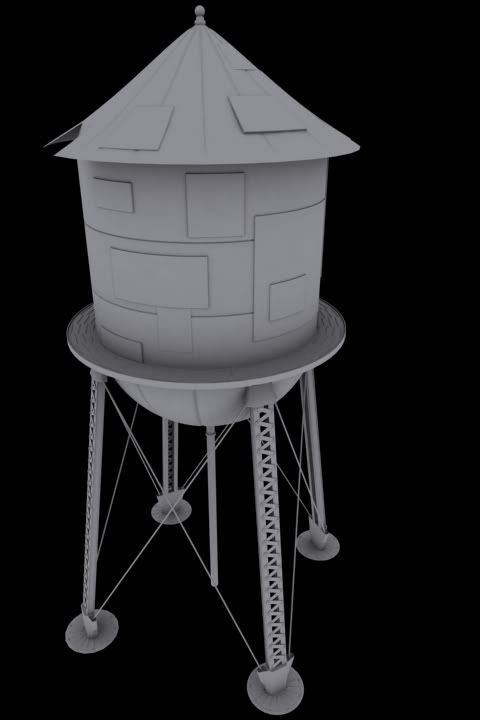
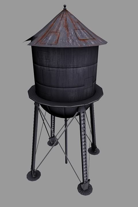
Hey PC's! I'm working on a water tower for a school project. I'd like to get some critiques from you guys see if I'm headed in right direction. I got 50% of the diffuse done...I think. It's a 2k tri limit, and this one is sitting at 1981 tris.
Hipoly
Thanks for watching, and happy memorial day!
Hipoly
Thanks for watching, and happy memorial day!
Replies
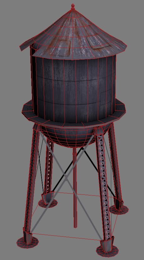
The very top element has quite a lot faces for such a small scale you could probably reduce it.
Diwan: i think there are some areas that can easily be optimized a bit.
first off you have (or appear to have) a redundant loop in the circles at the base, and you could take out 1~2 loops from the roof without any visual difference
secondly i think you could very well replace the half sphere with a geosphere - those are a lot
more efficient.
then you could use those extra polies to put a rim around the roof and make the walkway a bit rounder.. and add the crossbars HJS mentioned
texturewise you need to watch a few things:
right now the rust makes a fair amount of sense, but the metal doesnt. you can see the texture continuing on the loose plates which looks odd.
the entire thing could use a lot more color variation. there's more then 1 metal color you know =P
and don't forget to add more soot and moss etc.. you could even add some alpha planes or something if you really want to weather it down
like the plates. They need more color variation, maybe even a completely different metal texture applied to them. And the grunge would react to them differently. The roof looks ok, but the body just looks half done.
As for the modeling.... seems like you could cut a few polys out of the rounded bottom of the water tank. Could get same result with a few less loops and some smooth norms.
With the polys you would save from doing this you could... imo if you bent one of those panels back and had some water busting out would be dope. Would really bring this thing to life. If not that then I would recommend maybe puting up some logo or text on it. Usually it is the name of a town or a sports team or something. Like this maybe....
Otherwise I like this better than the parking meter. Keep up the good work man.
Take a look at some more reference to see how plating is actually used on water towers and other objects.
You can have plates haphazardly slapped on to thingsl ike this, but the way you've done it looks like it is made solely out of haphazardly placed plates.
think of it like this: This water tower's main hull is constructed of several large plates and the "haphazardly placed" ones are there to repair the main hull's structure, say where there was a leak, or a puncture. So slapping plates on things haphazardly isn't bad, but use them more sparingly so that it appears that at one time this thing was engineered as a single working object and has been jimmy-rig repaired over time.
on the texture. the plates that you've put on these guys have the exact same texture running over them as the parts they are covering. mask out these areas where the plates are and make them of different materials, colors, and have different types of streaking going down them so they will read as different plates instead of looking like a slapped on texture with an attempt at breaking it up with a normal map.
The texture is very flat at this point. Try overlaying some graidents on top of the phototexture, or doing a clouds layer over it and using it as a mask on an adjustment layer to gradiate different colors through the boring grey/white of the photo.
All parts of the texture at this point seem to be the exact same photo. Break up the different sections of the texture and give them different levels of value to differentiate between certain areas. As of now they all blend in together as one.
Saturate some areas, desat other areas. Don't be afraid to use colors on metals, it'll make them more interesting. Also with your rust and grunge. Rust doesn't have to be one color of orangey red, it can b e all sorts of different colors, even on the same material so b reak up your grunge by changing some sections. This can be done with levels or even just hue/sat adjustments pretty easily.
Here's a paintover that illustrates my ideas.
I dont know how far along your are on this wip. Most of my suggestions are probably things you already planned on doing anyway but I figured it type it out anyway.
Sorry for the sloppy ass paintover but you get the idea
PS - make an awesome SPEC MAP!
make it more interesting by paintings, a real lighting setup (now its just a view port modeling grab - not fancy at all)
also regarding the plates - I think like now they are to smal and rather look like star wars the death star
to rectangular and smal
I was aware of the dullness of the color, wasn't even close to be done, however all you guys have valid points and I've taken bits of everyone's comments and put them together. Still not finished, mostly focusing on the diffuse on the bigger parts at the moment. I threw on a quick spec to see what kind of effect I would get out of it, nothing fancy at all. I also changed the support beams to geometry instead of alpha planes. I'll be doing the railing and other misc props on the side to populate it more.
Does it make sense that some new waterflow from the top have run down and given some specularity?
Thanks again
http://forums.cgsociety.org/showthread.php?t=373024
specifically the "all layers" checkbox on the paintbucket tool is what will give you a great effect if you play with it the right way.
More color! More character! Keep going sir
Also, I really think you should add some thickness to the basepads and the roofing. they look realllly thin
The first one without the red roof is a better one imo. I like that you did change it up and really made the other one different. The worn paint look turned out pretty cool. Maybe something other than red, i don't know. Maybe blue or green. Just a thought. I like the addition of the text on the sides as well.
Good work on this project man. Came a long way. Keep up the good work. You decide what your doing for project 4 yet?