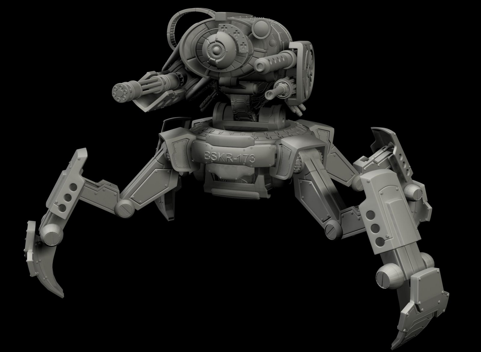
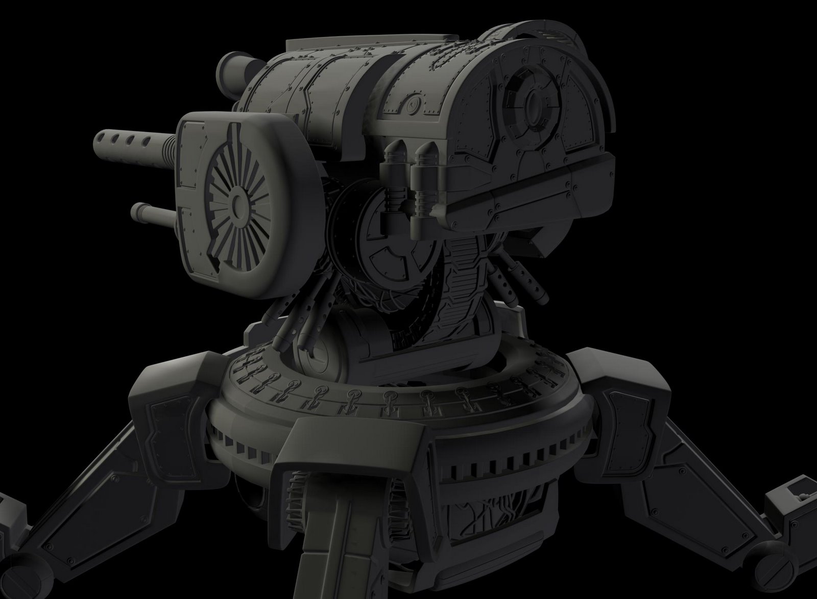
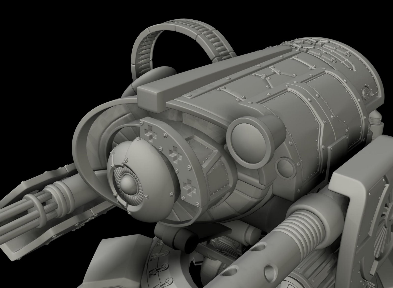
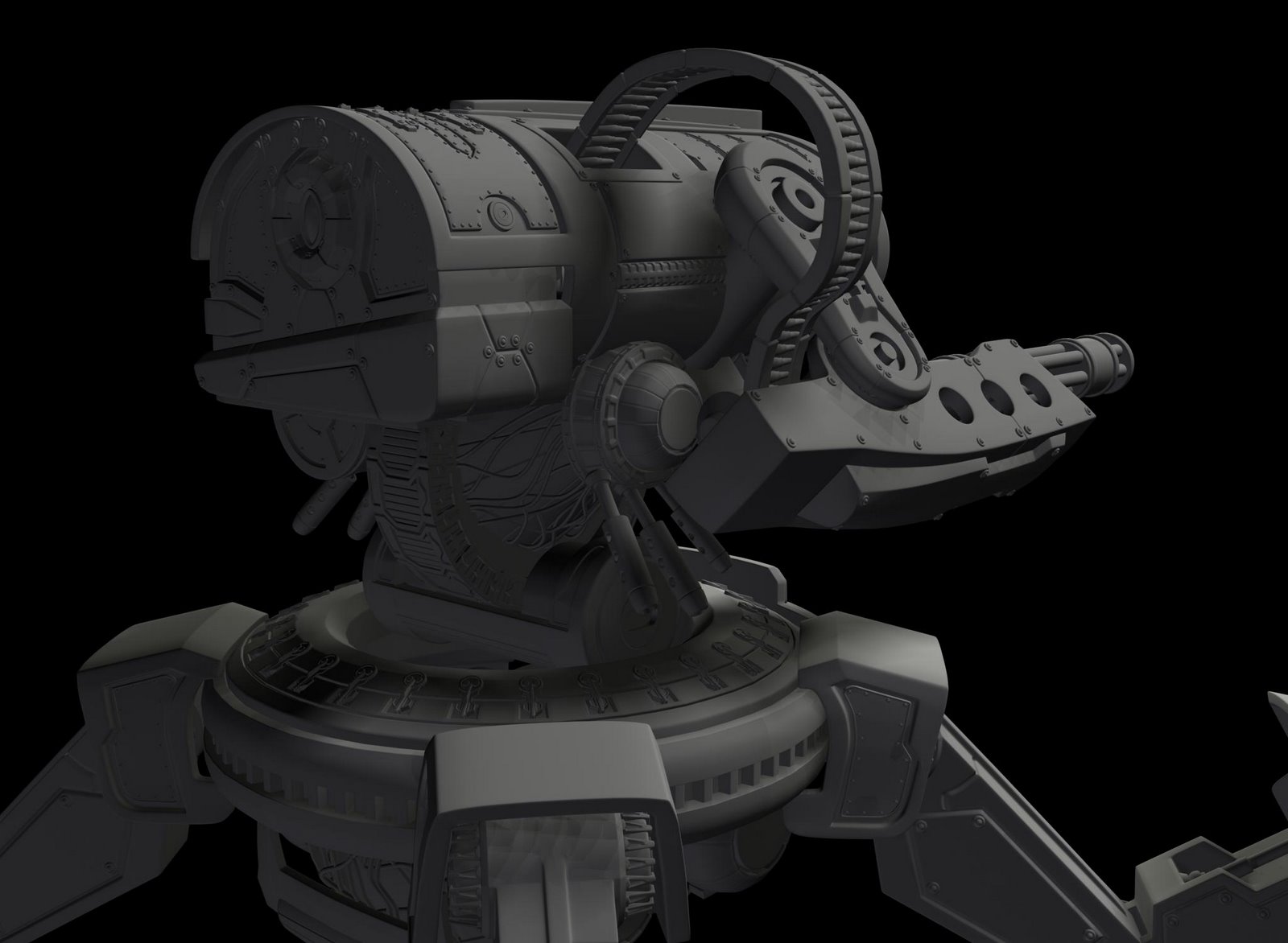
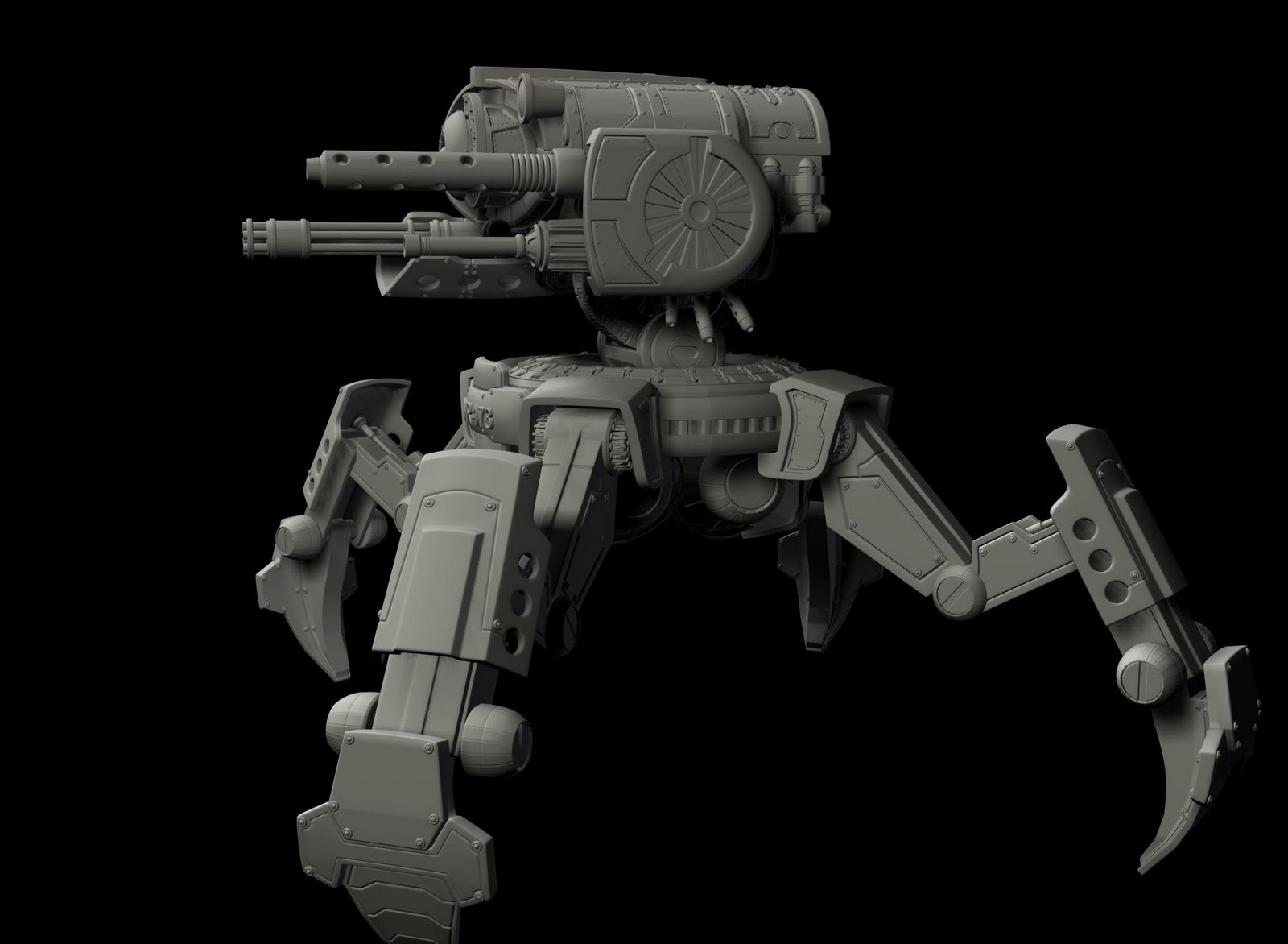
Sentinal by Tim Graybill
hey, my name is Tim Graybill I am a 3d artist trying to get into the game industry. I wanted to post up some of my new work and see what people thought about it. this is a work in progress, I'm just about finished with the high poly modeling and I'm about to start with the normal mapping and textureing. let me know what you think. and if you want to see more of my stuff, you can see it at timgraybill.com
Tim Graybill
tg@timgraybill.com
timgraybill@blogspot.com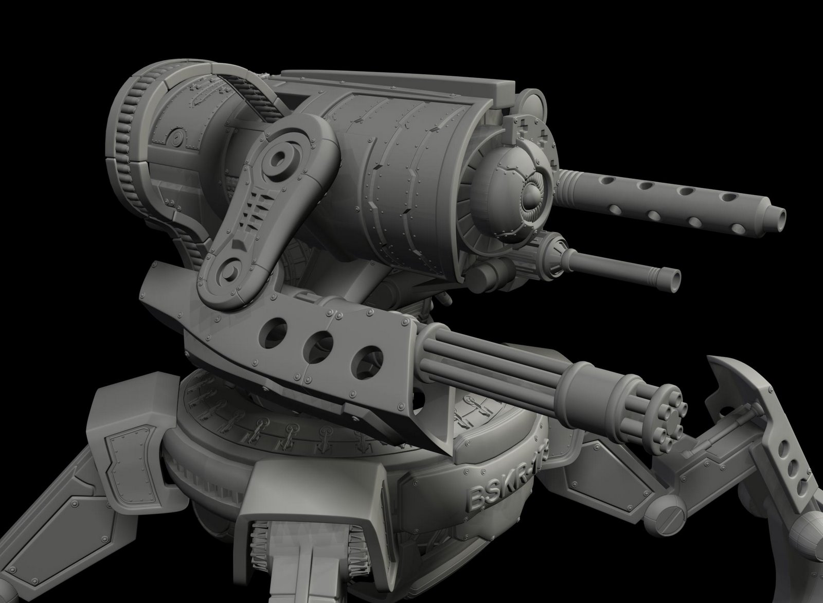
Tim Graybill
tg@timgraybill.com
timgraybill@blogspot.com
Replies
Your architectural renderings are top notch. Great work there.
Spelling across the board needs a lot of work. "specualr map", "Great full", etc.
Your "About me" says you have developed "Your own process for developing high detail, high polygon..." etc. What is so great about "Your process" that makes it correct/better than everyone else's process?
Screenshots are way too small, un-savable, and give no indication to who you are if I did want to save them and show them off.
You show no wireframes or high res source work in your screenshots. Sorry if they are in the video, myself as well as anyone else looking at this most likely won't even bother with the video.
Your "Misc" section is questionable. If it is unfinished or incomplete models, you are telling the world you don't know how to finish a sculpt and see it through to completion.
If you want to be an artist, make the first thing I see your 3d work, not your demo reel.
Your wooden pedastal makes no sense when showing a sci-tech vehicle or a venom-spitting monster. It doesn't fit.
Most people don't use bump maps anymore.
The majority of your spec maps would not pass in today's shader systems. Black and white versions of your color map don't cut it.
Just to name a few.
Keep it light HTML with pictures. Simple, easy, fast and clean.
why do you have such small shots of your work. I can't see anything. You have your site and your art. Your art should be the main focus of the site. The largest size you have look like some peoples thumbnails...:(
to slow transitions in the animations and gallery- makes me want to close it right away - it really needs to respond quickly - otherwise people like us and the ones that review yours later for a job will close it right away.
Another let down is the tiny tiny size of each image once you click on it - really not big enough at all - which is a pity because you seem to have some renderings with lots of details to look at.
Having a home section is the worst thing you can do these days in webdesign - its simply outdated because websites are not like diaries unlike they are blogs. The reason for that is that with a regular website like yours its very unlikely that you will update the front page on a regular basis if not never. Now why should anyone see it then each time they enter your domain? - just leave and start with the gallery right away because that is the core content of your portfolio.
Aside from that since you are using flash it is almost impossible to simply save the images. Same btw. for your email address. If I would be a possible employer I would have to manually copy- type your email address to my adress book and by some chance I might even mess that up because I mistook a I with a l or something like that.
I am not sure what standards are for resumes these days at game companies but at least in the advertising industry PDF is the standard and word quite absolute. My suggestion would thus be to offer at least a PDF file since more people can open a PDF as lets say the *.doc format (my computer even screamed at me saying that I need to install some office shit...)
ok lets get to the content
I think your strongest pieces are the architectural renderings - would be nice though to know what part is really yours. Like is the design of those houses also yours, or did you do that in a architecture agancy- if so with who together ect.
The demoreel is quite nice- it has some clich
i really wanted to get feedback on my new piece on my blog spot. check it out.
timgraybill.blogspot.com
it's...
http://timgraybill.com
if you cant see them then look at my blog at
timgraybill.blogspot.com
Thank you Dekard, I was not going to look...
It's there and it's not at the same time.
Work on that. Oh yeah and the page feels a litl laggy.