Home 3D Art Showcase & Critiques

WW2 Environment

dummyyou
polycounter lvl 15
Offline / Send Message
dummyyou polycounter lvl 15
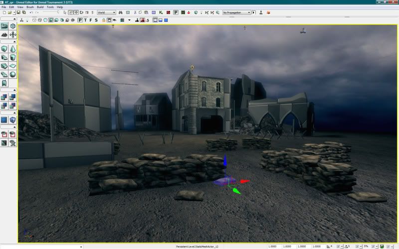
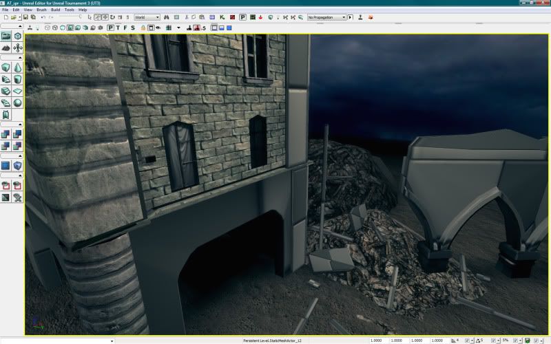
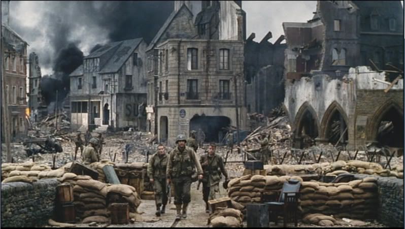
Hi. After seeing all the cool entries for Scene from a movie comp, I thought i would give it a shot. Iam using screens from saving private ryan as my refrence. Heres is were im at so far. This a weeks worth of work here so nothing is near finsihed yet. Screens are from UT3. Comments and Crits would be awesome :D
Screenshot016.jpg
at_full.jpg
at_closeup.jpg

I plan to put another 2 to 3 weeks to fully finish this piece.
Replies

  • sampson
    Offline / Send Message
    sampson polycounter lvl 9
    haha man i was going to make this scene once.... i still have a link to my refs which might help: http://home.samroberts3d.com/files/MOVIE%20COMPETITION_v3.rar i dont think theres a password. if there is leme know.
  • Ben Apuna
    I'd say you're off to an ok start. You might want to consider getting some more placeholder geometry in there so that you can more accurately place everything in relation to everything else. It will also help identify how much you can get away with modular design and instancing. As you complete the different pieces you can easily replace the placeholders with the finished ones. You might also want to get a generic human character in the scene to check scale and proportions with. As for more specific crits it might just be your camera in unreal but it seems as though your central bulding and the arches to the right of it are too far back right now, in fact all of them look a bit too far back... Also the brick textures you have on that central building are way off scale compared to the ref image. Those slightly arched windows you've got on the 2nd floor are flat in the ref as well, or are those damaged bricks that are making the windows just look like they are arched? I like your debris pile, it's looking pretty good. I'm sure your sky is a placeholder for now but it needs to be more of a overcast desaturated daytime rather than a cloudy afternoon. Hope that helps, keep it up :)

    Edit: I hope that didn't come off as overly critical or anything, I guess it all depends on how close you want to get to that reference image.
  • wisebrownmonkey
    I agree with "Ben Apuna." You need to get everything in place. If you start texturing now, you won't want to move stuff around if you have to. What I mean is lets say that after you get everything is put into place, you may have to get rid of something, but if it's textured you won't want to get rid of it, becasue you put so much effort into it.
  • dummyyou
    Offline / Send Message
    dummyyou polycounter lvl 15
    Ive been slowly working on this with my freetime. I decided not to keep it 100% to the movie stills so i changed a few things so it would look better. Been super busy with work and trying to finish school.. I took the crits you guys gave me and this is what ive come out with. Still not 100% but getting there :D. Eveything is mine except the smoke emitters ( <- Epic's).
    Also. thank you to sampson for the ref pics. They were great!
    photobucket1-1.jpg

    photobucket2-1.jpg
  • jacob07777
    Offline / Send Message
    jacob07777 polycounter lvl 15
    That's lookin pretty good man. Quite a bit of work to pull off all by yourself, but it's definitely paying off. My only crit. would be on the lighting, not sure if you're done with it yet, but the scene just looks a little dark. I like the shadows and the darkness of them, but try to lighten up the rest of the scene a little bit so we can see all of you're great work on them buildings and ruble. Can't wait to see the final version.

    Are you gonna get any tanks or vehicles in there? Cuz that would be awesome!
  • Minos
    Offline / Send Message
    Minos polycounter lvl 16
    Looks nice but I don't think your lighting is helping to show your architecture. I think you should try to follow your reference pic more closely lighting wise. Use a desaturated blue tone for the shadows and an almost white tone for the sun light.
  • bluekangaroo
    Offline / Send Message
    bluekangaroo polycounter lvl 13
    its looking good...quite an ambitious project
  • Thewiruz
    Offline / Send Message
    Thewiruz polycounter lvl 16
    Looks awesome!
    Can you explain how you textured the houses,Is it modular ?How many diffuse maps per building?Tileable textures?Or unique for each one?
  • c0ldhands
    Offline / Send Message
    c0ldhands polycounter lvl 15
    Looks nice, this can turn out pretty awesome. Only thing I would say is that the pics are too green for me, the original picture look more like blue/greyish, kinda marine blue atmosphere.
  • AnimeAngel
    HAve to agree, the lightning needs work, but its coming along nicely. Thats alot of modeling and textures. Any idea How long have you spent on it so far?
  • Firebert
    Offline / Send Message
    Firebert polycounter lvl 15
    Looking good so far man... this will be great once it's done!
    One thing I noticed in comparison to the ref is the arches on the right. They are recessed and tapering inward where you have them extruded outward.
  • DarthNater
    Offline / Send Message
    DarthNater polycounter lvl 10
    Lookin' good. Reminds me of that one Multiplayer level in CoD2.

    The lighting looks like it's a scene that is inside and just has a blue light on it. Tone up the lighting a bit, do what Mino said...

    Also, the spec looks a little too high on those ruins on the right side of the screen.
  • Neox
    Offline / Send Message
    Neox godlike master sticky
    i agree on it beeing too green it is looking really strange and somewhat destroys the atmosphere
  • dummyyou
    Offline / Send Message
    dummyyou polycounter lvl 15
    Thx for all the crits and comments.And to answer the questions, All the building were made with tilable textures and they are modular. Ive been working on this project every weekend for 4ish weeks now. Ill post a updated version soon. Working on the lighting and still importing a few assets.
  • dummyyou
    Offline / Send Message
    dummyyou polycounter lvl 15
    Alright.. Heres an updated lighting screen. I took out the greenish tint and brighten it up a bit. crits and comment plz . thx
    newcharpjpg-1.jpg
Sign In or Register to comment.