Home 3D Art Showcase & Critiques

PortSide

interpolator
Offline / Send Message
Gannon interpolator
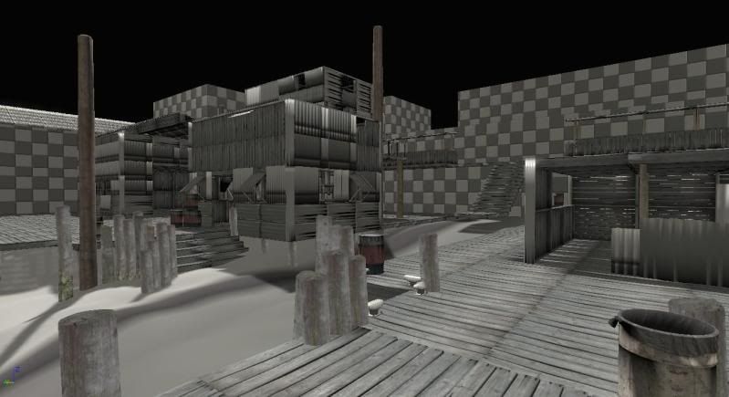
First actual post with work. I started about a week ago modeled a few, textured a few. The corrugated metal sheets are being re-textured because the base was too noticeably repeating. I've laid out just about everything I've got modeled so far. I'll be bringing in Doors, windows and other decorative pieces in this week.

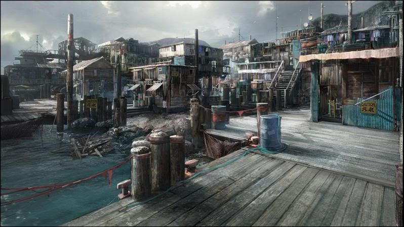
Probably looks familiar, one the the AILA students was kind enough to let me take a whack at it. Not sure who the concept artist is, I couldn't find the exact picture on the site they linked me to.
Pic1.jpgPort_01.jpg

Replies

  • Cody
    Offline / Send Message
    Cody polycounter lvl 15
    Looks like a good start. I think the trash cans/barrels could have some more color to match the concept. I don't like how so many game environments end up looking so drab and gray nowadays, with some exceptions, and I would love to see this keep the great color and mood of the concept. Another thing I notice is that your version seems a bit cramped compared to the concept, could just be the field of view, but I think spreading it out a bit more would be nice. Keep it up!
  • ericdigital
    Offline / Send Message
    ericdigital polycounter lvl 13
    You AILA guys always have these killer concepts but never know who they are from, Personally I think there needs to be a bit more effort in giving credit where credit is due, noticed this a few times now.

    On the flip side looks like a good start. Looking forward to seeing its progress.
  • Ged
    Offline / Send Message
    Ged interpolator
    its not hard to find out who did it, its from stranglehold, I remember seeing it in the game
    http://features.cgsociety.org/story_custom.php?story_id=4094&page=2

    nice work so far but its all a bit gray, maybe you can play the game to see if you can get some inspiration its UE3 too.
  • Gannon
    Offline / Send Message
    Gannon interpolator
    Cody wrote: »
    I don't like how so many game environments end up looking so drab and gray nowadays, with some exceptions, and I would love to see this keep the great color and mood of the concept. Another thing I notice is that your version seems a bit cramped compared to the concept, could just be the field of view, but I think spreading it out a bit more would be nice. Keep it up!

    I agree about the color thing as well as the cramped space. I noticed that as soon as I put them side by side, so that's being addressed as well.
  • Gannon
    Offline / Send Message
    Gannon interpolator
    update: Fixed the corrugated metal texture to fit a little better. Got some better contrast out of the wood and relaid the map really quick to give some breathing room.
    Untitled-1-1.jpg
  • Cody
    Offline / Send Message
    Cody polycounter lvl 15
    nice improvement. keep crackin!
  • Gannon
    Offline / Send Message
    Gannon interpolator
    Been really busy, I've only been able to work on this a little over the last week. I'm trying to pick up a part time job otherwise I've gotta move back in with the folks.... no bueno.... Anyone have any free-lance jobs available? lol

    Anyway here's the update. Everything's just a diffuse map currently. I'll do the others a little later.

    Update1.jpg

    Update2.jpg
  • Sage
    Offline / Send Message
    Sage polycounter lvl 19
  • SHEPEIRO
    Offline / Send Message
    SHEPEIRO polycounter lvl 17
    alot of your proportions are off, everything looks a tad chunky, esp the corrugated iron i know this means less polys but i think it will hurt your overall feel
Sign In or Register to comment.