Home 3D Art Showcase & Critiques

Cyborn - A railshooter student game project o.0

keyframe
Offline / Send Message
EbolaV keyframe
Hey folks i decided to make a thread for the 2. scene for of my student project at the games academy in Berlin. We are a biiiig team of 7 people. I can tell you who makes what at our team if someone want to know . The game projects are the main part of our school to learn and be prepared to work as a team in a "professionel" way and what it needs to make... games and run into a wall with that xD haha. Maybe someone know my first scene i created in the past. I want to improve some parts there but its more lightingstuff. I started that scene with the knowledge to make... boxes and maybe unwrap them then... i found PC and everything changed. I learned tons of stuff (and still need to learn much more tons ^^) and i tryd to rework more and more that scene... i learned a lot but its more or less a little bit a fail that scene i think
Ok something about the game would be nice i think. Cyborn is a railshooter with headtracking and that wiimote control (for lightgun). Its in a "near" future where the most valuable things are organics. So everyone pimps his body or sell organics and the gap between rich and poor is extrem and the rich people use the police and mercenarys to steel organs from the poor. The player was one of those mercenarys who wasnt able to kill a kid for organs and the teammates killed the "hero". But rebels found him and "repaired" him with deadly stuff and send him out with his new powers to kill the guys who tryd to kill him and all those other milions of enemys xD

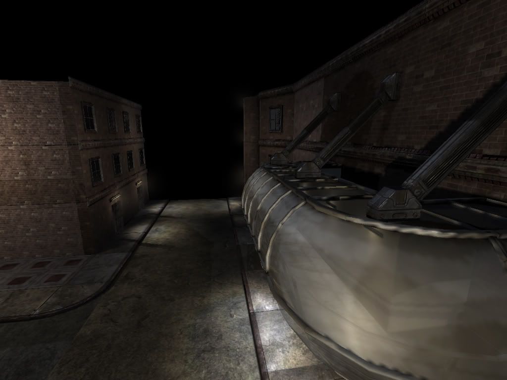
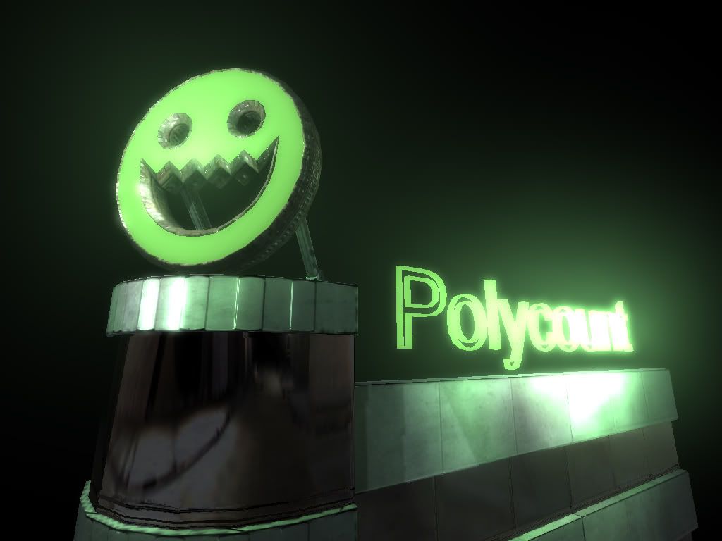
Its a future of megahuuge citys with different cultures side by side. Scene 1 was a kind of backyard and the room where the hero was rebirthed, dirty, dark etc. in scene 2 i try to get a mix of a bit eaststuff like tokio with a lot of advertising, glas/metalic and smoother reflective stones and western rough old stonebuilding (bricks etc.) i really hope i am able to get what i want to do in my remaining time at the school before i get kicked into that brutal world where everyone wants to eat me xD hrhr. I would like to show a little ingamevid if someone can tell me where i can upload vid and maybe in a better quality but i have some first pics of the second part. I started the last days with that please dont expect to much :P i wanted to build first some mainblocks and the area where the player will be at the start in scene 2 and that the game designer can tell me if he wants something changed etc. then i add first the more unique/asian buildings and then i have to see. Im not really experienced in making complete gameenviros by my own :/ sounds like a bad excuse hehe. My team is a bit chaotic :( i cant reach them often or its not easy, that sucks. And because i love PC i added my "extreme must have" now :D who knows what it is ^^ ok now some pics. if anyone would like to see some specific cool stuff i take every help i can get from you guys. im the only enviro guy here at my team x.x i try to keep you updated
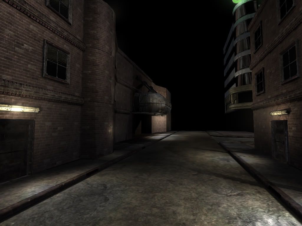
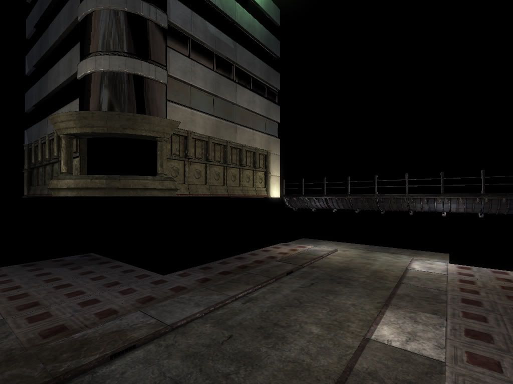
SceneViewer2009-05-1002-10-12-25.jpg

SceneViewer2009-05-1002-10-34-37.jpg

SceneViewer2009-05-1002-10-58-14.jpg

SceneViewer2009-05-1002-12-28-28.jpg

Replies

  • Fishypants
    Offline / Send Message
    Fishypants polycounter lvl 18
    That building in the second picture, looks like a building in tokyo, from the shibuya (or something like that) district . . . is that right?
  • EbolaV
    Offline / Send Message
    EbolaV keyframe
    yeah youre right :). its still wip but its from that district Shinjuku/Kabuki.
  • Fishypants
    Offline / Send Message
    Fishypants polycounter lvl 18
    Thats right! Yeah I knew it looked familiar. The only reason I know this is because I had to model that building and destroy it on an episode of Heroes. Modeled the whole street, with the train tracks and everything.

    So far so good, keep up the good work!
  • EbolaV
    Offline / Send Message
    EbolaV keyframe
    wow Fishypants thats cool :) i dont build that whole street but some of that and similar stuff. Have some updates. lantern baked and textured today and worked a bit on the scene itself. tommorow some new pics of the scene. here some of the lantern und an other object i did for the game the last days.

    lamppost_lp_01.jpg

    lamppost_01-1.jpg

    ventilator_lp_01.jpg
  • EbolaV
    Offline / Send Message
    EbolaV keyframe
    update time =) its still very dark. didnt do much on light cause its still more "worklight" to see something in editor of vision engine. but i hope you like it :)

    SceneViewer2009-05-1218-36-43-57.jpg

    SceneViewer2009-05-1218-37-24-03.jpg

    SceneViewer2009-05-1218-37-37-98.jpg
  • snake85027
    Offline / Send Message
    snake85027 polycounter lvl 18
    the fan is looking cool!
  • Pope Adam
    Offline / Send Message
    Pope Adam polycounter lvl 11
    I dig the neon :)
  • EbolaV
    Offline / Send Message
    EbolaV keyframe
    thanks guys :)

    update from today. a bit lightstuff (damn the notebook i use to work with the engine displays a different light then that i take the screens with :( )
    hehe i forgot 2 big letterdetails on the new building. think happened when my producer wrote with me :) add them later. work on some more standard old (cracked old stone) buildings and standard tokiobuilds (glas, metal) now to kick the brickparts and fill the scene with more buildings. it will take some time. maaan i like that scene now more then my first enviro i did for the game :D

    SceneViewer2009-05-1403-07-09-46.jpg

    SceneViewer2009-05-1403-07-31-71.jpg

    SceneViewer2009-05-1403-07-53-03.jpg

    bricks for the new motel building part
    brick.jpg
  • EbolaV
    Offline / Send Message
    EbolaV keyframe
    some new pics :) whoops didnt deleted that one door :D still a lot to do.

    SceneViewer2009-05-1809-03-08-42.jpg

    SceneViewer2009-05-1809-03-14-67.jpg

    SceneViewer2009-05-1809-03-39-10.jpg

    SceneViewer2009-05-1809-05-17-85.jpg
  • renderhjs
    Offline / Send Message
    renderhjs sublime tool
    it has a little bit duke nukem 3d feeling like the cinema level. The sushi building is the weakest building so far - its far more boring in terms of shape design and textures. Maybe add some more details to it - so its more appealing.

    What will fill the scene later are lots of small and tiny environment stuff like electricity stuff, wires, trash bags/ cans/ containers, ads, boards, sings, waste,...
    For a project chronos I worked on most of what we created were those environment things, little pieces that make out the scene. Those were like 60% (object amount, not time amount) of what we modeled and textured for the whole project.
    here are 2 screens of it
    http://renderhjs.net/portfolio/pages/page_14.jpg
    http://renderhjs.net/portfolio/pages/page_15.jpg
  • mLichy
    That's looking tight, I love the polycount Neon. How did you do that render of the bricks for the wall, the highpoly? It looks very similar to how Epic does their renderings, and it looks nice.
  • vladino
    Offline / Send Message
    vladino polycounter lvl 15
    renderhjs wrote: »
    it has a little bit duke nukem 3d feeling like the cinema level.
    ^^^ first thing that went through my mind :)

    I think it would help a lot for the presentation to add some environmental map and background.
  • EbolaV
    Offline / Send Message
    EbolaV keyframe
    thank guys for you replys. youre right renderhjs. i think the scene will looks much better with all its lightadvertises and other props, especially props for the "tokio" buildings.

    After a few days of break ( bought DoW2 :D and other reasons) im back on this scene. here are some updates. mhh i added a cloudy sky but the cubemapfunktion of the engine we use seems to not really working :/ cant see a sky. But started to make some simple background skyscraper, bullethole decals, advertise stuff, and windowstuff and worked a bit on the bridge. skyscraper will be hiden behind other buildings. currently they are bit flying in the background ^^ hehe. oh and the one lightadvertise have a missing texture... that engine wants to kill me -.- i save and save and save but its allways killing one or more materials "whoops i forgot to save your work after you pressed save that shit" damn :D

    SceneViewer2009-05-2323-46-55-53.jpg

    SceneViewer2009-05-2323-47-11-51.jpg

    SceneViewer2009-05-2323-47-37-81.jpg

    SceneViewer2009-05-2323-47-57-46.jpg

    SceneViewer2009-05-2323-48-14-75.jpg
  • EbolaV
    Offline / Send Message
    EbolaV keyframe
    still working on the level. was a bit busy the last days but some progress. hope you guys like it. in motion is that advertisestuff much more cool all those energywaves and cool stuff :D

    SceneViewer2009-05-2923-44-40-31.jpg

    SceneViewer2009-05-2923-45-21-00.jpg

    SceneViewer2009-05-2923-44-58-18.jpg

    SceneViewer2009-05-2923-45-11-59.jpg
  • Yozora
    Offline / Send Message
    Yozora polycounter lvl 11
    the black/red "text" of that building with the yellow flower logo is the wrong way round, actually half of it doesnt even look right no matter which way you flip them... did you just make them up? :o

    Overall the scene looks quite nice, keep it up.
  • EbolaV
    Offline / Send Message
    EbolaV keyframe
    whooow worked the last 2 days on the level. after some presentation, portfolio action and made the first applications =) but i still work on the level for my game. Oh yeah there are some bigger and smaller ut/gears models. i remodelled (hp,lp,texture etc.) them for training and because i love that stuff. I use them for my game. But that game will only seen by you guys and in school.... "studentgame" no commercial. hope its not that bad ^^ if yes... then i will hate myself lol =) have about 2 month left to finish it, hope so. I wait now for my game designer that he can tell me where he wants coverassets and that he create the enemypathing. I try to upload a video. Helicopter was made by another artist.... he needs 2 month for that low poly ;(

    some new coverassets (unreal engine)
    barrier_01.jpg
    barrier_02-1.jpg
    cyborn_cover_01.jpg

    and levelupdate... low lighting quality. many ugly shadows etc.

    SceneViewer2009-06-1200-41-48-03.jpg

    SceneViewer2009-06-1200-42-02-26.jpg

    SceneViewer2009-06-1200-42-15-65.jpg

    SceneViewer2009-06-1200-42-31-70.jpg

    SceneViewer2009-06-1200-42-52-07.jpg

    SceneViewer2009-06-1200-43-02-68.jpg

    SceneViewer2009-06-1200-43-21-28.jpg

    SceneViewer2009-06-1200-43-31-23.jpg

    SceneViewer2009-06-1200-43-43-35.jpg

    SceneViewer2009-06-1200-43-49-68.jpg

    SceneViewer2009-06-1200-44-08-31.jpg
    SceneViewer2009-06-1200-44-17-25.jpg

    SceneViewer2009-06-1200-44-39-85.jpg
  • EbolaV
  • Zack Fowler
    Offline / Send Message
    Zack Fowler polycounter lvl 11
    It looks like you've recreated a few assets from UT3. That seems confusing to me, to have a scene that would mix and match UT3 assets with your own designs. Not to mention ethically questionable. How would you point out in your portfolio which assets are your own design and which aren't? It'd be unethical for you not to mention where the designs are from, but it seems like it would devalue your original work to share a scene with borrowed designs. It doesn't help that the UT3 assets stick out like a sore thumb, either.

    Personally I'd say you should go with one or the other -- either recreate a scene from UT3 and make sure to point that out clearly, or stick to original designs. Or you could even take a scene concept made by someone else and try fleshing it out yourself, if starting a scene from scratch is too daunting. But mixing UT3 assets and your own is something that just doesn't happen in the professional world and having a portfolio with such scenes seems like a lot more problematic than it's worth.
  • SHEPEIRO
    Offline / Send Message
    SHEPEIRO polycounter lvl 17
    looking good but i think you could push the lighting to get a more atmospheric feel, use smaller light falloff so that yiu get more pools of light, and reduce any ambient or large lights you have

    also a little more atmosperic effects would be nice, say some steam from airducts, voumetrics,

    and add some decals, graffiti, dirt, rubbish on the floor etc to break up fairly plain texturing you have in places
  • rasmus
    Just a tip, but for a more authentic Japanese-city feel, keep in mind that there a pretty much zero buildings made of real bricks/mortar/stone slabs around.
  • warby
    Offline / Send Message
    warby polycounter lvl 18
    love the video !!!

    ... the weapon selection screen seams a bit intrusive something whee you could see whats happening in the background would be better !

    keep up the great work !
  • odium
    Offline / Send Message
    odium polycounter lvl 18
    Am I the only one that thinks most of this scene is waste...? Its a rails shooter, yet i'm seeing a lot of detail in parts that to be honest are never even seen, faces that wont even be visible in game.....?
  • Justin Meisse
    Offline / Send Message
    Justin Meisse polycounter lvl 19
    odium wrote: »
    Am I the only one that thinks most of this scene is waste...? Its a rails shooter, yet i'm seeing a lot of detail in parts that to be honest are never even seen, faces that wont even be visible in game.....?

    What? I'd like you to point out these parts because your post baffles me.
  • odium
    Offline / Send Message
    odium polycounter lvl 18
    A on a rails shooter is just that... on rails. You dont get to control where the player moves because its all pre-defined. There are buildings, signs, lots of edges etc, all of which will never actually be seen by the player... So why render them at all? Once you have your rough path just do what you can see, which includes large buildings AND small details. Whats the point in loading a large texture when only half of the mesh is seen, wasting the memory...?
  • Justin Meisse
    Offline / Send Message
    Justin Meisse polycounter lvl 19
    why build a unique mesh to fit the rail path when you can build modular pieces.
  • EbolaV
    Offline / Send Message
    EbolaV keyframe
    youre right odium but i dont think its that waste :/. Thats why i will wait now, while make some smaller props for street which will be more seen until my designer made the pathings how he want it. Then i have to cut away stuff and scale down textures etc. The problem is in our rail shooter you have minimal movement possibilities with the headtracking. you can move a bit to the left and right, go into crouch. I will have to look with the pathes what will be seen. The player will jump down of the helicopterplace and move back to the crossroadpart so stuff will be seen again and there will be a bossfight at the end. dont really know how that part will be played and seen. We are a bit chaotic team of students xD make a game, run with that against the wall and learning. I try my best.

    SHEPEIRO: i work on it. I started making the helicopterplace a bit more interesting with small volumes and lightspots. after process the lighting it didnt looked like in the preview xD work on some more atmoprops like planks for the windows dirt for the ground etc like you mentioned. thank you.

    rasmus: Maybe i make some more tokio buildings but we wanted a mix of the cultures and architecture. for example behind the bridge will be more industrial stuff and the crossroadpart is more "red light" and funplace. But i will take a look if i can make it more japanese.

    warby: will keep that in mind. Will tell my game designer. He made the interface. The weapon screen is new.
  • Shinsen
    Offline / Send Message
    Shinsen polycounter lvl 9
    sweet thang, me likey
  • EbolaV
    Offline / Send Message
    EbolaV keyframe
    ok some updates. worked on some smaller stuff and level itself. will post only 1 new "bigger" prop and new level pics. lighting still sucks. will work at the end on final lighting. some props can be grabed by the player with our cyberpower :/ and thrown like gravitygun in half life. oh and a little preview for our bossmesh... will be fun :D the boss needs some glowy party but we have the problem that if we use a glow material, everything that share the id loses specular effects and cause of that you cant realy see normal maps... sucks. I dont realy get the problem... another team had the same problem with that engine but they programers solved it. dont know why our proger dont ask the other team...

    streetsign_02_lp.jpg

    streetsign_02.jpg

    streetsign_01_lp.jpg

    streetsign_01.jpg

    SceneViewer2009-06-2004-11-42-64.jpg

    SceneViewer2009-06-2004-12-54-84.jpg

    SceneViewer2009-06-2004-13-24-67.jpg

    SceneViewer2009-06-2004-13-29-26.jpg

    SceneViewer2009-06-2004-14-17-43.jpg

    SceneViewer2009-06-2004-20-28-43.jpg

    SceneViewer2009-06-2004-16-57-95.jpg

    SceneViewer2009-06-2004-14-37-79.jpg

    SceneViewer2009-06-2004-14-57-85.jpg

    SceneViewer2009-06-2004-15-10-21.jpg
  • renderhjs
    Offline / Send Message
    renderhjs sublime tool
    some things are just to dark - just pitch black like the robot and most of the parts of all screenshots. I assume that will be fixed once you start with lighting
  • EbolaV
    Offline / Send Message
    EbolaV keyframe
    yeah i have a lot of work with the lighting soon... with all those possible lightsources there. also i would like to have some dynamic shadows for physicobjects and the enemies. The robot have some realy dark color. maybe thats why the robot is so dark.
Sign In or Register to comment.