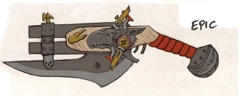
I think the biggest prob with this piece right now is material definition. As it stands its hard to tell what anything on this gun is made out of. The first and most obvious is the leather handle grib. Right now it looks like its just flat red instead of what I would imagin should be leather.
Same applies for the gold and the wood. The gold just looks like a yellow color and the wood isnt realistic enough or stylized enough to give off the look of wood. If you are going to go for stylized you really need to push that.
This also seems unfinished as it dosnt appear to have a grunge pass beyond the gun barrel connector. If that was a blade I would imagin it having a new scratches, nicks and dings along it. There would prob be some gun powder residue at the end of the barrel and dirt in the crevases. The straps of leather would most likey be born a bit along the outsides of each strip as the oil and wear from being held in someones hand.
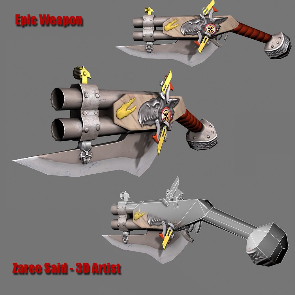
I do like the skull there on the blade, just wish you had your low poly wire showing the full model with normals so we could see how much is normal mapped on there and how much is geo.
Hey thanks for the crits, is this Anthony from Ai? I think I recognize your avatar My biggest problem is to get material definition, especially wood and fabrics. Do you have any suggestions? I'm guessing most of it lies in the specmap? As for the grunge, I intentionally wanted to keep it sort of clean because of the concept, but I guess you are right, if it doesn't tell any story then there is nothing interesting to look at.
Are those supposed to be two flintlock hammers? I don't see what they are supposed to be striking, either. They look exceptionally thin, as well.
I agree with the material definition. Look at a bunch of photos/some real wood, metal, etc. in real life and get a better handle on the specular and the color.
Like Autocon said, the materials look a bit off. I ain't an expert in WH mythology, but I guess the fantasy world doesn't have much in the way of guns, so it's for 40K? Anyway, you should do a darker wood and perhaps a bit shinier metal?
Also, it would look better and more to character of WH if you added some wear and tear on it and made it a bit darker overall. I like the dragon and the skull and the leaves that you zbrushed on it a lot. BTW, maybe take a look Kimono's "Knife dump" thread for reference on the blade?
Yeah I think this turned out dope man. You matched the concept pretty well. I see what people are saying about the color and the grunge, or lack there of. I like that you kept the the concept as much as possible.
I think for the edge of the blade it would have more a perpendicular type scratch to it, as if someone was using it to cut down through something. But if you think about it this would more than likely be used as a shank type rather than a slasher type blade. Sorry if this is confusing.... don't really know how to say what I'm thinking.
Anyways... have you picked what your doing for project 3 yet? Good luck man. Keep up the good work.
did a quick paintover for ya... higher spec, more wear, some additional scratches, and material def.
yes, the concept is pretty flat, its' a 2d drawing. I reckon you make your 3d object look like how a 3d object would when it gets used. Good work so far, but it could be made way cooler if you put some more time into the textures.
Ghostscape - I have no idea how this gun is supposed to work, but yeah I agree gonna work on the material this weekend.
t4paN - I checked it out, and yeah that dagger looks dope, thanks for the inspiration!
A.Kincade - Hey you another Anthony from AI! Thanks man, and you are totally right I think I tried to hard to match the concept whereas I totally forgot the sense of realism of how the gun actually would look when used and what not. But that's gonna change!
Pope Adam - Man that's very helpful paintover, thanks bunch buddy! And I guess I gotta train my eye to not follow the concept if its very plain made.
All rite, a second try. Thanks to all you guys comments I changed up the weapon a bit...well quite alot from the first pass of textures. Any further C&C is lovely welcome!
I'm not sure why you moved the center point of the barrel all way up to the front? Pull that back down the barrel no amount of texture tricks normal map or otherwise are going to give the illusion of depth, more then actual depth. If you're set on leaving it the way it is, then remove the extra loop.
It seems really low poly, I'd say this is about world model specs not player pers specs? But it depends on the game and the specs you where given.
The textures are coming along nicely. You should highlight the blade edges and maybe take out some of the imperfections in the blade. It looks like its made out of crumbly stone
Remember to take what the player will see into account, I'm not sure there is much for them to look at from the player pers. You could really go to town on the flintlock hammers, they're paper thin, check out some real world ref on flintlock they where almost as thick as the weapon.
I think there are too many conjoined pieces (looks like you traced the shapes) and I think they should be broken off so you can each its approate depth, which will have a great impact on the detail and would shave a few polys. A few of wich you could put into the wooden part to round out some of the really sharp corners.
Why not spend a few polys and bump out the metal embossed bird? Again from the players pers this will help greatly, since normal maps and standard diffuse maps fall apart when viewed at such angles.
They also seem floaty which might be noticeable from the players pers also? Pins and depth to the pieces could mask that pretty effectively.
Paint Over
1) Block in the colors. At this stage work at 100% opacity 100% hard edge brush. Squint to kind of see how the next step take shape.
2) Using smudge blend the colors together.
3) With some large detail "crap brushes" paint some quick rust and dull imperfections.
4) Using sharpen ever so lightly push a few areas to bring out the crap. Then take a small dark brush and nick the edges. Then switch it to a lighter color and paint in a few highlights around the nicks and in in other areas on the blade.
I'm not so sure I buy the idea of using rust on the end of the barrel as your grunge. Even a well used gun isn't going to be rusty, due to maintenance by the owner, it would however make a lot more sense for that brown "rust" to be something more along the lines of black powder residue.
It's looking better for sure but I would definitely take some of Vig's crits and apply them, especially the painting tips.
Hey Vig, thanks alot for your comments, it helps very much. The specs that was given where 1k tris and 512 texture size only. As for the center point of the barrel, it was just the shadow on my lighting that was off, didn't change anything on the mesh. It's just an AO and Normal thats giving that illusion.
I tried to do the way you made on the paintover, and I guess the results are ok, I need to work on it further though.
I don't quite understand what you meant here though.
I think there are too many conjoined pieces (looks like you traced the shapes) and I think they should be broken off so you can each its approate depth, which will have a great impact on the detail and would shave a few polys. A few of wich you could put into the wooden part to round out some of the really sharp corners.
What pieces is it you mean?
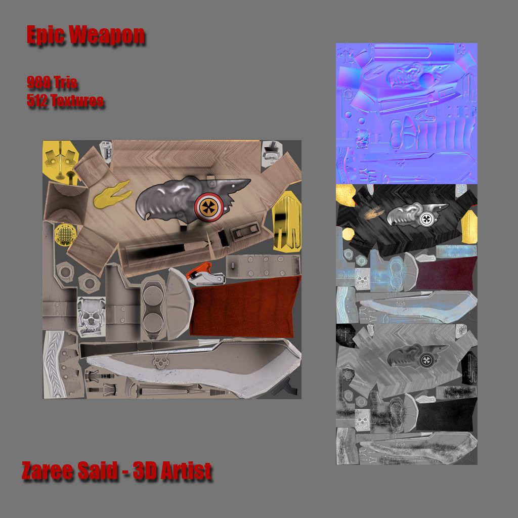
I wish I could spend more tris on the gryphn, but sitting on 988 right now I don't think I can manage to get there.
Mark, yeah thanks I actually was going for gun powder but it turned out brown haha.
The thing that jumped out at me the most was the little bit of metal holding the two barrels together. Those little screws on it have too much grunge on em. It looks like you just put the same grunge map on the little screws that you did for the whole bit.
I would say just either lighten the screws to create a nice little contrast with the grunge or remove the grunge from them.
Also, that little yellow flame in front of the griffins head is probably metal...not wood. Notice on the concept it has a highlight..which was probably intended to be metalic.
I do love me some grunge, but i think it's overkill on the barrels...the bottom one is fine...but the top one doesnt look like the powders coming from the front...it's just a general black grunge. And there shouldnt be that much grunge on the barrels that are closer to hte handle.
Love the leather handle in the back though. very nice. and that blades starting to come out.
1) This is a screw, looks very flat and attached to the backside of of #3, when it should be going through. Detach the head from the shaft, thicken both. Probably keep the shaft at 4 sides but rotate it 45 degrees on its local.
2) Same can be done for this piece.
3) This is paper thin, it needs to be thick enough to pinch #2 and hold it in place as the hammer swings. Right now it looks like it might easily loose it grasp. It also needs to be thick enough to hold #1. It is also missing the wing/feather detail.
Replies
Same applies for the gold and the wood. The gold just looks like a yellow color and the wood isnt realistic enough or stylized enough to give off the look of wood. If you are going to go for stylized you really need to push that.
This also seems unfinished as it dosnt appear to have a grunge pass beyond the gun barrel connector. If that was a blade I would imagin it having a new scratches, nicks and dings along it. There would prob be some gun powder residue at the end of the barrel and dirt in the crevases. The straps of leather would most likey be born a bit along the outsides of each strip as the oil and wear from being held in someones hand.
I do like the skull there on the blade, just wish you had your low poly wire showing the full model with normals so we could see how much is normal mapped on there and how much is geo.
I agree with the material definition. Look at a bunch of photos/some real wood, metal, etc. in real life and get a better handle on the specular and the color.
Also, it would look better and more to character of WH if you added some wear and tear on it and made it a bit darker overall. I like the dragon and the skull and the leaves that you zbrushed on it a lot. BTW, maybe take a look Kimono's "Knife dump" thread for reference on the blade?
Yeah I think this turned out dope man. You matched the concept pretty well. I see what people are saying about the color and the grunge, or lack there of. I like that you kept the the concept as much as possible.
I think for the edge of the blade it would have more a perpendicular type scratch to it, as if someone was using it to cut down through something. But if you think about it this would more than likely be used as a shank type rather than a slasher type blade. Sorry if this is confusing.... don't really know how to say what I'm thinking.
Anyways... have you picked what your doing for project 3 yet? Good luck man. Keep up the good work.
yes, the concept is pretty flat, its' a 2d drawing. I reckon you make your 3d object look like how a 3d object would when it gets used. Good work so far, but it could be made way cooler if you put some more time into the textures.
model and normals are good to go!
t4paN - I checked it out, and yeah that dagger looks dope, thanks for the inspiration!
A.Kincade - Hey you another Anthony from AI!
Pope Adam - Man that's very helpful paintover, thanks bunch buddy! And I guess I gotta train my eye to not follow the concept if its very plain made.
Thanks all!
Thanks for watching.
It seems really low poly, I'd say this is about world model specs not player pers specs? But it depends on the game and the specs you where given.
The textures are coming along nicely. You should highlight the blade edges and maybe take out some of the imperfections in the blade. It looks like its made out of crumbly stone
Remember to take what the player will see into account, I'm not sure there is much for them to look at from the player pers. You could really go to town on the flintlock hammers, they're paper thin, check out some real world ref on flintlock they where almost as thick as the weapon.
I think there are too many conjoined pieces (looks like you traced the shapes) and I think they should be broken off so you can each its approate depth, which will have a great impact on the detail and would shave a few polys. A few of wich you could put into the wooden part to round out some of the really sharp corners.
Why not spend a few polys and bump out the metal embossed bird? Again from the players pers this will help greatly, since normal maps and standard diffuse maps fall apart when viewed at such angles.
They also seem floaty which might be noticeable from the players pers also? Pins and depth to the pieces could mask that pretty effectively.
1) Block in the colors. At this stage work at 100% opacity 100% hard edge brush. Squint to kind of see how the next step take shape.
2) Using smudge blend the colors together.
3) With some large detail "crap brushes" paint some quick rust and dull imperfections.
4) Using sharpen ever so lightly push a few areas to bring out the crap. Then take a small dark brush and nick the edges. Then switch it to a lighter color and paint in a few highlights around the nicks and in in other areas on the blade.
It's looking better for sure but I would definitely take some of Vig's crits and apply them, especially the painting tips.
I tried to do the way you made on the paintover, and I guess the results are ok, I need to work on it further though.
I don't quite understand what you meant here though. What pieces is it you mean?
I wish I could spend more tris on the gryphn, but sitting on 988 right now I don't think I can manage to get there.
Mark, yeah thanks I actually was going for gun powder but it turned out brown haha.
I would say just either lighten the screws to create a nice little contrast with the grunge or remove the grunge from them.
Also, that little yellow flame in front of the griffins head is probably metal...not wood. Notice on the concept it has a highlight..which was probably intended to be metalic.
I do love me some grunge, but i think it's overkill on the barrels...the bottom one is fine...but the top one doesnt look like the powders coming from the front...it's just a general black grunge. And there shouldnt be that much grunge on the barrels that are closer to hte handle.
Love the leather handle in the back though. very nice. and that blades starting to come out.
1) This is a screw, looks very flat and attached to the backside of of #3, when it should be going through. Detach the head from the shaft, thicken both. Probably keep the shaft at 4 sides but rotate it 45 degrees on its local.
2) Same can be done for this piece.
3) This is paper thin, it needs to be thick enough to pinch #2 and hold it in place as the hammer swings. Right now it looks like it might easily loose it grasp. It also needs to be thick enough to hold #1. It is also missing the wing/feather detail.