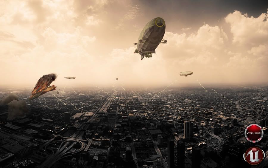
Airship for UT3 / Crysis
First proper bit of work I've posted on here since joining:
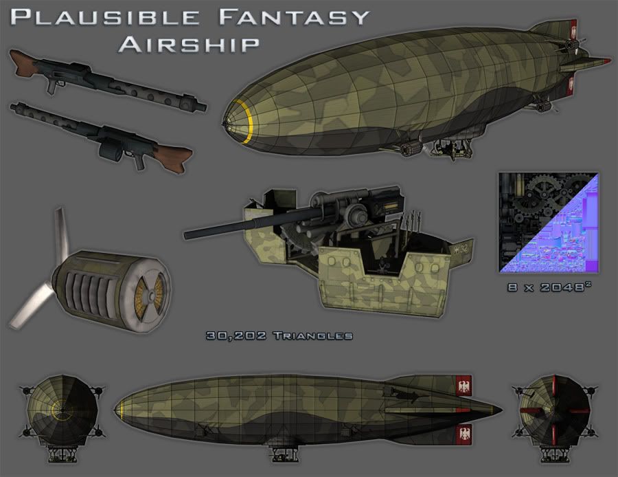
It's a "Plausible Fantasy Airship" I did for a Uni project. The idea was to take something unrealistic, in this case an airship with a massive gun turret, and make it look structurally sound.
Even though it's handed in now I'm going to try and improve it - and yes I know the textures are bland, downfall of my project was that I had so much to do and so little time!
Vanity Render (incl. post in photoshop)

Model Sheet

C&C welcomed!
EDIT: As title suggests I built the model for UT3 and Crysis and put it in both. Though it only works as a vehicle in Crysis.
It's a "Plausible Fantasy Airship" I did for a Uni project. The idea was to take something unrealistic, in this case an airship with a massive gun turret, and make it look structurally sound.
Even though it's handed in now I'm going to try and improve it - and yes I know the textures are bland, downfall of my project was that I had so much to do and so little time!
Vanity Render (incl. post in photoshop)

Model Sheet

C&C welcomed!
EDIT: As title suggests I built the model for UT3 and Crysis and put it in both. Though it only works as a vehicle in Crysis.
Replies
cool comp shot, maybe push the spec a bit more to get some better material definition.
I've just seen the extra engine loops myself and I cant for the life of me work out why they're there. Sigh... should have posted before I handed it in!
@ PixelMasher - The gundeck is designed to be stood on by a player, so most of the tricount goes into the cradle that holds the flak gun, the control system for the aircraft and the defensive machineguns.
Just for clarity: there are 8 diffuse and 8 normal maps, each 2048. 3 for the gundeck and machineguns, 1 for the flak gun, 1 for the girders that join the gundeck to the turntable (the big cylindrical bit), 1 for the turntable and 1 for the envelope itself. Pixel density for the player areas kept similar to UT3 vehicles, and bits that will only seen from afar are very low indeed.
Thanks for all the input guys!
Get a close up on everything, as from the players point of view. Let me see if those 8*2048's are justified, because right now, it looks like the entire thing is on two texture maps from this view.
Technicalities aside, I'm really diggin it. Make it awesome! :]
I've quickly grabbed some other shots to show the gundeck in more detail.
Biggest problem I had was that the textures were going to have a lot more detail in than I ended up having time for, so hopefully I'll manage to justify the huge textures... or cut them down!
EDIT: The extra loops of polygons on basically every surface was because I'd never normal-mapped before and held the mistaken belief that the whole thing had to be one smoothing group - so the additional loops were put in to stop it looking horribly blobby
2nd EDIT: My bad the far right image is normals with wires
so are you putting this into your portfolio for game art or just art?
it looks cool. but seems a tad overkill in textures. a lot of the camo stuff could just be a smaller tileable texture. I would also put a more interesting floor instead of camo. wood planks or rubber mats...?
Also, it appears you didn't create a proper low poly, rather your low poly is simply your high poly not subdivided. I say this because I can see all the extra cuts that don't change your low poly at all, unless you are subdividing. I think you should go back in there and start removing all those unused polygons to optimize this up.
I'm also interested in hearing exactly what maps you have for what. I would think in the most generous of cases, you might use 2x 2048 for the airship, and 1x for each prop. So the propellers and airship would be 2 x 2048 and each gun would be x 1 (2 + 1 + 1 = 4). So roughly half the resolution you currently have. Now if this is an issue with you transferring the maps, you could always down size your textures to 1024 and I'm sure the resolution would not look much different; if at all.
Show more close ups though man, I want to see what this all looks like (and include some flats too).
For now here are some of the maps (which I do admit need some serious love):
This is the camo scheme I copied, from an Ac119
I altered the actual pattern to be a sort of splinter camo/dazzle camo hybrid