The BRAWL² Tournament Challenge has been announced!
It starts May 12, and ends Oct 17. Let's see what you got!
https://polycount.com/discussion/237047/the-brawl²-tournament
It starts May 12, and ends Oct 17. Let's see what you got!
https://polycount.com/discussion/237047/the-brawl²-tournament
Environment: Alleyway Scene
Hi PC
working on this alleyway scene since last thursday. I've got a little bit of brushing up to do on my textures (the street light and garbage cans are the most obvious) and a little bit more modeling to do (the archway in the back of the scene). This is my last day that I'll be working on the scene and was hoping for some crits before I submit it.
tri count for the entire scene: 11896
Textures for the entire scene is around 4096x2048 at this time (estimate)
As of right now there are no normal maps or specular maps on anything.
Thanks for looking guys
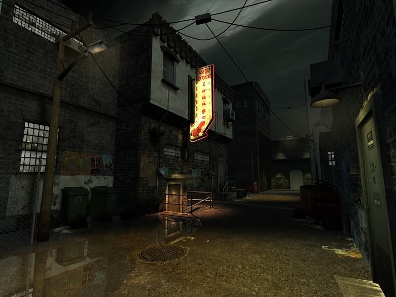
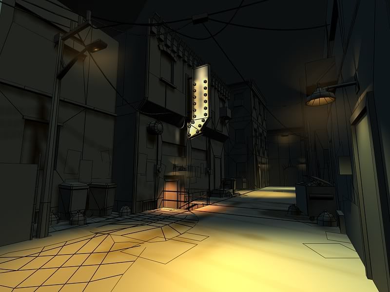
and here's a slightly diff. camera angle
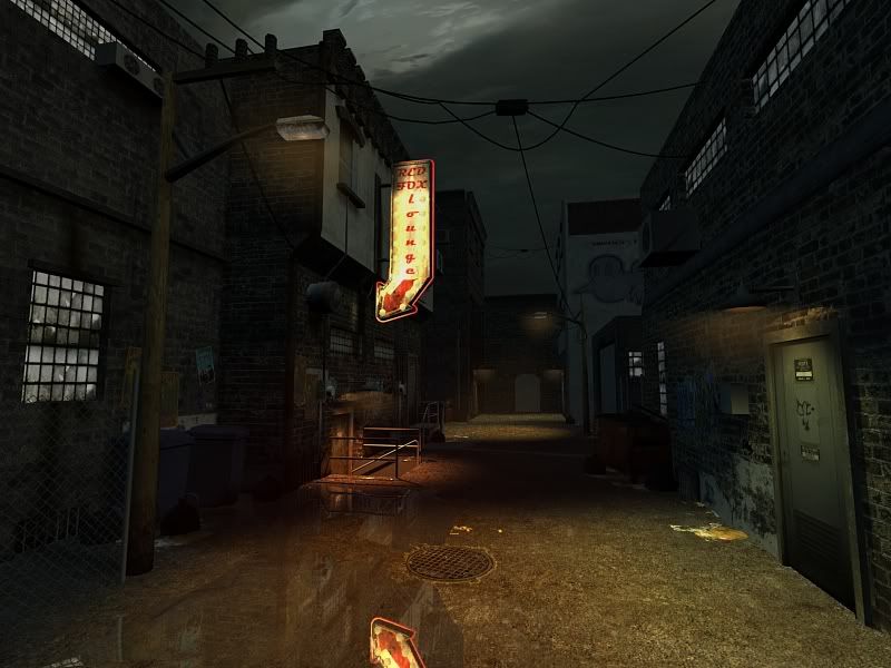
working on this alleyway scene since last thursday. I've got a little bit of brushing up to do on my textures (the street light and garbage cans are the most obvious) and a little bit more modeling to do (the archway in the back of the scene). This is my last day that I'll be working on the scene and was hoping for some crits before I submit it.
tri count for the entire scene: 11896
Textures for the entire scene is around 4096x2048 at this time (estimate)
As of right now there are no normal maps or specular maps on anything.
Thanks for looking guys


and here's a slightly diff. camera angle

Replies
I would extrude windows and doors inside the buildings too, other than that, I like the lighting
The biggest thing I see is that texture seam which runs along the building on the left in the foreground (you can see it run right along that edge above the cans/posters). Easy fix.
Lighting turned out good, can't wait to see how it does with normals/specs on stuff.
Mark - Yes nasty seam there! It's because that isn't a tileable texture yet cuz i've been lazy. good eye i totally forgot about that!
Not sure if I'm going to put any normals or specs on things... maybe just a few select things. MMO's don't always have 3 or 4 different types of maps on every object so I'll just pick and choose a few that I think need some more material differentiation.
Thanks again for the feedbacks folks. cheers
-adam
Good luck, any info on the limits on this? how many poly's, how much texture space, etc? Concepts?
Let us know how the test goes and good luck!
Best of luck good sir. Let me know how it goes.
Y don't I get tests anymore:(
1) The abrupt change in materials from the brick to the white plaster on the top looks really odd to me. It feels like it should still be brick.. If you want the plaster, maybe show that the building used to be made of plaster, and it's been slowly wearing off.
2) Normal mapping would really help, but you're doing that later you said
3) Maybe putting a subtle distort on the water pools would help? Right now they're perfectly mirrored. A little distortion would help a lot.
4) I'd put an emissive texture on your light meshes. They're really dark, but they're still casting a lot of light.
The ground is hard to read what the surface actually is. Right now it looks like dirt-crete. Where are the potholes, the cracks, the bad paint, the black gummy-gunk.
Would prefer to see some chamfers on the doorframe, the AC unit, and that box at the top of the light pole.
Never skimp on your walls and floors. That's the majority of the surfaces a player is going to see.
Were you given a budget for the triangle count? Or just trying to keep it low based on target?
I wish I would have posted this stuff up a day earlier, I would have been able to make all the recommended changes. I pretty much left the scene as it is, changed the composition a little and tweaked the lighting. I will go back in and add chamfers to all the cubey parts. I agree many of the edges are just too damn hard.
I put some normal maps on a few things... walls and sewer grates. To be honest I couldn't really tell a vry big difference between them being applied and not applied. Nvidia filter normals was all I had time for before my deadline, but i'll be making some nicer ones in the coming weeks.
Ott: True, I'll bump up the lighting on the sign for the next set of renders, and probably add a few more alpha cards to the ground to break up the flatness, and possibly add a few small details to the diffuse channel as a whole.
I wasn't given a tri budget or a texture budget, but I was instructed to simply keep in mind that this should be able to fit into an MMO type game, so I kept things as low poly (which in the end meant slightly boxy) as possible. I know now that a few chamfers here and there wouldn't add that much more to the poly count and probably would have been totally worth it. I'll be making those corrections asap.
Current try count is 12807 for the entire scene
current texture size is about 4096 x 2300 for the entire scene. Here are my final renders.
Cheers and thanks evereyone. Please continue to comment as I update - it's really appreciated!
-adam
These sorts of things will alter the level of detail you apply to each individual piece, as well as the scene as a whole. You should also determine whether or not the game is being built with a modularity heavy sense of design, and if systems such as decals are in place.
(This would save you a lot of trouble with UV layout, object creation, alpha mapping, etc.)
And moving forward, remember that Triangle Count shouldn't always be the biggest concern on a PC skew. Pretend you would be working on a game coming out in 1-3 years, and the expectation of PC performance is constantly escalating. Even WoW is putting tons more triangles and textures in their latest expansion compared to older stuff.
Make it look good, with a reasonable triangle count. You should also consider how their lighting engine works. If it is vertex lit, your scene wouldn't pass.
Why do your top renders look sharper than the last renders at the bottom?
I actually don't know exactly why my renders look sharper up top. When I did my final renders this morning I did them at a rather high resolution and then decreased the size of the image after compiling my sheet. Perhaps I forgot to have resampling turned on - eek!
I still have all of my high rez images. After class tonight I'll try fixing up these shots, although it's too late since I've already submitted.
This is just a render out of max. I'll throw it in Unreal in the next couple weeks while I tighten up all the loose ends.
http://www.visualphotoguide.com/tilt-shift-photoshop-tutorial-how-to-make-fake-miniature-scenes/
fingers crossed!
Excellent scene man, and good luck. I also liked the way your textures came out. One question though is 4096 x 2816 a passable size for something like this?
I literally wasn't given any specs to keep within, nothing more than "this should fit in an MMO style". I've never worked on an MMO, and have only played a few. I tried to keep everything down as best I could. Now that I'm done with the scene, I think I may go back in and reevaluate some of my texture sizes and such. All depends on what kind of feedback I get.
thanks for all the good wishes - fingers cross :P
which one looks better?
(go with the right one, please )
also your texture under the door looks like it is set to additive instead of modulate. In the right foreground the window should probably be casting a little bit of light out on the scene if they are that well lit. Toss in a few bounce lights in under the street lamps to help break up the darker surfaces like the wall between fore and mid-ground buildings, the area between them seems really flat. A couple of alpha planes for steam from the sewers might be a nice touch to add a bit more atmosphere to the scene. I look forward to seeing it wrapped up.
thanks for everything polycount! :P
P.S. maybe add some loose trash along the foreground and or middle of the alley. A lot of empty space right in front