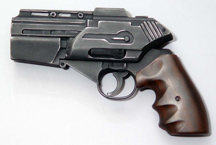
Looking at the model, scratches are a bit randomly placed, instead of smartly placed, if you know what i mean.
but after i opened up the texture sheets, I noticed you actually had a lot of work to place some decent scratches on the specular, but it doesnt really work on the final 3d piece, because of those random scratches! I'd say get rid of them, and you'll have one fine piece here!
The wood texture is definitely nice, but I'm not sure about the color. The wood in the original ref is a bit more redish, and I guess if you picked the same color for your texture, it would look much better! just try it out with a quick HUE change on PS, it would look like this:
Also the letters you added look a bit fake, you could try and wear them down a bit so they blend in with the metal or something, as it is right now it makes the pistol looks a bit plastic, and way too sci-fi'ish imho.
Apart from that, badass work! really inspiring for something I'm working on ATM!
i agree about the wood. it should be more red, less saturated, and darker. also could use some darker parts where the fingers rub against it usually.
i also agree with slightly less amount of random scratches. and instead of going with clearly defined scratches on the edges, id go with a bit more blurred, like its worn instead of scratched. the refernce you first posted shows this the best.
i wonder how it would look with the lettering pressed into the metal intead of painted on.
Looks very nice! But why does every gun model nowadays have soo many scratches? It looks like someone rubbed this gun on the asphalt just to "make it look cool".
Subtle edge work is ok, but placing random scratches everywhere doesn't add up to making your model look better. I know it's a little easy to get carried away with this stuff but you need to find a balance.
I agree on the discoloration instead of so many scratches. Some of the scratches make sense and can be seen in the reference. But some just seem like filler.
Looks very nice! But why does every gun model nowadays have soo many scratches? It looks like someone rubbed this gun on the asphalt just to "make it look cool".
Subtle edge work is ok, but placing random scratches everywhere doesn't add up to making your model look better. I know it's a little easy to get carried away with this stuff but you need to find a balance.
Well if you think about the setting, these weapons see heavy use and cannot be replaced... I don't really go for this level of wear, generally, but I think it's appropriate given the conditions. Plus I think it's altogether palatable from the FPV angle
The wood, yeah, the color isn't really right, it's the first time I've painted wood in a looooong time and I guess I was happy enough to have something that looked like wood that I just let it go But yeah, it's definitely not the distinctive red from the series, might change that.
Replies
NOOOOOOOOOOOOOO!
Your gun looks awesome though man, Looking forward to seeing some textures put on that beast
NOOOOOOO!
textures
but after i opened up the texture sheets, I noticed you actually had a lot of work to place some decent scratches on the specular, but it doesnt really work on the final 3d piece, because of those random scratches! I'd say get rid of them, and you'll have one fine piece here!
The wood texture is definitely nice, but I'm not sure about the color. The wood in the original ref is a bit more redish, and I guess if you picked the same color for your texture, it would look much better! just try it out with a quick HUE change on PS, it would look like this:
Also the letters you added look a bit fake, you could try and wear them down a bit so they blend in with the metal or something, as it is right now it makes the pistol looks a bit plastic, and way too sci-fi'ish imho.
Apart from that, badass work! really inspiring for something I'm working on ATM!
cheers
i agree about the wood. it should be more red, less saturated, and darker. also could use some darker parts where the fingers rub against it usually.
i also agree with slightly less amount of random scratches. and instead of going with clearly defined scratches on the edges, id go with a bit more blurred, like its worn instead of scratched. the refernce you first posted shows this the best.
i wonder how it would look with the lettering pressed into the metal intead of painted on.
anyway, great job.
Subtle edge work is ok, but placing random scratches everywhere doesn't add up to making your model look better. I know it's a little easy to get carried away with this stuff but you need to find a balance.
And yeah, the wood could use some variation, perhaps make it a little red and worn out may be a nice direction to go into.
I agree on the discoloration instead of so many scratches. Some of the scratches make sense and can be seen in the reference. But some just seem like filler.
Good work!
The wood, yeah, the color isn't really right, it's the first time I've painted wood in a looooong time and I guess I was happy enough to have something that looked like wood that I just let it go But yeah, it's definitely not the distinctive red from the series, might change that.