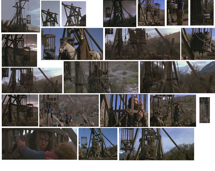
Daikini in a Cage.
polycounter lvl 16
This is 2 days of work, and I think I am going to start the cage next. I am hoping to use only a 1024 sheet for the whole thing.
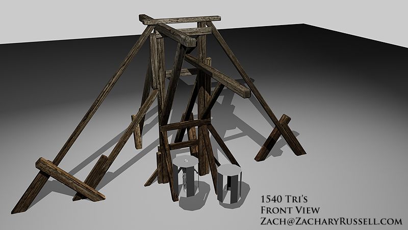
Ref Sheet
Front view
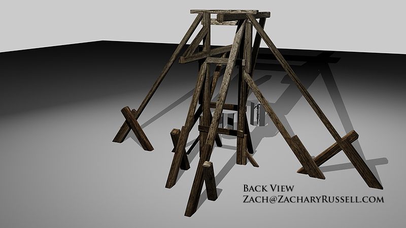
Back view
Please let me know how this looks so far, and I will update with the cage soon...
:thumbup::thumbup:
Ref Sheet
Front view
Back view
Please let me know how this looks so far, and I will update with the cage soon...
:thumbup::thumbup:
Replies
I feel like all the beams are all the same in size so some smaller/thinner beams would go a long way.- and based on the ref this structure seems much taller and spindly.
another observation from the ref is those cages seem much more tall/slim- similar in shape to a can of redbull where the ref shapes you currently have seem squashed like a can of soup.
Cage 1212 Tri's a piece
Front
Back
Let me know! Laters!
:thumbup::thumbup:
-Neil
I plan on putting more rope around the structure, it was just quitting time for me.
There are no normal maps applied in these screens, but I am taking note. When I adjust the color next time, I will try to make the blacks just a darker brown?
Thanks to you for the comments!
Wow, I really need to get that movie on DVD - used to watch it a lot when I was younger. Thanks for a childhood flashback!
I am going to try some bones and skulls and what not, no Madmartigan though.
Dude, I found my copy in the five dollar bin at the Wal-Marts...
I painted on the texture for a few minutes, tying to get rid of the blacks. Added some more ropes, and the metal plates.
Does this structure look like it could stand like this? I plan on adding even more rope, but it will be decorative rope, not used in the actual holding up of this structure. Does that make sense? Anyway here it is...
1. Is 864 tri's to heavy for that chain?
2. Which looks better the Orange arrow or blue arrow for a bush?
More screen shots.
Over head view port
From eye level?
I plan on adding more rope to the main structure, creating more bushes, trees, and grass, and getting the floor less blurry.
Tear it up!
2. ornj
3. more rope
1. portfolio piece
2. The ornj one is a plane with a PNG image attached to it. The blue one is 1300 polygons of me trying to create a dead bush model. Maybe, I will try again?
3. I added some rope to the base stand, and some to the cages to try to make them look unique. I think next for the cages is going to be fabric and cloth in the bottom of them.
New screens, let me know.
If you want to paint over where I should add rope, please feel free to do so.
the cages
Wireframe
What would you add/do?
why are all the textures different texel densities, your spending of resources is very imbalanced
and i think KP meant what type of game would it be for
I would also play with the values of the wood beams to separate them more. It doesn't matter what's realistic.. it's important that the object is readable.. and right now it's a bit visually mixed together. separating sections of the object by doing value shifts would probably make it a lot more readable.
Would you like to see the flats as well? I am working on making the wood stand more readable, and Festival Grass!
I guess it would be for an FPS?
The tiny boxes look really dense? Are they super important?
Instead of a slightly deformed plane how about put it on a pedestal base?
That might help you take shots from different angles and not be looking down on it all the time?
You are literally going opposite in your scene, where the biggest objects have the least, and the smallest have the most.
Don't render it and look at it from 100 yards away - imagine you are a player standing down there on the ground looking at this scene. The ground would look like shit, and the biggest support pieces of the structure would look worse than the smaller objects.
Making an object for a "portfolio piece" doesn't mean a potential employer won't be looking at whether or not your object would actually fit or work in a game environment.
here are the flats at 50 percent. I could probably leave them this size huh? Change the rope sizes? more Rock?
a close up of the cage/wood
Do they not look good close up?
Thank you Vig!
I see what your saying...I may change up my flat and take out to two pieces of wood at the bottom, continue the wood to the bottom and tile it...I never saw that before. :poly142:
I added some festival grass, a couple of broken cages, rounded the bottom of the floor so I can make it on a pedestal. I also tried to make some brates, and a broken crate as well. I tried to take the screens from eye level..
How is it looking? :poly122:
From the back
assets
The in the air view, see the paths?
honestly, when i look at the image, it's a total chaotic mess. I can't for the life of me distinguish one object from another. The reason for this is that you aren't controlling the values and color in your scene.
Take those rocks -- they're really bright, next to a dark ground. it's the highest point of contrast in the scene, and my eye is drawn right to them. the wooden object it's self, however, is the same value of the ground, and a similar level of saturation. Also, all of the planks are the same value, so I can't tell for the life of me what I'm looking at. the ropes are brighter.
it's a common mistake, to be honest. What you're doing is deciding on your values from the point of view of "what color would this object actually be" -- this is a BIG MISTAKE. you need to chose your materials to find a way to make the object readable in the context of the scene, and have it realistic somehow.
You need to consider this stuff even if you're actually going for something confusing and ambiguous. That shot that you took from the back is MUCH more pleasing, because it's tonal range is very simple and it's a very ambiguous composition.. it's an image that looks like it's ment to be confusing.. you've got all these funky diagonals.. it's abstract and nice. The pulled back shot, however, where we're trying to actually understand what we're looking at, is painful.
I would:
desaturate the ground
darken those rocks so that they blend in with the ground
Brighten those cages.. turn them metal if you have to.. or at least make them old, dry wood or something, so that they pop out.
basically flatten out the contrast everywhere in terms of color, saturation, and value, except for the areas that you want to be interesting.. make those areas brighter, more colorful, what ever...
The ground texture as mentioned looks too low res for the rest of the scene plus it would be nice to see some wear around where the poles had been dug into the ground.
I do plan on adding more things like you stated GCMP, but for now how do these colors look? I tried to give you the same views as above so you can compare.
Also there is too much visual noise in the texture which works like camoflage making it hard to pick out shapes from each other.
Dont mind the crappy paintover
http://i42.photobucket.com/albums/e305/muzzoid/bleh.jpg