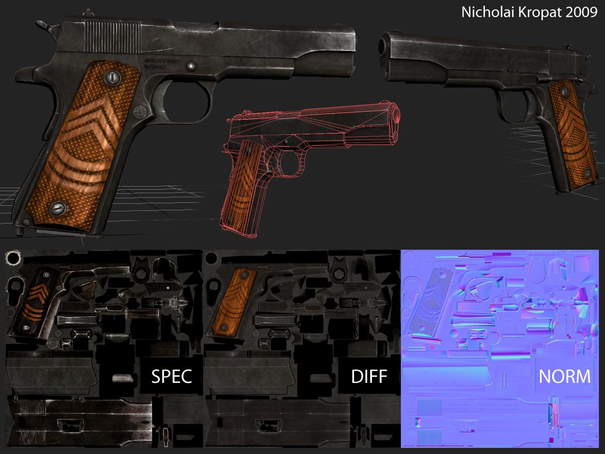
Texture crits needed - colt .45
Hey Gang
Ive been picking away at texturing this model for a while now, and I feel like I could really use some expert advice.
First off tho - I DID NOT model this gun. This was given to me as an art test (Epic fail) and I'm revisiting it now that I feel I have a clue what I'm doing. The model was pre-unwrapped, but I generated all the maps for it. This is the first weapon I have ever textured to this degree and the most involved normal map Ive made, so its been a huge learning experience for me. So far I have about 6 hours of work into it but I think I could do it again in 4ish.
I know I can do better than this, but Im not sure exactly what I need to work on, so if anybody would like to offer some crits I would really appreciate it! All screenshots taken from Max using Metalbump 9
-Nick

Replies
2. Work on the wood
3. Less random scratches and only scratches in areas where scratches can be.
further to what HAL said, the wood needs to be less saturated as well.
also the screws in the grip aren't round? especially the lower one. seems like it was baked this was too so the error maybe in your high poly model.
@ quyeno - Yeah, the wood is way too saturated - I agree. The screw on the bottom is tweaked on the maps... I tried for hours to get a proper render out of max and xnormal, but it always came out skewed like that. The example normal map that was provided as part of the test had the same distortion on it too, so I think it may be the uv's on the low poly. Short of distorting the maps in photoshop, is there an efficient way to fix this problem?
-N
e:// forgot to mark the good parts
Anyway those scratches at the edges n stuff
Crits:
- Maybe a bit too much wear. I don't know this particular weapons history but its seen a lot of use and damage. If this is for a WW2 style game, remember that weapons you find online are older then they would appear in the game. 50 years from the time of production to us, 2mo in the game.
- The spec might be a little over the top, since you're using color, mix in some colors to the metal. Try a very subtle purple or light blue.
- There seams to be some wasted UV space namely where the words SPEC and DIFF are. You could probably detach the wooden grip, pack a few pieces in its place and up res it. Not sure that's needed as grips are normally covered up but who know the purpose of the gun, if its only going to be shown this way you should probably change it up. Baking/projecting to a new UV layout shouldn't be an issue both Maya and Max can do it pretty easily. I'm not sure how you did your normal map so be careful if you rotate pieces if you plan to put the normal in the diffuse slot and rebake/project it that way.
- The screws in the grip look to be floating, not really recessed or flush.