The BRAWL² Tournament Challenge has been announced!
It starts May 12, and ends Oct 17. Let's see what you got!
https://polycount.com/discussion/237047/the-brawl²-tournament
It starts May 12, and ends Oct 17. Let's see what you got!
https://polycount.com/discussion/237047/the-brawl²-tournament
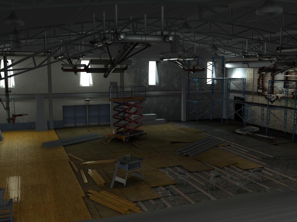
(WIP) Renovation Gym
this is my personal project I am working on right now. C&C are more than welcome.:thumbup:


Replies
and here is my new update. got some more of the roof done.
only comment would be to move the plank leaning on the workbench in the centre, it kinda draws the eye too much where it is - at least from this particular angle
For now i just feel bothered by window refletion on the left side of the image. It sort of takes too much attention.
Other than that, really nice to look at. Good stuff.
personally i wouldnt make an environment with so many parallel hard edges for 360 or ps3 as the AA (or lack of) would make it a fizzy mess. frequency of detail can be quite important to keeping good image quality on these platforms, but you can counter some of this by using normal maps with far less hard edges as this will give smooth lines due to filtering.
anyway as a rendered peice you have no issues with this, any plans to get in engine?
rossco1111: thanks I Will place it to a better place so it won't draws too must attention.
Matroskin: Will turn it down a bit, and thanks for the job info that's very cool of you. =] will try and apply for sure.
thewiruz: sure thing, will do that the next time I update this post.
tda: LOL YOU GOT ME !!!! =P I know the plank are not supposed to be shiny when they first installed it, and it should be polish after every thing are done ... but I was afraid that the scene will be a little boring since the floor plank and the base plank have similar color ... will think about to try it with unpolish texture in the end I guess, hope to finish it sometime this week.
SHEPEIRO:
To be honest I haven't have any plans to put it in engine ... but it sure would be interesting to see it in a engine ... don't have much experence ... but I've played with UT3 engine b4, so I just might do it if got time.
Will update soon hopefuly ... allergy is giveing me a hard time to focus LOL =P .
thanks guys
Mike
I should take notes for my own gym.
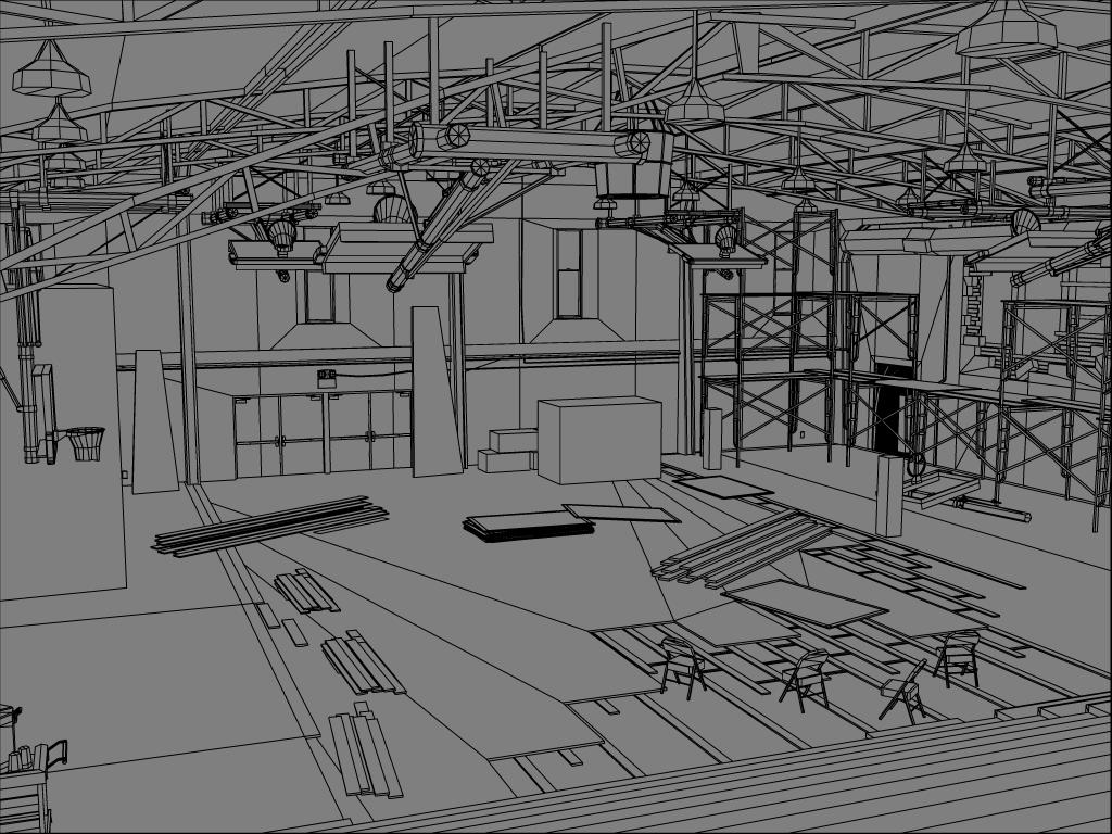
Can I see a close up of the chair wire frames? I've been failing at making nice ones for years. I've only done passable simple ones like you'd see in vice city, but they look like shit in a more detailed scene.
On a side note, I was looking at the wire frame of the first post while the textured version image was still loading. When it was done, it popped into place and replaced the wireframe version on my screen. I thought I was going crazy.
For the scene itself, it'd be good to have a focal point as well though it's nicely composited.
The reflections off the floor however, seems a little course to the usual laminated floor, what are your settings on that?