Texture work troubles.
I am trying to texture this machine thing, and I am having some problems around the corners. I cannot get them to match up, or at least look like they flow together ind of well. I am going to post the flat shaded and textured version as well as the texture flat. Also I am working in Maya.
Flatshaded
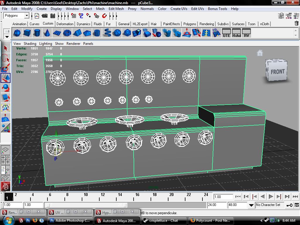
Textured
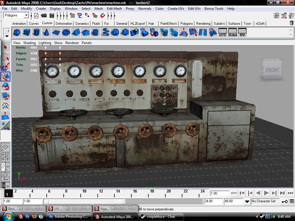
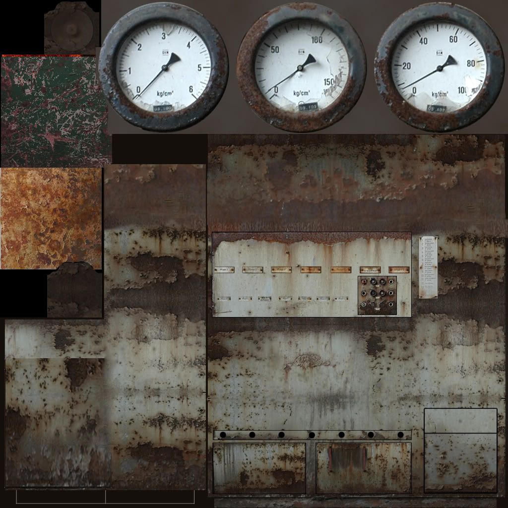
Texture sheet
Problem areas
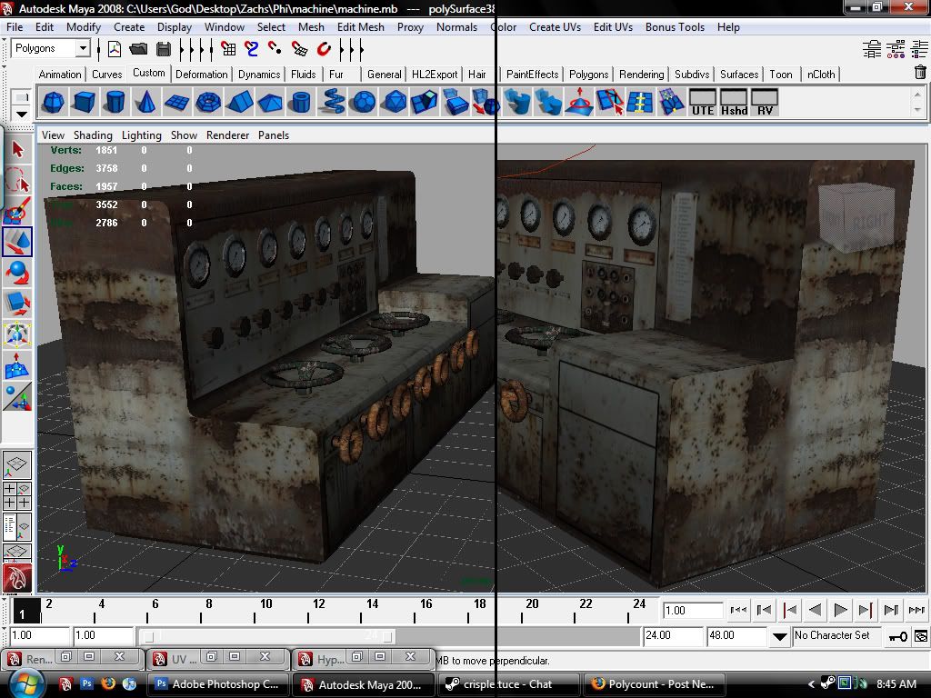
1. What the best way to get those looking like the sides should match up with the front?
2. Is the space for the gauges too much?
3. Should I not model them and put the gauges directly onto the texture map?
4. Hows it coming along?
5. I will ask questions as they come to me, hahaha
Flatshaded

Textured

Texture sheet

Problem areas

1. What the best way to get those looking like the sides should match up with the front?
2. Is the space for the gauges too much?
3. Should I not model them and put the gauges directly onto the texture map?
4. Hows it coming along?
5. I will ask questions as they come to me, hahaha
Replies
Do you mean the gauges?
or if you modeled it to scale and your shooting for a 4 pixels per max unit scale (is that what Unreal 3 and the likes use now?) > box map it at 1/4 your texture size (then lay out the uvs)
Many texture surfaces are just way bigger scaled compared to other elements. Also in my oppinion the body surface texture of the base block are to huge scaled - I think that all those details should be way smaler compared to the 3d model.
All in all I think the texture work is to bold and rough - it needs way more fine tuning. Make smal details really smal - and not that big like now.
Box map it?
Maybe start with like a base coat, and wear it down?
Sorry I did not mean to double post...
Noooo
You need to either increase the tiling on that checker, or create a grey bitmap and apply noise to it (making pixels visible). The overall density of your texels are very mismatched. This causes fillrate issues, aliasing/moire and other nasties.
The UV's just need adjusting. The gauges need less UV space and the body needs more.
The main reasoning behind the box mapping method is to get a consistant pixel density across all assets in a project not just within a single model.