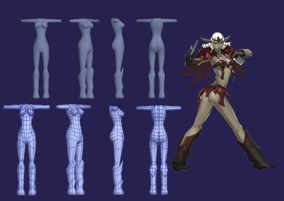
WIP_Imogia
Hello.
Well BradMyers82 suggested me in my portfolio topic to create a new one in which I'd post WIPs.
So here it is, feel free to comment, suggest, help
Artworks comes from this site :
http://www.gorgonzola3000.com/
there's a bunch of very cool concept there.
Next, why I choose this model and what I'll try to do:
This model is quite close to nude anatomy, witch is a good start in my opinion for working on props.
There is skin and a little metal texture, so I will have to work on both of them.
I plan to keep under the 2000 polys, and with a 512² texture.
And I've never made a sexy babe so far, so it's the moment
Here's where I stopped modeling yesterday:

Replies
After thinking about it, I guess that one set of 2 textures would be better. One for the nude, and one for the armor and objects.
The head still need alot of work in my opinion...
I've made the arms a bit longer, and rework a bit on the head.
I was affraid that the arms will be too long so I didn't make them very much longer...
direct link:
http://www.servimg.com/image_preview.php?i=151&u=12592859
I wonder, isn't the image too small?!
I have a few questions though, why paint in the nipples if they are going to be covered in armor. Unless you plan on having the armor come off then forget that question.
Secondly, are you going to have all of the armor on the same texture sheet as the skin? because as of right now the sheet seems to have a lot of empty space. As of right now it might be to late to change any of that, but just consider it next time your unwrapping your models.
One thing that I see that is way different from the concept art and your model is, your model has very large cheeks while the concept art has little to no cheeks. And while modeling arms, I always like to have the geometry twist to mimic the natural twists of the radius and ulna. Just food for thought.
Are you planing on sculpting this in zbrush/mudbox?
Keep it up its looking good so far.
Thanks for your help.
1- Nipples lol, I was sure that someone would say something about this. Well they will be of course recoverd by the armor. Ther is several reasons for witch I choose to paint them: first of all, the orinial concept had a kind of bra that is very tight and a part could have been painted directly on the body, but I was affraid to face unexpected matters of texture joints where the bra armor must be connected to the body.
Then I thought about painting a bra on the body, but with such a breast, it would look bad, and flat if painted directly.
Moreover, as I choose this concept for working on anatomy (especially training on textured anatomy), so I thought that nipples are a part of the anatomy.
2- No, the armor parts are in a second texture, as I consider this char like a double exercise: first anatomy (near to nude) and then armor with steel material.
I also plan to use the extra space on the body texture for the weapons. But it's optionnal for now, so I didn't model nor unwrap them yet.
3- For the cheeks, thanks for telling your opinion! I already reduced the cheeks, but I couldn't tell by myself that they are still too small (I think the face would look flat), so I tend to not respect the original concept. I must still work on this, and on observations skills.
For the arms, I went to your site for seeing by myself. Ok I get it, i'll try it in a next char I think, so I'll see how it is.
4- Unfortunately no, I don't plan to use CG sculpting at this point of my training. I think I'll train on some more chars and work on the diffuse texture a bit more before starting learning zbrush.
In fullview, the texture is the real size I'm working with: 1024²
I've come to someting that might look like a final version.
I guess I'll stop working on it for now ^^ This lady kept me very busy these days and I'd like to do something else!
here's my latest work ^^
And here's are links for the WIPs:
http://imogia.deviantart.com/art/Sacred-Flower-Clan-Girl-WIP-121234079
http://imogia.deviantart.com/art/Sacred-Flower-Clan-Girl-WIP-2-121463716
The second girl looks good it seems as though you've improved in the body proportions and keeping the the feminine curves.
keep at it.
Look, even though its a cartoon character you still need to use decent proportions. I think if anything you should exaggerate the proportions when doing a cartoony character not flatten them out.
It seems that you aren't really taking my advice from earlier, so I figured I would just show you how much easier modeling will be for you if you just make some decent drawings ahead of time to get the proportions right. This isn't the greatest paintover in the world but I think it should illustrate my point.
These concepts you are using are not really my style, and I believe you should be making realistic characters first and then move onto a stylized approach if you want. But if you plan to continue to use these sort of concepts, you really must do some 2d art/orthographics before you move onto the 3d. I see a lot of potential in your work which is why I am taking the time to do this. Keep working hard, but take your time, please.
I did some props rework on the last character but I can't post it right now (not at home).
I was also a bit in a hurry, so that's why I think I made the same mistakes from before.
Well i'll post the version I've reworked in a few days.
But I've also realized while modeling these two chars that I effectively lacks in anatomy knowledge, and drawing too.
I'll try to draw again (it's been a time that I've stopped drawing erf) and particurlarly anatomic stuff.
direct link:
http://i89.servimg.com/u/f89/12/59/28/59/page_r11.jpg
Brad-> I guess you are totally right, I think the next char I'll start here will be a realistic human model. So i'll work anatomy for anatomy.
Looking forward to the next one.
I was quite busy working on a lot of (different) things.
Here's my last character
And I made this inorder to be able to work more on this:
http://imogia.deviantart.com/art/Stelligrid-Dialog-boxes-script-128976290
I just finished a new work, so I postit before going to bed (I'm exhausted
Please tell me your impressions!
You don't have any real broad shadows or highlights, and when your going straight diffuse like this its really important to get at least some Ambient Occlusion going.
You are indeed showing improvement, but tbh, you should really take advantage of the crits you can get from polycount. Post stuff before you are calling it done, so you can refine and improve it.
Great comments Brad
As far as characters go, i believe you shouldnt use dodge/burn that often if at all. Use the dropper tool and use the colour wheel and pick different fun colours while brightening and darkening it.
I suck at 3D lighting (and maybe this comes from the fact I've worked a lot under the very low poly constraints where lighting is only self illu), I'm not used to occlusion stuff.
As I use overlapping UVs for tiling and freeing texture space, is it possible to bake an occlusion texture? I've heard of something called "render to texture" but i never look into it. Maybe should I?
I'm working on a character as a test for a job. So it would be nice if I could have advices and critiques...
I have a constraint of 1500/2000 tris, and I'm already at 1 988. I'm thinking of makinf this version the final one, after a few minor changes.
Thanks, thanks, thanks in advance.