The BRAWL² Tournament Challenge has been announced!
It starts May 12, and ends Oct 17. Let's see what you got!
https://polycount.com/discussion/237047/the-brawl²-tournament
It starts May 12, and ends Oct 17. Let's see what you got!
https://polycount.com/discussion/237047/the-brawl²-tournament
Replies
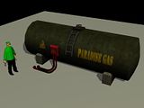
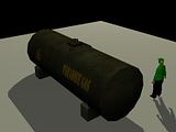
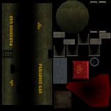
this post grabbed my attention cause the first model I textured was one of these tanks! Anyway, my first thought would be change the color from green. I am no expert in the fuel tank field but I have not seen many green tanks.
I dont know the context of this scene but I would dirty this thing up as much as possible! Rust, Dirt, Filth, maybe slop up the paint on "paradise Gas", make it look old. Again this is all assuming that you can make it look dirty, I dont know if it is suppose to be clean or not. but in my meager experiance in this industry I found that making stuff dirty is some good clean fun! lol no pun intended!
Makin it white or grey may make it more identifiable to people, when I first saw it I didnt think fuel tank...
Most of all thou you should just start gathering reference. Im sure a google search would yeild some results! if not there are usually some of these in every town ive been in. take pictures and use photo reference for your textures.
you have a great start here and a perfect model for some interesting textures! keep it up and hope to see some updates!
I will try to change the colour to white/grey, and try to add some brown rust. I didn't say the context but the mod is on a tropical environment (jungle) and city.
I will try and add more dirt everywhere and add grunge to the text.
Thank you
Also, avoid dark places in your diffuse, even if it's not for the 'next'-gen machines. A black area in your diffuse is a place that even vertex color wont be able to illuminate.
Also, some less segments on the pipes and more for chamfering bigger volumes like the gas tank would be better and more noticeable.
Good start so far; my crit sorta falls where ParoXum's crit was going...
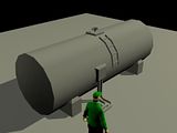
Taking a look at the large cylinder that makes up the mass of the tank, it seems a bit too low poly for my taste. For such a large object, it would be nice to see a little higher poly to round it off just a bit more.
When I compare the small hoses; they seem higher poly than the large tank. Perhaps distributing some of those poly's from the hose into the large tank would give us a smoother result in the silhouette's without taking too much away from the hoses.
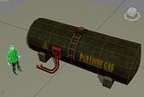
Aside from the other valid crits - I like the 2nd rendition much better. The brown rusty color is reading well, and the highlight you've added on the edge has improved by uniting the tanks texture as a whole.
Keep on truckin man, looks good!