The BRAWL² Tournament Challenge has been announced!
It starts May 12, and ends Sept 12. Let's see what you got!
https://polycount.com/discussion/237047/the-brawl²-tournament
It starts May 12, and ends Sept 12. Let's see what you got!
https://polycount.com/discussion/237047/the-brawl²-tournament
Dylan - Anime character
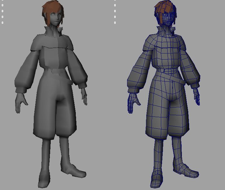
Well, Im doing a freelance work for a small 3d game project, in which i have limitations of 5000 tris for this character, and 2 diffuse maps for it. Its gonna be cartoon render style, so the model has to really stand out, rather than the texture itself.
So, basically heres where im at.
Anyways, im kinda hoping you guys can help me out with the topology, where i could work on it, and where i could add more polys.
Its 3864 tris atm.


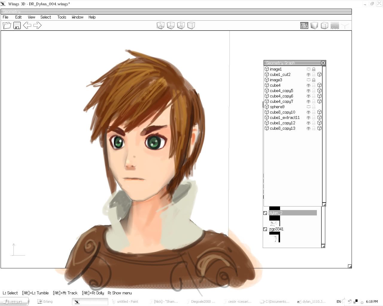
This is a small test I made for proportions just painting a screeny of the model *later changed the proportions just a bit

C&C Welcome!
So, basically heres where im at.
Anyways, im kinda hoping you guys can help me out with the topology, where i could work on it, and where i could add more polys.
Its 3864 tris atm.


This is a small test I made for proportions just painting a screeny of the model *later changed the proportions just a bit

C&C Welcome!
Replies
I'd add an extra loop or two around his neck. If that guy was to turn his head as it is right now that neck would collapse horribly. Also you seem to be having smoothing issues at the neck as it is now, probably partly due to the long polygons you have there now. As a rule of thumb it's usually a good idea to have pretty equal polygon density all over models to avoid different issues, especially a deforming object like a character.
Kodde: Ur absolutely right. Im gonna add a bit more polys to his neck so it doesnt look ugly.
New updates coming soon
https://images.tfaw.com/covers/400/11/11737.jpg
[edit]
I imagined you were working from existing art reference, so it is really the concave areas you have to worry about.
Listened to you guys and decided to put more loops on his deformation areas, took some polys out, some in, etc. Also, moved the arms a bit higher since a friend noticed the neck looked weird. I think its uv time. c&c welcome!
I finally got time to finish the UV map, and now its texturing time. Just a little work on the texture, c&c welcome!
p.s.
I agree with neox to some extent
But its looking naice
Ur probably right
About the mockup image by sama.van: I dont agree with alot of the changes here, it changes the style too much. I have to keep in mind that this is gonna be toon shaded as well, so I have to be kinda minimalistic on the texture. BUT i still do have to put in more detail on it, since it was a really fast texture to see a fast result. Thanks for the paint up!
Worked on the textures a bit, just mainly sketching out forms and color, and afterwards, im gonna get everything detailed down
Keep in mind, this is gonna be kind of celshaded, so i have to mantain a really simplistic texture. C&C welcome
Is there by any chance that I can see a higher resolution of the wire frame for the head?