Home 3D Art Showcase & Critiques

Boathouse - Massive Harry Dongs

polycounter lvl 15
Offline / Send Message
Cody polycounter lvl 15
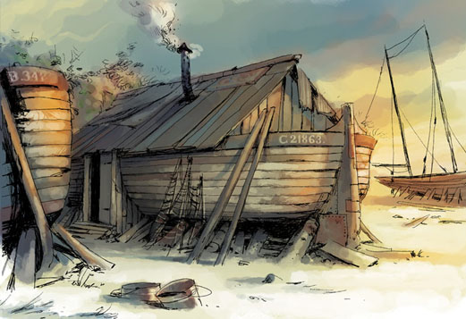
Gotcha! Ok this is a new scene I'm starting. Here are the concepts by Arctis over at conceptart.org [yes I got permission].
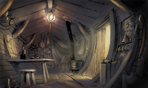
concept1.jpg

concept2.jpg


I am going for a handpainted realism style. Here is what I have so far. Comments and crits appreciated. I plan to get this in the Crytec engine or perhaps the Marmoset toolbag.

Blockout of the interior.
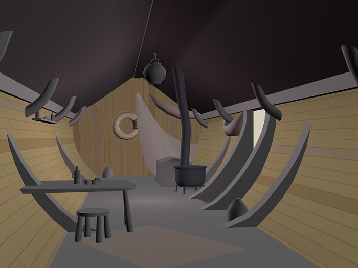
boathouse.jpg

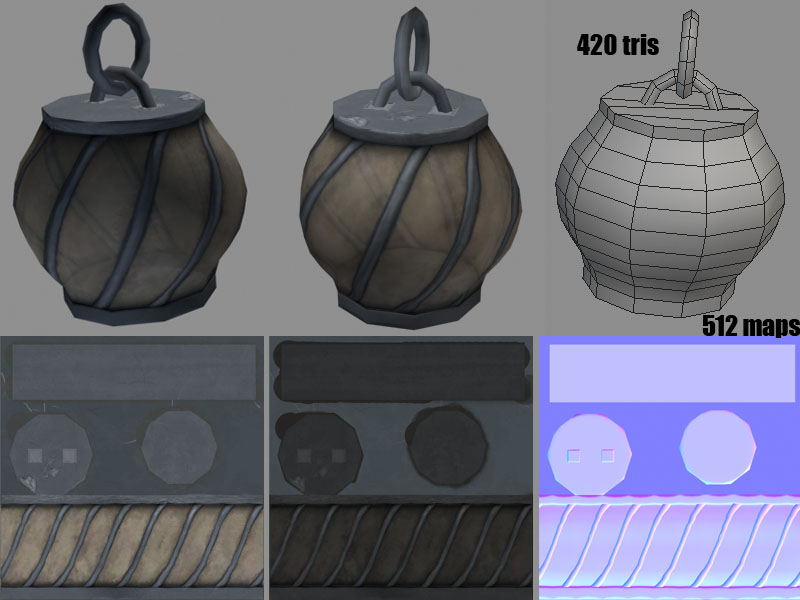
Lamp
lamp.jpg

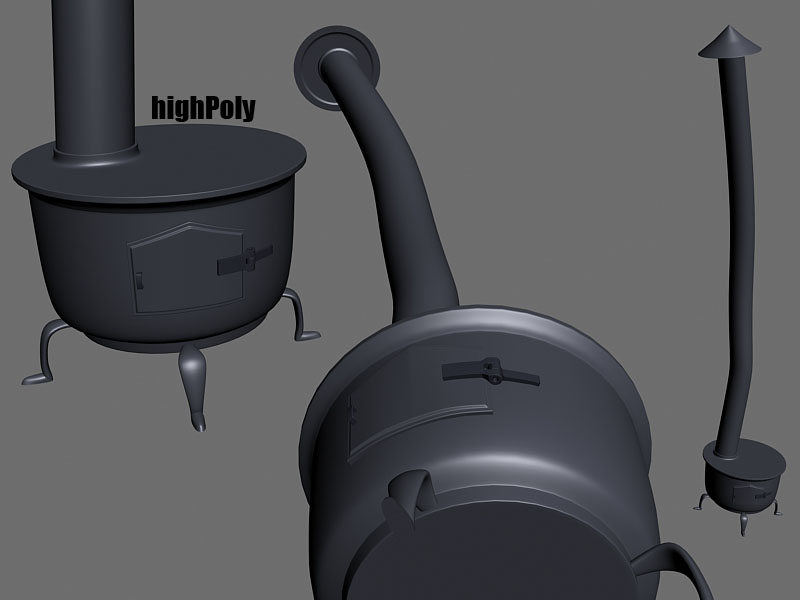
Stove wip
stove.jpg

Thoughts?

Replies

  • hawken
    Offline / Send Message
    hawken polycounter lvl 19
    nice title you have there.
  • t4paN
    Offline / Send Message
    t4paN polycounter lvl 10
    How the hell do I always fall for shit like that? Anyway I'm interested to see the exterior of this scene, should be interesting. Good start so far.
  • turpedo
    Offline / Send Message
    turpedo polycounter lvl 12
    Your post is pure trickery lol. Cool concept and good start. I feel that your lantern has too many horizontal edge loops. You have room to optimize it and still keep the same silhouette. It looks like there is a vertical loop that doesnt really do anything on the left side of it.
  • Cody
    Offline / Send Message
    Cody polycounter lvl 15
    I could optimize the horizontal ones, yes, but that seemingly random one is a place to cut the uvs that wont mess with the normal map, giving me a perfect no seam model!
  • SHEPEIRO
    Offline / Send Message
    SHEPEIRO polycounter lvl 17
    hey there cody- nice start, but personnally i dont know why so many people make envs, by blocking out then propping up then filling in, doing it that way leads to disjointed and slightly un-natural scenes, IMO its much better to build an env, like an real life env, start with what was there first

    - ground plane
    - boat
    - add the bits which were added once its landlocked
    - then populate with props

    - outside add the flotsome and jetsome
    - then pile the sand up round that

    also on another note, the lantern, could be alot more effecient and look the same, firstly the mapping could be halved, by only rendering out one side of the main round and tiling it horizontally, as you never see both sides at the same time.

    stylisticly it seams a bit flat too, old glass lamps like this were often blown straight into the cage, so the glass would bulge out, which would be a nice effect. also where are the holes, looks a bit air tight for a flame to exist in there, i would consider revising it so that it has an mostly open top.

    im geussing that middle map is the spec??- if so it needs work, the glass should be the most specular thing with the dirt as mostly non-spec, so push the levels on that, and the metal would be nice if it was low spec, but with some sharpe highlights.

    I would consider revising the lamp totally as its a kind of feature, and keep the same size map, but split the shaders in two and duplicate the glass cylindersection. so you would have the metal parts mapped on to the outer bit with a stencil alpha and the glass on the interior duplicated faces with a slight self illumination and ref map
  • theDEAD
    Hey cody,

    Looks like a fun little project!

    Aside from the horizontal edge loop removal, I think its a good block out so far.

    It might just be me, but maybe using a single 512 map for a small prop in the scene might be a little over the top. Perhaps a 256 would work just as well in the long run. What do you think?

    Can't wait to see more!

    -peace
  • EarthQuake
    Cody wrote: »
    I could optimize the horizontal ones, yes, but that seemingly random one is a place to cut the uvs that wont mess with the normal map, giving me a perfect no seam model!

    Any of the vertical edge loops would have given you exactly the same result.
    Also, awesome thread name.
  • Cody
    Offline / Send Message
    Cody polycounter lvl 15
    Shepiero- Good idea on the workflow. I think I shall do that, although I have no idea what flotsomes and jetsomes are. Google search, here I come! From the concept, I thought the lamp was paper, not glass, but I like your idea better. I will get on that. Thanks, man.

    theDead- True that, I will try it with a 256.

    EarthQuake- True, horizontal ones would work, but I don't see how that would work texture wise, for tiling. Btw, sick burn on the title name, thanks for that. :)
  • MoP
    Offline / Send Message
    MoP polycounter lvl 18
    What's up with the far right image for the lamp textures? The background makes it look like it's meant to be the normal-map, but the colours are all wrong on the textured parts, that isn't a normal-map at all.

    Also, the shapes on the highpoly stove could really be exaggerated, get a lot of thick pieces and chunky details, it could look really cool. Right now all the details seem pretty thin, small and flimsy. Scale up the hinges, add big rivets, thicken all the trims and the feet, IMHO that will look much better.

    Apart from that it's shaping up well, keep it up.
  • SHEPEIRO
    Offline / Send Message
    SHEPEIRO polycounter lvl 17
    ahh hadnt thought of paper

    MOP- weird it looked like a normal map earlier today
  • Target_Renegade
    Offline / Send Message
    Target_Renegade polycounter lvl 11
    where are the tits? Good start, some nice colour variations would work well. Its a nice environment to work on. Make it Monkey Island like, and I'll buy you a beer.
  • bounchfx
    man, I clicked for the tits and didn't get any last time, now I clicked for the dongs and I'm still let down.

    I came to this thread and all I got was a sweet boat.

    nice, somewhat vague concepts, looking forward to your progress.
  • Cody
    Offline / Send Message
    Cody polycounter lvl 15
    Okay, lots of delays, but I am finally working on this again.

    Here is a WIP of the outside of the boat. Still deciding if that's the texture style I want.
    texturewip.jpg

    Here is the texture.
    texture3.jpg

    And here is another style I was toying with.
    texture2.jpg

    Ideas, comments, crits?
  • t4paN
    Offline / Send Message
    t4paN polycounter lvl 10
    Man, how the hell did I fall for this thread again? I must have a thing for massive Harry dongs. Who the hell is Harry anyway?

    As for the boat, the initial texture isn't saying much (Geometry looks fine, albeit a bit linear) but the more stylized style you're going with in the second pic I think would work much better for the piece, considering the concept looks pretty comic-y in it self.

    Might take you a long time to paint the detail on the texture though...

    Anyway, another thing that struck me is that the metal smoke-carying dong that's protruding from the roof looks pretty straight, so maybe you could stylize it a bit? Like make it crooked and a bit out of proportion?
  • Cody
    Offline / Send Message
    Cody polycounter lvl 15
    Terrain WIP
    terrain.jpg

    and the two textures I used.
    terraintex.jpg

    I plan to sculpt the terrain and paint in the textures in engine. I know it's a bit darker than the concept, but idk, I'll see how it fits later on.
  • Cody
    Offline / Send Message
    Cody polycounter lvl 15
    Working on the high poly now...

    hiWIP.jpg
  • Cody
    Offline / Send Message
    Cody polycounter lvl 15
    t4pan- ya i like the more detailed, i don't mind if it takes awhile.

    small update
    hiWIP2.jpg
  • butt_sahib
    Offline / Send Message
    butt_sahib polycounter lvl 11
    Looking great!
    Im expecting to see some extreme zbrush sculpting on those wood planks
  • SHEPEIRO
    Offline / Send Message
    SHEPEIRO polycounter lvl 17
    why noy makt it out of components? sommit like this otherwise your going to struggle for res

    paontover.jpg
  • Cody
    Offline / Send Message
    Cody polycounter lvl 15
    Good call Shep...modular is the way to go.

    @Butt- I'm not sure if I am going to sculpt the planks, maybe sculpt a tiling wood for everything, we shall see.

    Here is a WIP sculpt.
    midMUD.jpg
  • Cryocat
    Good to see this coming along. Personally I like the second type of texture style you had up a few posts back, but can't be certain until I see on the model itself. It looks more intentional when you already have a very simple color pallete if you have an ornate detail set. both in the models (as you have) and in the diffuse.

    I hope you stylize the boat exterior 'walls' a bit more in your highpoly or later. have a few sticking out a bit more perhaps, it looks a little strange with everything else poorly fitting together to have a perfect plank wall, especially as I'd expect that area to experience the most amount of strain over the life of the structure.

    I'm diggin it man!
  • Cody
    Offline / Send Message
    Cody polycounter lvl 15
    More wip wips.
    middleT.jpg
  • Filbot
    Offline / Send Message
    Filbot polycounter lvl 12
    Digging the painterly style man
  • mLichy
    Ya, that last render is cool, I love that style in general.
  • Cody
    Offline / Send Message
    Cody polycounter lvl 15
    Thanks, guys. I took a page out of Adam Brome's book on this one. http://www.adambromell.com/subpage7/big1.php

    I still have a few seams to clean up, and those scratches don't look to good. Have to fix those. I haven't had a lot of time to work on this as of late. But trying to knock some stuff out now.
  • bluekangaroo
    Offline / Send Message
    bluekangaroo polycounter lvl 13
    LOL at the thread title....thats pure win right there. I like the latest update and how you're painting it, I think thats going more in the right direction
  • Cody
    Offline / Send Message
    Cody polycounter lvl 15
    Another update. Thanks for the kind words, gents.

    I'm having a hard time figuring out how to model the wood plank parts. Do they need a normal map? Would it really benefit it? I'm just really bad at sculpting. Everything always ends up blobby and uneven. Just model in the imperfections maybe? Any ideas or tips on work flow would be great.

    Anyways, what do you think about the texture wip here?
    boatWIP.jpg
  • SHEPEIRO
    Offline / Send Message
    SHEPEIRO polycounter lvl 17
    i would be tempted not to bother with highpoly and instead go for high res and fairly high poly diffuse only, dropping normal and spec maps allows you to use that resoloution in the diffuse. and you can afford to draw many more polys as your render passes are reduced.

    diggin the style of thar prow, but agree that the plank details need some more work
  • Cody
    Offline / Send Message
    Cody polycounter lvl 15
    Thanks for the tip, SHEP. I'm gonna try to add some more detailed woodness tonight. :)
  • BradMyers82
    Offline / Send Message
    BradMyers82 interpolator
    Hey Cody, I'm just seeing this thread now. Everything is looking really good so far, and it should be a really good exercise doing hand painted work like this. I'll definitely be watching this one.
Sign In or Register to comment.