London's Tower Bridge
Currently just finishing up a big group level in school
We are doing 1940's London. During the London Blitz
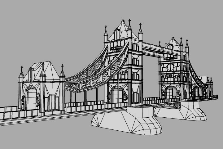
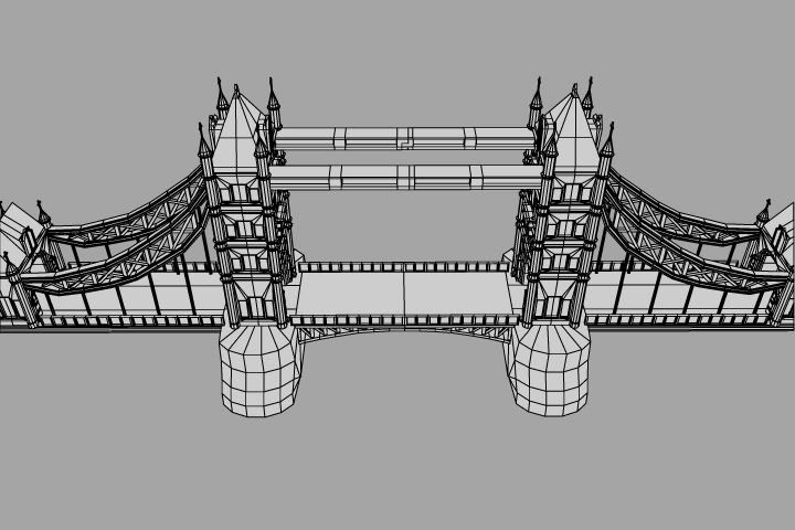
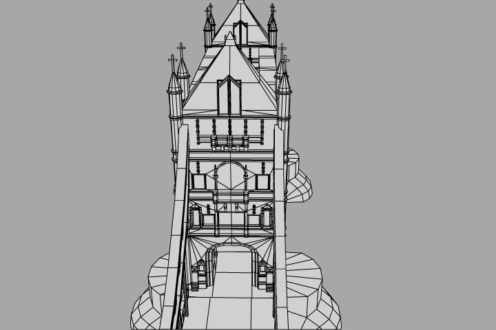
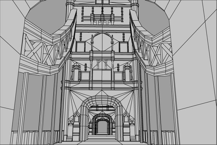
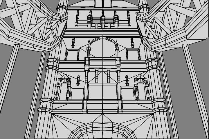
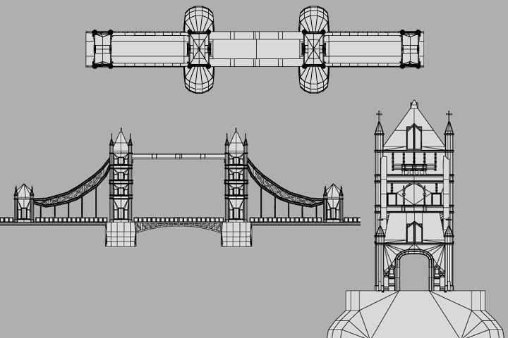
this is one of my models. The biggest model ive done in my 2 years of 3d modeling.
Due to size issues in the level. The bridge is not 100% accurate. I took some creative licence with the ends of the bridge.
the model is pretty high poly. clocking in at 40,800 tris (20,400 for each half then instanced
It is currently not texture because someone else in our group is in charge of texturing. During the summer when i have time, i will be texturing it myself.
any C&C's would be greatly appreciated


Replies
Crits:
http://upload.wikimedia.org/wikipedia/commons/4/44/Tower_Bridge_London_Feb_2006.jpg
- The solid connecting pieces from tower to tower are triangle shaped, and have a large crest in the center flanked by two smaller ones on either side.
- The side beams/cables, actually come down and meet the deck at a little marker/crest half way between the big and little towers. So from land they go, skinny > slightly thicker > skinny touch the marker > really thick > skinny touch the center tower. These side cables also seem pretty thick on your model and go skinny thick skinny.
- The towers have a lot of details that flair out at the top 2-3 floors. They aren't straight up and down. Major changes to the silhouette should probably be recreated?
- The little towers that connect to the land, actually have sections and arches that extend under the deck, I believe there is more decking and a few arches before the little towers.
- Those aren't crosses on the roof, they have 4 decorative nubs that stick out of a post.
- The rounded base stumps in the water actually have a point to them and aren't perfectly round.
- There are a few little buildings on top of the rounded base stumps and off to the sides of the towers.
- Lights lights lights, and more lights. Adding a few clusters of lights here and there along with cables and mounts can help break up some of the large bleak areas.
However, if the player is going to be really close, then I would suggest going crazy on the detail, there really are a ton of interesting elements, as can be seen in the photo Vig linked, that could really make this for an extremely strong show of modeling ability in a portfolio.
Could we perhaps get wire render with some AO on it. As is it right now, it seems like some areas on the model have an excess of unnecessary polys, such as the two top beams connecting the towers as well as the suspension support arches.
It's a good start, I'd really like to see how it ends up textured.