The BRAWL² Tournament Challenge has been announced!
It starts May 12, and ends Oct 17. Let's see what you got!
https://polycount.com/discussion/237047/the-brawl²-tournament
It starts May 12, and ends Oct 17. Let's see what you got!
https://polycount.com/discussion/237047/the-brawl²-tournament
BurtonBabe finished
Finally I mange to get my Burton babe ready.
This is what i fixed after last post.
-All spec maps fixed
-Made all limbs a bit longer
-Made longer fingers
-Fixed all normal maps..still does not look very good thou
All feedback are welcome even those who say that this looks like garbage.
11786 faces
23576 tris
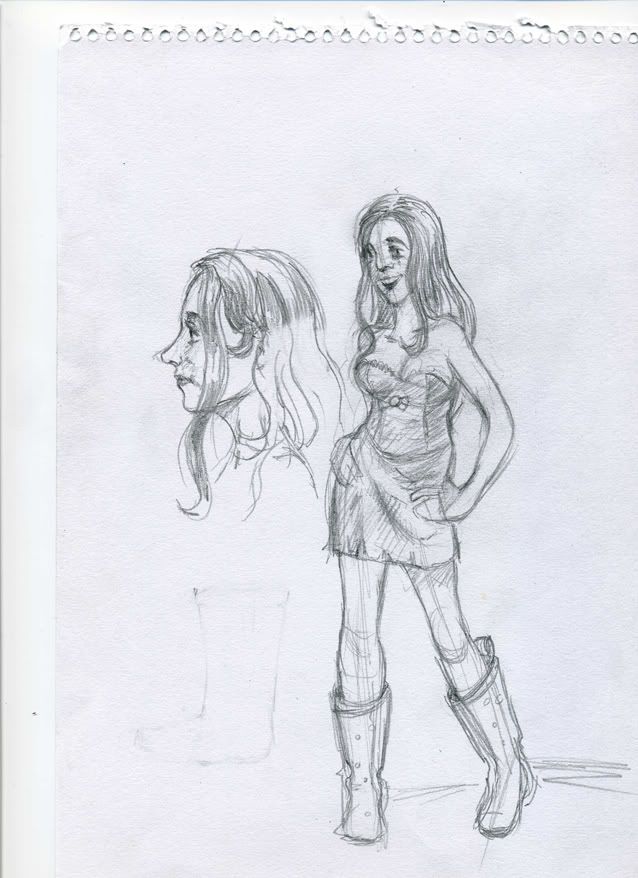
I wanted it too look something like this sketch.
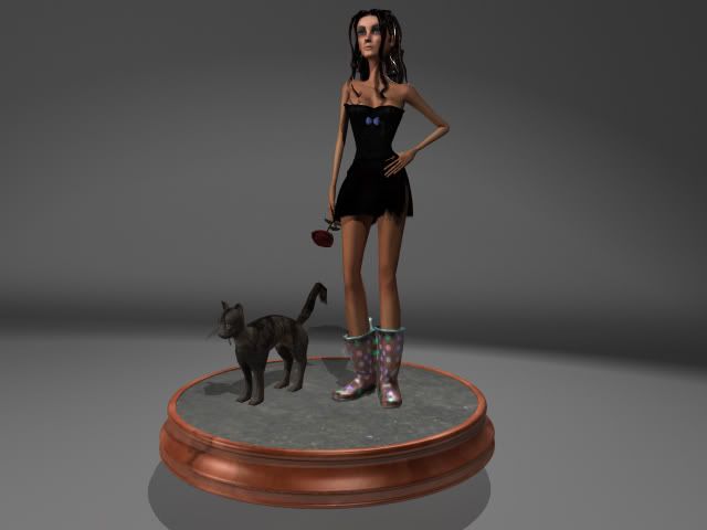
This is how it look rendered
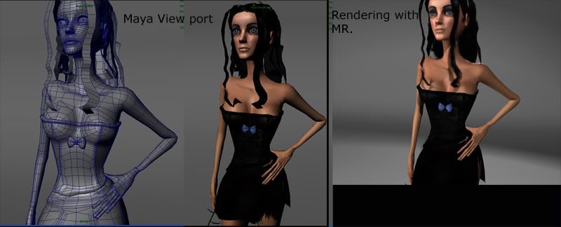
Wireframe
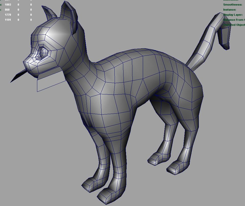
..and the cat
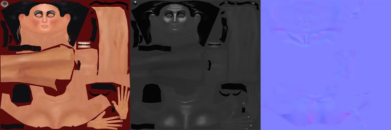
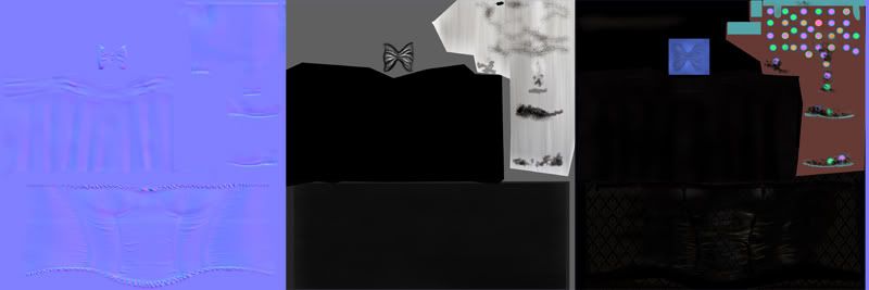
Maps
This is what i fixed after last post.
-All spec maps fixed
-Made all limbs a bit longer
-Made longer fingers
-Fixed all normal maps..still does not look very good thou
All feedback are welcome even those who say that this looks like garbage.
11786 faces
23576 tris
I wanted it too look something like this sketch.

This is how it look rendered

Wireframe

..and the cat

Maps


Replies
Alphas turned out pretty good as well.
Overall you made a lot of improvements. Keep up the good work.
Also, those boots aren't very stylish at all. Who would wear a nice dress like that with those things? :poly108:
If you want an odd punky tossed together look, I think the whole outfit needs to be more ecclectic.
About the calves,, yea her pose looks kind of odd. Maybe if I push up the hip a bit, then adjust angel on the knee.
Yea wanted to keep her pretty dark,,, but now you can hardly see any color variations in the texture. I will redo the
color map.
And about looks and style, I got a stubborn girlfriend who demand to have a screen shot every now and then on this babe.
The design process went kind of like this.
Of course you cannot have both red lips AND soted makeup on eyes..doh.(girlfriend) (I usually do red lips on all my girls) Back to the drawing board.
Then there was the rose in her hand. I modeled an umberella but then "no A ROSE is romantic and suits her". Oh well I modeled a rose instead.
Thats where we come to the issue on shoes. I made some boots with high heels, and then she was. "Come on" That is so 80s, have ever seen a girl with those boots on, and btw the heels looks disgusting???
"Who cares it is only shoes"( I said that)
"She looks like a clown, no girl have such ugly shoes in public"
Oh well.
Then I sketched rubber boots just to piss her off, but guess what..
This rubber boots really are stylish. The reference pic for the shoes I found on google goes for
60£?!
I mean really.
Women actually pay 60£ for a pair of rubber boots??
Pic of 60£ stylish rubber boots.