DWIV - 3D - Chai
Name: Basilisk
Race/Class: Machines / Cyborg
Description: Character Description: Hunter/Scavenger Unit, deployed in abandoned battlezones to roam and annihilate all survivors.
The Basilisk can operate for a long period of time, as it feeds and uses organic parts as part of its construction.
It is notoriously known for harvesting the memories of the fallen to aid in the hunt for suvivors.
Text Image :

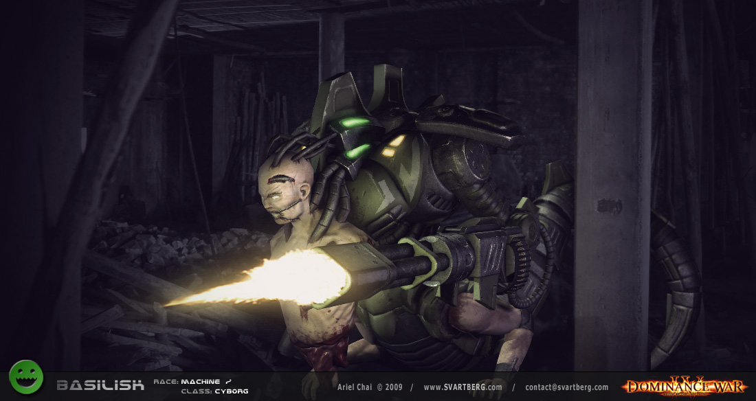
Beauty Shot :
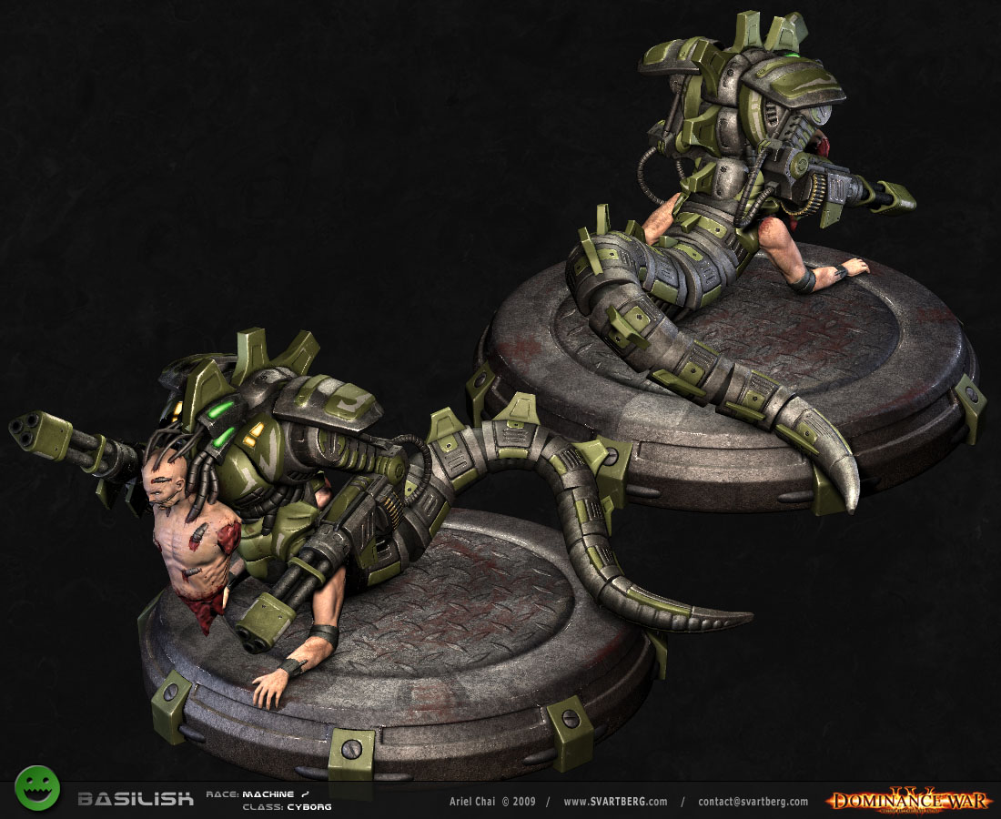
Presentation Shot :
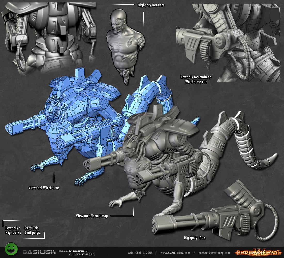
Construction Shot :
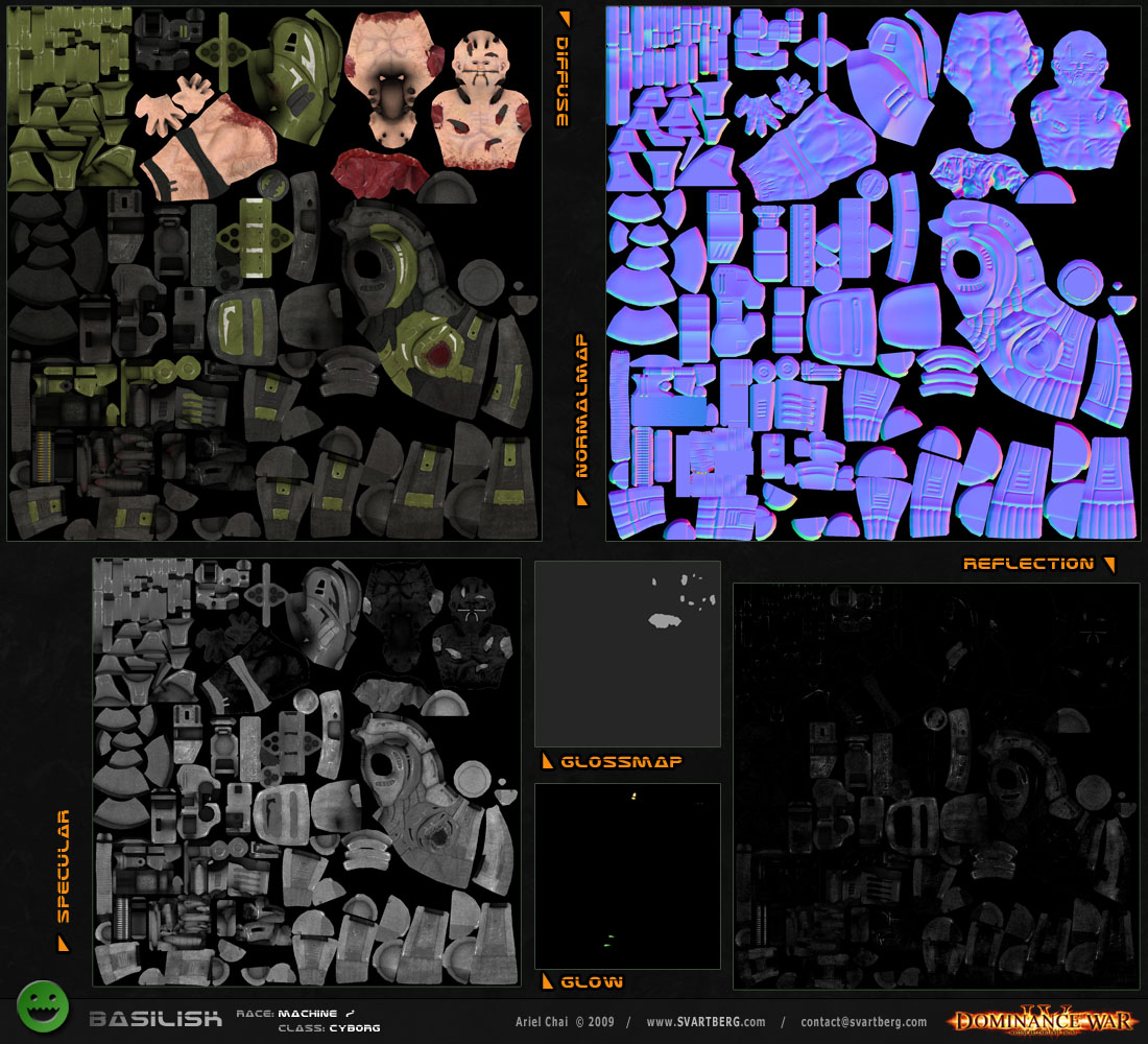
Texture Sheets :
Concept Image:

Race/Class: Machines / Cyborg
Description: Character Description: Hunter/Scavenger Unit, deployed in abandoned battlezones to roam and annihilate all survivors.
The Basilisk can operate for a long period of time, as it feeds and uses organic parts as part of its construction.
It is notoriously known for harvesting the memories of the fallen to aid in the hunt for suvivors.
Text Image :

Beauty Shot :

Presentation Shot :

Construction Shot :

Texture Sheets :

Concept Image:


Replies
Working on the form and adjusting proportions, sketch below also has simple random machineguns outlines to see how things work together.
Here's a few quick thumbnails of the gun systems :
I also played with the idea of splitting the tail spikes to two along the middle - I don't want to draw the attention away from the body too much for now ... but might revisit it if the body become bulkier.
i like dual version, but you could play with trial tho)
Not sure about the shoulder wing/guard thing though.
More work into the highpoly below :
nice mesh so far -- looks very clean!
Started highpoly work on the gun - but I really need to figure out what I'll do with the bullets during normalbake, since it doesn't look good unless the tip sticks out from the belt like in reallife ones ... Any suggestions ?
Enough work on the guns, moving on
unless there will be an extension i probably won't have time for presentation but at least I'll try finishing the asset.
I really like the idea and the mechanical detailing is awesome, nice work!
Crits:
- Beefier arms, they look like they aid in locomotion? Or does the tail do most of the moving and the arms are there for support and grabbing things?
- Get the hands into a clawing position. Also rotate the arm back at the shoulder and raise the elbow up off the ground, kind of like a dogs front leg/paw. Probably don't need to go that extreme and run him around on the finger tips.
- Muscles are a bit blobby and the proportions are kind of off. I'm probably the last guy that should do a muscle paint over but here goes...
Thanks Vig, but it's not an arm, it's a thigh !
I love the crawling positions for hands idea mate, and I definetly looking to move the arms around when I'll pose him, like a someone crawling.
I've fixed the thigh muscles to be more anatomically correct after a study, looks like the muscles still aren't there yet.
So is the bicep area the front or the back of the leg?
ah I thought biceps are only for upper arms no ? the upper half of the leg is just like a normal leg - you can see the thigh and the ass cheeks there.
the lower piece of the leg is forearm attached to hand, but am not sure bout it - am struggling with the muscles there since it's not in natural position ...
Would really appreciate any crits and feedback to kick it up a bit, cheers
But really I'm over thinking it. I'd just say magic happens in the metal joint that attaches them both and call it good. It's entirely possible that whoever put this guy together could use the thigh muscles as a bicep, its just a little crazy... but thats kind of the point ha!
Looking cool! Keep up the good work, 7 days left!
thanks Vig, that is correct but is always great to learn a bit more about the muscles and anatomy cheers
The mechanical part are nice. ... but more you can rework the anatomy of the human body. I think that would enhance the quality of your model.
I totally understand the arm leg hybrid, though I'm concerned people misinterpreting it and thinking the anatomy is messed up when in face its a leg!
Awesome so far though!
It looks like it requires a major redesign to still look good but even with the extension I won't have time for this ...
I'll add a some gore and blood around the intersection area, and if anyone has any clever ideas would be great to hear them.
Anyway I did some work on the hands, thanks Vig for the suggestion !
there are always and still are many things I can improve, but the thigh section was just a design flow which could have ruined all the other work I've put into this character.
thx virdog, ericdigital and the dozen or so people who pointed it out
anyway that's it, no more highpoly modificiations, and if I work hard tomorrow I could get back to schedule.
wireframe below ...
I worked on the texturing, I'm still not finished but seeying there are technically only 3 more days left, I should post wip's.
I'm mostly pleased with the mechanical part, maybe a bit more wear & tear, most of the work left however is the skin and gore.
I did some paintovers for the glows, because the shader I'm using (one poop posted a few years ago) doesn't seem to support glows properly.
textures are pretty much finished, time to move to presentation in the next couple of days.
thanks ve|2tigo for the helpful crits !
I'm concetrating on the construction, presentationand beauty shots - so I won't work on the other ones much unless I somehow finish the others in time.
I do wonder however, I still need to add glows - is it permitted to add full blown glow effects ?
This entry probably won't end up in the top, and I can see dozens of things I would change or improve.
But that's irrelevant, I am very satisfied with the results and feel I gave it my best shot, all in all it's another step out of many and have enjoyed this.
Sorry haven't been much talkative in this thread as I saw it more of a work diary, so here goes :
Vig: you are a great animator, push a lot of people forward with your positive feedback and have been respectful of not posting crits unless when I asked for them - and when you did they were top notch, you rock man !
Aldo: thank for the positive feedback throughout my entry man !
jim_sam, ericdigital: thanks for the feedback and crits !
Gav, Tankz0rz, conte, WarNoodle, r4ptur3 & Ged: thanks for your comments
and thanks for everything outside the forum with their amazing crits, you know who you are
Beauty image below:
I've updated the beauty shot, as it was without perspective
the mecanical part are really cool !!
Normalmap respond very well to the lowpoly.
Good job on texture too !!!
Good work man !!