DWIV - 2D - Bashomaru
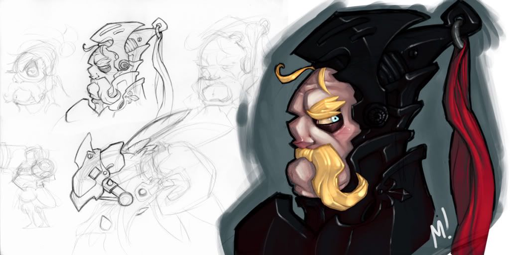
Name: Archibald Fairbane
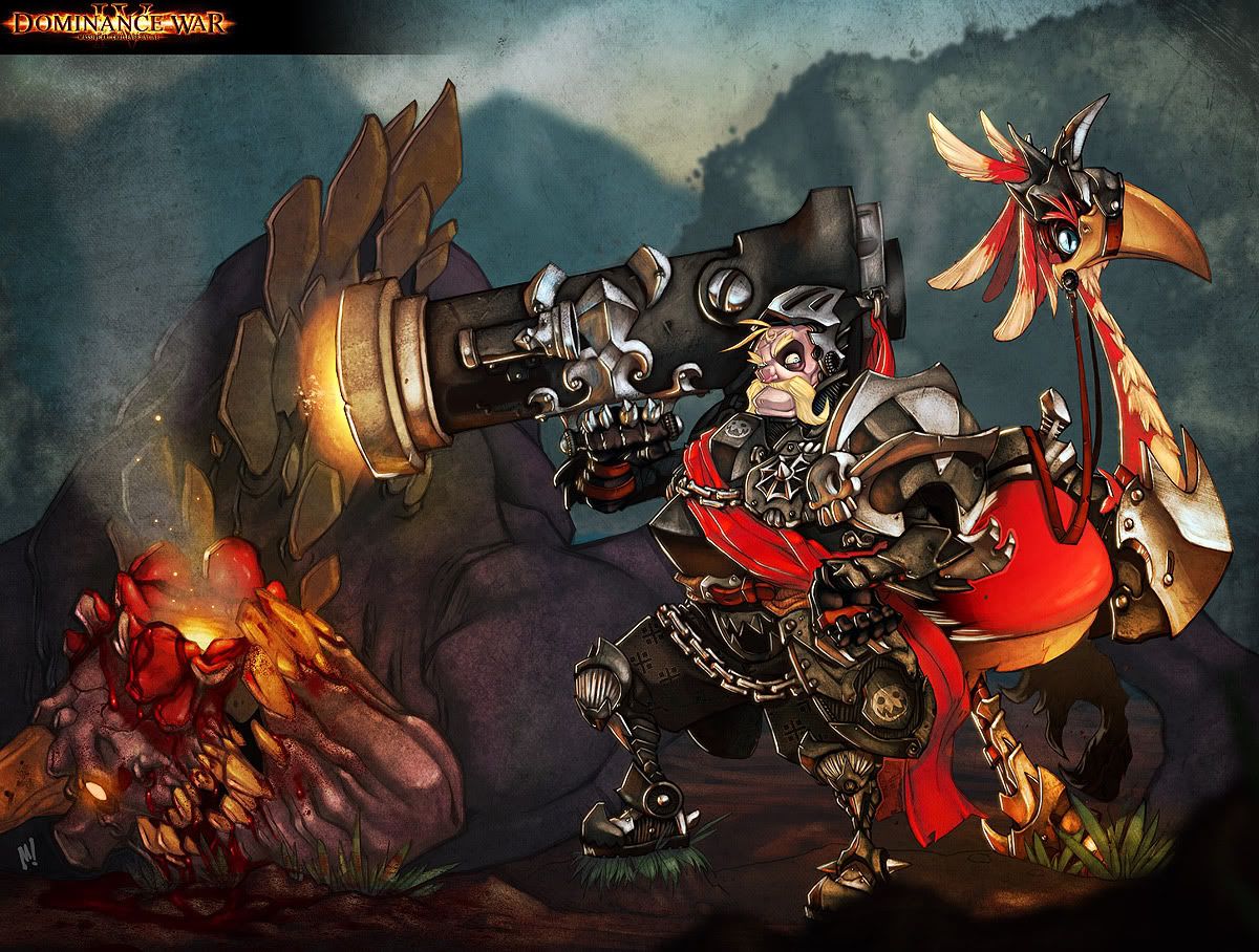
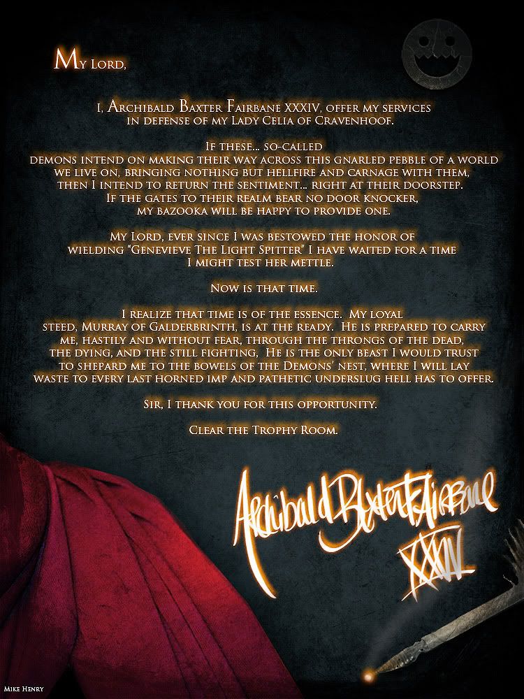
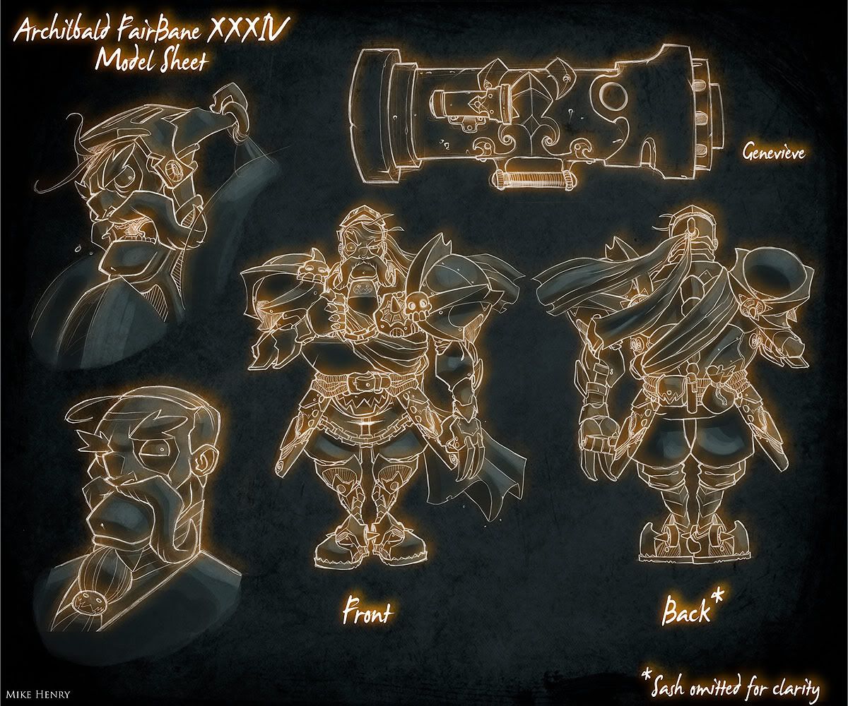
Description: Archie is part of the Elite Royal Guard assigned to protect the princess of the land he swears allegiance to, Cravenhoof Kingdom. With his trusty mount, "Murray", and his even trustier Bazooka, "Genevieve", he has set off to battle as a representive of Cravenhoof. The princess' safety weighing heavy on his heart, he know he cannot fail.
CURRENT STAGE: Started turns.
FIRST POST:
Hey gang. I'm in.
I don't post much, if at all, on this forum but I fought for Polycount the last couple of times.
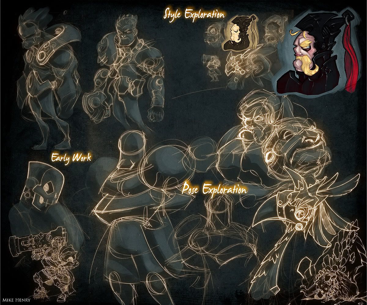
This is a Norm, warlord. I have some pretty cool ideas for him in terms of abilities/weapon and method of painting for the final version. I'll reveal more of that as I go. For now, here is the first page of warm ups.
M!
Description: Archie is part of the Elite Royal Guard assigned to protect the princess of the land he swears allegiance to, Cravenhoof Kingdom. With his trusty mount, "Murray", and his even trustier Bazooka, "Genevieve", he has set off to battle as a representive of Cravenhoof. The princess' safety weighing heavy on his heart, he know he cannot fail.
CURRENT STAGE: Started turns.


FIRST POST:
Hey gang. I'm in.
I don't post much, if at all, on this forum but I fought for Polycount the last couple of times.
This is a Norm, warlord. I have some pretty cool ideas for him in terms of abilities/weapon and method of painting for the final version. I'll reveal more of that as I go. For now, here is the first page of warm ups.

M!
Replies
I want the final to sort of look like a painting he had commissioned.
M!
-Woog
Here is an update. Much more coming soon now that I am to the paints. BG will be developed during this stage.
M!
Too bad you're not 3d, I can easily read the forms for 3D!
M!
Kozlow
M!
I'm losing the hand on the right as it comes to rest against the armor. Not sure how to remedy this without messing your awesome style up! Other than that it's lookin' super ace.
I realized I haven't been replying to people. Sorry for the rudeness. I have been very distracted lately.
Thanks to everyone for the kind words.
r4ptur3: I'll see what I can do to alleviate that.
TheWinterLord: I have heard that from another person as well. I may get around to altering it.
BC3D: Hehe, thanks. It wasn't intentional but I think I am going to play that up now, hehe.
Thanks again everyone! I should have a lot of updates for the mount tonight.
M!
Finished the mount and cleaned up some of the rim light on the Archibald.
Posting a little large so people can check out some of the detail if they wish.
On to the background!
M!
-Woog
M!
I really dig it.
M!
How about shadows? Or is that last?
Foreverendering: I have tried the demon in a couple colors. I'll keep playing with it. I still have to knock a lot of stuff back, so maybe that will help.
Coldkodiak: Matching the colors isn't a requirement. I thought about making the bird and sash green. Tried it out and it just looked bizarre. Shadows are in now but may have to be stronger.
M!
M!
Looking for any more input anyone can offer.
M!
I think http://i7.photobucket.com/albums/y272/Zatransis/DWIV/IllustrationWIP10.jpg
that version has the highest clarity.
You should lighten up the ground a bit more and maybe add a bit more atmosphere into the background to help really sell the silhouettes more.
It's a great piece, it's just hard to see right now.
I hope everyone thinks it's slammin'!
M!
M!