The BRAWL² Tournament Challenge has been announced!
It starts May 12, and ends Oct 17. Let's see what you got!
https://polycount.com/discussion/237047/the-brawl²-tournament
It starts May 12, and ends Oct 17. Let's see what you got!
https://polycount.com/discussion/237047/the-brawl²-tournament
[WIP] derelict house
Hey all,
I'm doing a games course down here in Australia and I have been given my first major texturing project, which is to texture a run down house. We were given the model to work with so i didn't model this I only unwrapped and textured it. thought I would post up some renders of it and see what people think and any advice on what i can improve on or where I'm making stupid mistakes would appreciated, since I'm sure there is tons.
One thing that i know is really bad at the moment is the Dumpster, I haven't had time to fix that up but you can still comment on it .
.
Thanks n a advance.
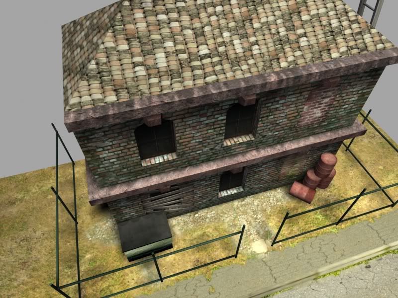
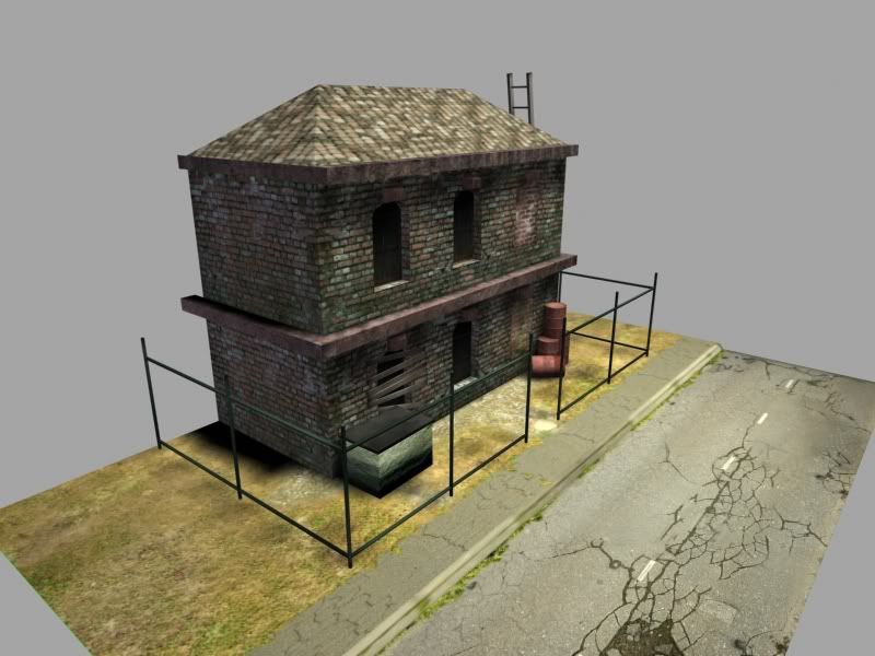
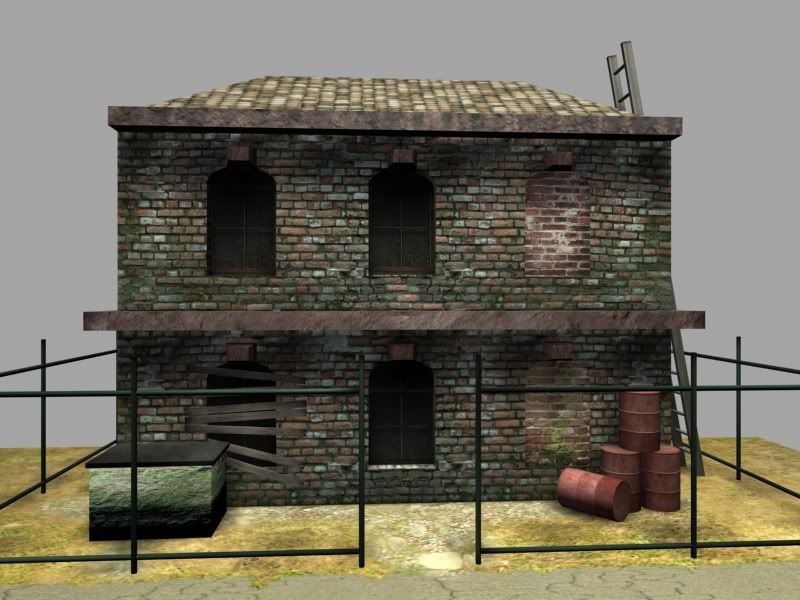
I'm doing a games course down here in Australia and I have been given my first major texturing project, which is to texture a run down house. We were given the model to work with so i didn't model this I only unwrapped and textured it. thought I would post up some renders of it and see what people think and any advice on what i can improve on or where I'm making stupid mistakes would appreciated, since I'm sure there is tons.
One thing that i know is really bad at the moment is the Dumpster, I haven't had time to fix that up but you can still comment on it
Thanks n a advance.


Replies
Roof: What's going on here? What is the actual texture? it's hard to tell, but I'm guessing it's a curved tile roof?
If it is, then it's being squashed like crazy. If it's not, then what is it?
Trim: What is this material supposed to be? Stone? Wood? Stucco? I don't know, but it doesn't really feel like anything specific.
Main Brick: THis looks pretty decent overall. I like the mossy look along the bottom of it, and it's got some nice variation within the texture without being too obvious about tiling.
Windows: These look ok from here, it's hard to tell what they are though. i.e. is there glass? are they boarded up from inside? etc. Arched windows made in brick walls pretty much always have arched brick above them, as support, to keep them from collapsing. This will help sell your building tremendously, as it will break up the tiling of the brick texture, and give your building more character:
Bricked Windows: These feel out of place because the brick is so different from the other brick. Obviously these would have been bricked up at a later date, so the brick wouldn't be the same, but it would be exposed to the same environment, and thus while the brick PATTERN might be different, the colors/weathering should be the same.
Boarded Window: These boards just seem like they're floating, not like they're nailed into the brick (which is a weird idea in itself) They also just look brown at this distance, and it's hard to see any wood grain (though it may be fine up close?)
Dumpster: You know about this. It needs form, and shapes to define what it is better.
Barrels: Pretty basic starting texture, but you can take it a lot farther. Think of where the wear would be. Think about what's in them (oil? toxic waste? chemicals?), layers of paint, warning signs, etc.
Fence?: Is it a fence? Or is it just a structure of poles? Is there supposed to be chain link in the big holes or something? The poles seem dark if they're the standard chain link fence galvanized steel poles.
Ground: Decent variation, but it's too desaturated and doesn't have enough contrast. Make the difference between dirt, and dried dead grass more apparent.
Sidewalk/street: This looks decent, but you've got some major stretching on your UVS for the sidewalk especially. Clean it up and it'll look even better.
Overall, good start, but get more reference for derelict brick buildings, oil barrels, dumpsters, etc. Look up what they ACTUALLY look like, and then try and match that. The more you try and pull it out of your head, the less believable it will be.
For the rest: What the guy above me said.
You should spend alot of time here during the next year or two because the feedback you will get will improve your art skills immensely. You learn the basics in these courses, but not much more. You're basically left to discover things for yourself, and you've come to the right place. Welcome.
In regards to your model, I think Tumerboy has it covered, take his advice and wow your class.
Tumerboy :
Thanks for all the advice ill try get as much of the changes done as i can (have to hand in the house on Tuesday) and post up the results, but i may have to leave it to a later date if i run out of time trying to put in all the changes since I'm doing like 5 different subjects at one time for the games course, its like finish one project and then straight onto the next one.
Thanks again for the advice.
Tanka:
The course I'm doing is the advanced diploma of multimedia (Games development) at Victorian university in Melbourne.
Good job though. Keep it up.