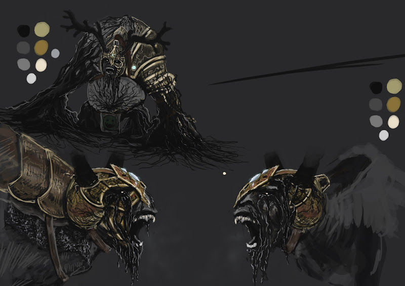
So it`s time for domwar again and I`ve decided against better judgement to enter this year as well. Been scribbling away on this demon lord guy for a couple of days now, just been too lazy to post anything. Finding it hard to find more than a couple of hours here and there to work on him with work and the curse called having a life but I`ll give it my best shot.
I had a pretty clear idea this time around that I wanted to make a big black demon lord who has consumed the power of the tree of death. Walking the lands throwing up black death-mucus-tar being an ecological nightmare and sucking the life out of his opponents with black-death-roots bursting out from his spine and lims deforming the demon itself in it`s lust for life to devour. You see, the power of the death tree is too powerful of a force and will eventually consume the host but hey that is the downside of being a walking plague. Without further ado, here it is
THE DEATH TREE DEMON!!!.........
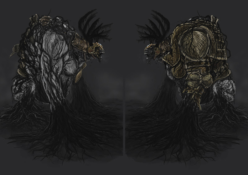
i think my only crit so far is maybe the roots are splayed out TOO far on the ground. try pulling those back to finger shapes then have pieces come out of there. that way you get the series of smaller and smaller details instead of huge to minute without any inbetween.
i love the tar dripping out of the eyes, so freaky
Yes! I like it. Make sure you keep his face that animal-looking! Almost like a goat. Really reminds me of the boar god in Mononoke, with the tentacles spilling out of his eyes. Yum. Good idea to have the armor predominant on one side only, adds interest. Nice muted colour-scheme as well. Maaaaybe add a few spots of red around the eyes/mouth to draw attention and compliment with something warm? And make sure you don't forget his visible breath in the winpose Antlers look very so-so in the sideviews. Also a few "fingers" poking through the splaying roots would be good to add some fading structure as the arms turn into.... dark stuff. Interesting workflow challenge too to separate the roots from the armor in a good way. Gambare!
Thanks to all of you guys who replied.
About the armour. I plan on having one side bare and one side with armour.
The side with armour will however be more torn apart and have more roots clinging to it than whats on the sketch, and oozing black tar pouring out of cracks and so on.
Richkid and Rasmus, about the fingers, you`re right. I`ll bring the roots together to resemble some kind of fingers. Might even have one hand partly visible.
Here are some progress shots. Nothing final and a bit hard to see the details maybe.
I`ve been setting up all the proportions and builing base meshes and stuff to make sure everything works.
Should make for faster progress later on. Found a ok way of doing the roots so thats what I`m doing now.
It`s really hard time to find enough time to work on this thing though.Not sure I`ll make it this year but I`ll try.
Awesome concept man, really digging it. Agree with snowfly though on trying to bring out the facial muscles in the sculpt more like in the concept. I also think that, maybe, the part coming from underneath his eye could be taken back a bit like in your sketches. Perhaps pushing out the cheekbones a bit more, making them sharper and having the rooty goodness starting to come from that could make him more menacing
It could be that the angle of these shots add to this, but I'm not feeling the goat-ness of the concept due to what I think is the placement of his eyes, which currently feel more human or ape-like in that they are higher, to the front and more centered as opposed to the peripheral vision of said herbivore. Sure it makes him look more intelligent and thus more evil, but I really like the expression of that Mononoke-boar thing where the creature is as much a victim itself as a frothing bringer of death. Kinda sad like in the concept. Also the skin could have more definition like these other thugs say, and I want that upper lip to curl Apart from that I would warn you against making the armor details and rivets too small considering texture space and readability. Hope you have enough time! With everything blocked out you have no excuses
you are all right of course, great critique guys!
cheekbones are defined, just hidden by craptastic tar modeling so more tearlike tar, goat-like eye placement, less noisy details and lip curl on its way!
all of those were things that was bothering me although I didn`t see i clearly until you guys pointed it out.
thanks!
Update! Progress slooow....partly due to my crap computer but mostly to a lot of rotating of the viewport trying to figure out what the hell I`m doing. But I atleast feel confident i`ll finish, with something...
Very WIP obviously, some kind of paintover to come with paintscheme and details I need to add etc.
Need a name for this beast if I`m going to sign up on the domwar page. Any suggestions?
Thanks kite, hope the images shows up now. Picasa stinks, but I`m too lazy to find some other host. If somebody out there could point me in the right direction I`d be very thankful.
Thanks guys.
meat - The roots are made by exporting a lo-version into max and then with snap to face on just clicking away on top of the model with splines.
Them splines are cool because you can have them render with custom thickness in the viewport which you can later export to obj. They also come with automatic uv mapping which you can use in zbrush to displace rough bark geometry to use as a start when detailing.
All the hanging roots are created on flat planes to make for easy extraction to alpha planes, in theory anyway...
kendo - I don`t envy myself either. will check out imageshack thanks.
I think I`ll need to get started on the lowpoly this week so we`ll see how that goes.
I don`t about anyone else but I`m stressed to hell about this deadline. It`s only 3 weeks left and still lowpoly, baking, texturing, posing, podium, lighting, rendering and presentation left!!!!
Am I the only one here pissing my pants right now?
Anyway here is a color scheme. Still have no idea about what to do for the smiling greenie. A flag attached to the horns perhaps could work, need to make a sketch. And name! Anyone have any ideas?
Latin pun(from wikipedia:poly136:): by eating the apple (malus), Eve contracted evil (malum)
So he`s got a name now, registered and all.
Ma'lum
By devouring the entire tree in his lust for knowledge the prince who`s real name is since forgotten became a vessel for evil itself.....yup, there it is..
Shapin' up! Roots look cool and all (renderable splines is everyone's best friend), I just expected them to splay out towards the ground - you're loosing something by not having at least some or half of the roots from his lower arms and hands merge with the ground I think...and the hands really stick out! Also think you should cover up his huge belly with roots or otherwise give it some more interest, but then again this is WIP, I know. Really like that glowing gem on his forehead! Ties in well with his royal past Maybe an amulet for the green meanie? And think about a podium! I still think a muddy wasteland with treestumps would tie in well...
rasmus - Thanks, Don`t worry about the roots, it`s hard to see from the angle but they are splayed out into 3 directions like fingers. It was just easier to model them this way. When I pose him I will have the hand of the armored side on the ground, roots splaying out in a wider arc.
About the belly, I think it just gets too busy and hard to differentiate the arms from his body if I cover it in roots. However you are right about that it needs something. I will have sick looking skin color like on his neck, not sure if that will be enough though.
An amulet is a good idea.
Podium? I`m happy if I get to a point where I have this guy textured, but thanks for reminding me...and a swampy mound lit by moonlight sounds just about right. Not sure about the scale of this guy yet, I`m thinking around 8m. Human reaches to about his knee. Need something on the podium to emphasize his scale.
Wow, can't believe I hadn't seen this one yet. Amazing work.Great design on the face/overall silhouette. The fingers poking through the roots look excellent as well..... keep it up, can't wait to see this guy all done up!
Hey! Thanks everyone for your support!
Malum is baked, skinned, WIP posed, WIP textured, has a WIP podium and is a Wery Incomplete Person right now so I don`t have anything that cool to show you just yet. In the meantime here are some baked screens from max with the very nice Xoliulshader. Complete with mip map smeg and alpha-sorting artifacts. And HEY! an extension!! who would have guessed?...I would probably have made it in time anyway but now I don`t have to be all stressed out this weekend...now that will happen next week instead.
Replies
I really dig this, keep it up!
i love it!!!!
-Woog
i love the tar dripping out of the eyes, so freaky
i love it, no crit
Good luck modeling the dude!
About the armour. I plan on having one side bare and one side with armour.
The side with armour will however be more torn apart and have more roots clinging to it than whats on the sketch, and oozing black tar pouring out of cracks and so on.
Richkid and Rasmus, about the fingers, you`re right. I`ll bring the roots together to resemble some kind of fingers. Might even have one hand partly visible.
Here are some progress shots. Nothing final and a bit hard to see the details maybe.
I`ve been setting up all the proportions and builing base meshes and stuff to make sure everything works.
Should make for faster progress later on. Found a ok way of doing the roots so thats what I`m doing now.
It`s really hard time to find enough time to work on this thing though.Not sure I`ll make it this year but I`ll try.
Looking hot.
Gav
cheekbones are defined, just hidden by craptastic tar modeling so more tearlike tar, goat-like eye placement, less noisy details and lip curl on its way!
all of those were things that was bothering me although I didn`t see i clearly until you guys pointed it out.
thanks!
Very WIP obviously, some kind of paintover to come with paintscheme and details I need to add etc.
Need a name for this beast if I`m going to sign up on the domwar page. Any suggestions?
you can get the images up on imageshack.us
meat - The roots are made by exporting a lo-version into max and then with snap to face on just clicking away on top of the model with splines.
Them splines are cool because you can have them render with custom thickness in the viewport which you can later export to obj. They also come with automatic uv mapping which you can use in zbrush to displace rough bark geometry to use as a start when detailing.
All the hanging roots are created on flat planes to make for easy extraction to alpha planes, in theory anyway...
kendo - I don`t envy myself either. will check out imageshack thanks.
I think I`ll need to get started on the lowpoly this week so we`ll see how that goes.
I don`t about anyone else but I`m stressed to hell about this deadline. It`s only 3 weeks left and still lowpoly, baking, texturing, posing, podium, lighting, rendering and presentation left!!!!
Am I the only one here pissing my pants right now?
Anyway here is a color scheme. Still have no idea about what to do for the smiling greenie. A flag attached to the horns perhaps could work, need to make a sketch. And name! Anyone have any ideas?
I like all these roots interlaced.
That may be my Celtic heart talking though
So he`s got a name now, registered and all.
Ma'lum
By devouring the entire tree in his lust for knowledge the prince who`s real name is since forgotten became a vessel for evil itself.....yup, there it is..
rasmus - Thanks, Don`t worry about the roots, it`s hard to see from the angle but they are splayed out into 3 directions like fingers. It was just easier to model them this way. When I pose him I will have the hand of the armored side on the ground, roots splaying out in a wider arc.
About the belly, I think it just gets too busy and hard to differentiate the arms from his body if I cover it in roots. However you are right about that it needs something. I will have sick looking skin color like on his neck, not sure if that will be enough though.
An amulet is a good idea.
Podium? I`m happy if I get to a point where I have this guy textured, but thanks for reminding me...and a swampy mound lit by moonlight sounds just about right. Not sure about the scale of this guy yet, I`m thinking around 8m. Human reaches to about his knee. Need something on the podium to emphasize his scale.
loving it! the roots are amazing!
-Woog
Malum is baked, skinned, WIP posed, WIP textured, has a WIP podium and is a Wery Incomplete Person right now so I don`t have anything that cool to show you just yet. In the meantime here are some baked screens from max with the very nice Xoliulshader. Complete with mip map smeg and alpha-sorting artifacts. And HEY! an extension!! who would have guessed?...I would probably have made it in time anyway but now I don`t have to be all stressed out this weekend...now that will happen next week instead.
It is very impressive. So many details!
Congratulations. That's really a great piece.
-Woog
good luck!